台式极简的功能性 Indotdesign 首
2021-08-16 13:48


虫点子创意机构设计总监:郑明辉
来自台湾的虫点子创意设计机构,主持设计师郑明辉本身是建筑背景也是插画作家的双重身分,热爱富有创意的事物,喜欢从生活中发掘创意及有趣的点子。在空间表现上,擅长以独特的线条以及空间穿透感,打破原有格局框架,形塑出独特的虫点子风格。
From Taiwan worm idea creative design agency, run the designer ming-hui zheng itself is the dual identity of the construction background and illustrator, enjoy creative things, like creative and interesting ideas from life. Performance in space, is good at with unique lines and space through feeling, break the pattern of the original framework, shape the unique style of insect ideas.
Minimalism design


这是位于台湾竹北24坪(约为大陆的80平米)的老房子,居住成员为两大一小,屋龄快20年,现况没有太严重的问题,只是东西杂物稍多。原始格局为三房,但空间都不大,因为屋主家裡人口不多,所以我们只保留两房就好,希望可以让公共空间尽量大一些。
It is located in the northern 24 Taiwan bamboo ping (about 80 square meters) of the mainlands old house, living members, for the two large and a small house almost 20 years old, status not too serious, just something sundry a bit more. Original structure for the three rooms, but the space is not large, because homeowners home small population, so we just keep fannie and Freddie, hope I can make public space as far as possible big some.


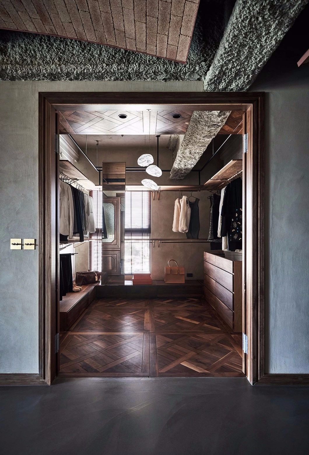
设计师重新将房间与厕所牆体调整,在有限的空间下塞入了一个大储藏室,这就是虫点子设计一直强调的:有个储藏室胜过一堆柜子;厨房牆面也打开让客厅的光线也能进到厨房。
Designer to adjust the room and bathroom wall, under the limited space into a large storage room, this is the worm idea design has been emphasized: a storage room is better than a pile of cabinet; Kitchen metope also open the light also can let a sitting room, into the kitchen.


整合 - 藉由几道牆面的切割,让收纳机能与生活空间取得了平衡。
Integration - by a few metope of cutting, to make the life and the receive function space achieved balance.


玄关设计了一个落尘区以及换鞋椅,原来很多东西都零散的放在地上以及挂在牆上,所以会显得比较凌乱,我们藉由悬空的柜体让外套包包都有自己的家。
Porch design a fallout zone and change shoe chair, originally a lot of things all scattered on the ground and hanging on the wall, so will appear messy, we borrow by dangling coat cabinet put oneself in anothers position to make handbags have their own home.


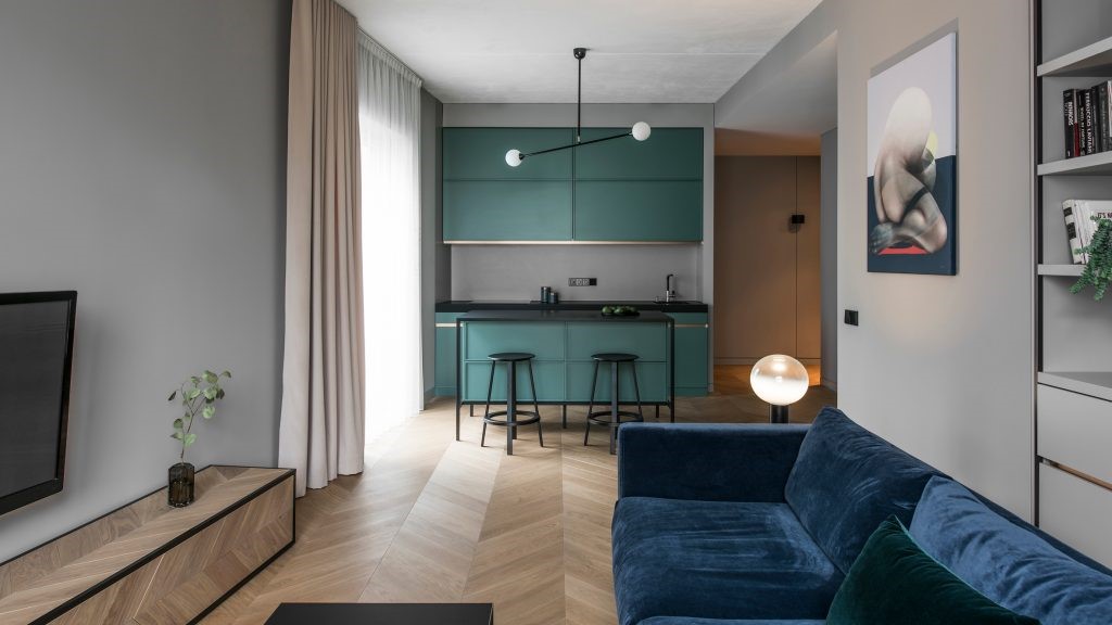
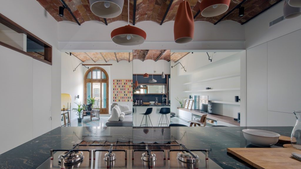
原来厨房牆面打开后变成开放式厨房,对于油烟问题我们有预留铁件拉门的轨道,日后可以直接安装。
The original on the metope of the kitchen into the open kitchen, we have reserved for the problem of lampblack iron sliding door, can be installed directly in the future.


餐厅区及厨房天花都有大樑穿过,于是我们用板块的概念收掉梁柱,因为厨房裡面天花更低,所以我们在边缘用了一条LED灯带,弱化天花的压迫也变成空间的界定。
Flowers have girder through the dining area and kitchen day, so we use the concept of plate beam, because inside the kitchen ceiling is lower, so we in the edge with a belt of leds, weakening the oppression of smallpox into definition of space, too.


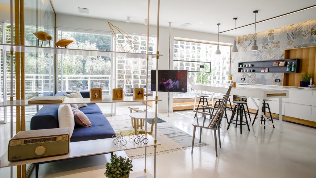
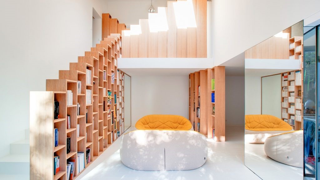
整个空间的色调以白色与木色为主,我们希望不要做太满,多一点留白给空间,收纳够用就好,所以有做了一个大储藏室。电视牆面大面的留白,只有做底下矮柜收纳以及延伸窗边卧榻。虽然拍照看起来好像没什麽东西,事实上很多东西都已经收在卧榻底下跟储藏室,这样简洁乾淨的空间,不管之后屋主想要怎麽摆装饰品,其实都可以搭。
Whole space is tonal give priority to with white and color, we hope dont too full, a little more space to space, receive enough good, so they have made a big closet. Under the TV wall bedding face of white space, only do short ark to receive and extended window bed. Although the pictures look like nothing, in fact, many things are under the bed and storeroom, the space of the clean, no matter how after homeowners want put decorations, actually can be set.


将房间与厕所以及储藏室门片整合,变成一道简洁的牆面。
Integrating room and toilet as well as the storage room door piece, into a compact metope.


主卧也是走极简白的调性,天花有一支大樑,我们用一个圆弧造型修饰,形成一个造型光带。原来主浴把它改成半套,将其他空间让给客浴,虽然是半套的卫浴,但仍保留一个超大洗手台,可以结合女主人化妆空间。
Advocate lie is also taking the minimalist white tonal, smallpox have a girder, we use a circular arc shape modification, to form a band shape. Change it to half the original master bath, bath will be space for other guest, although is half set of wei yu, but still retain a large sink, can combine the hostess make up space.


卫生间牆面跟地板都用白色的义大利矿物涂料施作,无缝的质感就是好整理,我们也利用管道间的一点空间,做成一个内凹置物层架,可以放很多瓶瓶罐罐。
Toilet metope and floor with white Italian mineral coating applied, seamless texture is good, we also use a bit of space between the pipe and make the buy object layer, an inner concave can put a lot of bottles.


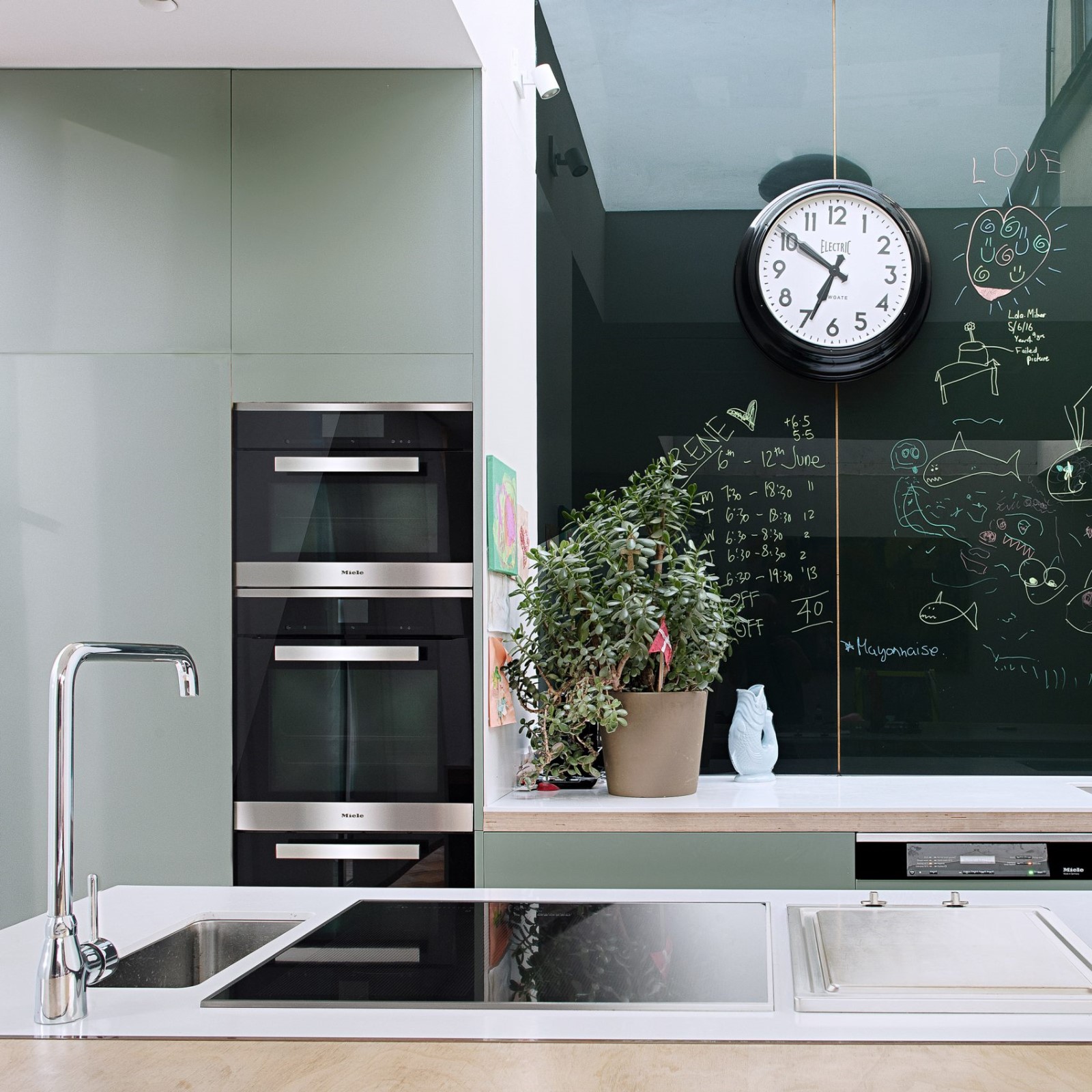
小孩房跳了一个墨绿色系,与外面洁白空间形成一种对比。
Child room jumped a blackish green color, with white space outside a contrast.

 PintereAI


