灵魂底色见证幸福时刻 首
2021-05-25 22:23


Wedding Hall
The main tone of the hall is white
Wedding dress and space
Neat and generous wedding dress shop design
Witness the happy moment of pure lovers


该项目“马卡利亚新娘”商店,工作室设计白色建筑,带柔软的曲线屋顶,漂浮在水面上。他们希望创造温柔、安静、纯净的空间,适合婚纱店。质感颜料、米色石灰华、地毯、半透明玻璃、镜子等材质被运用在空间,通过对空间和材质的处理,设计希望创造纯净柔和的空间,为游客展示和体验婚纱。
The project is Macalia bride shop, studio design white building, with a soft curved roof, floating on the water. They hope to create a gentle, quiet and pure space suitable for wedding dress shops. Texture pigments, beige travertine, carpets, translucent glass, mirrors and other materials are used in space. Through the treatment of space and materials, the design hopes to create a pure and soft space for tourists to show and experience wedding dress.


原建筑为单层钢结构建筑。它位于一个广场的中央,通过一条走廊与主办公楼相连,周围有停车场。原来的主入口太隐蔽,难以辨认,游客很难找到。进入建筑后,折叠屋顶呈水平状,看上去高度相对较低,略显凹陷,没有体现屋顶造型的特征。
The original building is a single story steel structure building. It is located in the center of a square, connected with the main building through a corridor, surrounded by parking lots. The original main entrance is too hidden and difficult to identify, which is hard for tourists to find. After entering the building, the folding roof is horizontal, looks relatively low in height, slightly concave, and does not reflect the characteristics of the roof shape.


停车场杂乱无章,有些车停在玻璃幕墙附近,挡住室内空间风景。原钢结构的质量和外观不好。如何组织建筑与周围杂物关系?如何避免现状弊端,甚至转化为项目的特色?这些是这个项目中需要解决的最重要的问题。
The parking lot is in disorder. Some cars are parked near the glass curtain wall, blocking the view of the indoor space. The quality and appearance of the original steel structure are not good. How to organize the relationship between the building and its surroundings? How to avoid the disadvantages of the status quo, and even into the characteristics of the project? These are the most important problems to be solved in this project.


经过反复的行走、观察、体验、思考,工作室决定将主入口改为西南侧。游客从山墙进入,山墙变成前面的。折叠车顶的形状与品牌名称的首字母“M”暗合,主入口变得更加显眼,游客可以找到。从山墙一侧进入,游客可以体验到相对较高的空间,视觉上避开较低主横梁。
After repeated walking, observation, experience and thinking, the studio decided to change the main entrance to the southwest. Visitors enter from the gable, which becomes the front one. The shape of the folding top coincides with the initials m of the brand name, making the main entrance more visible for tourists to find. Entering from one side of the gable, visitors can experience relatively high space and avoid the lower main beam visually.


其他所有设计理念逐渐浮出水面,玻璃幕墙拉回约2米,以扩大内部空间与外部停车场间的距离。它还为进出大楼的游客提供一个过渡空间,遮风挡雨。工作室还大楼外建一个浅水池,与不远处的停车场进一步隔开。
All other design concepts gradually surfaced, and the glass curtain wall was pulled back about 2 meters to expand the distance between the internal space and the external parking lot. It also provides a transition space for visitors in and out of the building. The studio also built a shallow pool outside the building, further separated from the nearby parking lot.


幕墙被透明玻璃所取代,让阳光从不同角度进入空间。阳光最好区域作为沙发接待区。工作室使用厚墙形成不同的空间,并包裹钢柱和钢梁。原有钢结构的工业感和“薄片”感被转化为更坚实稳定的体验。厚墙有利于正面的内部空间,并有助于容纳不同功能在其厚度内,如展示壁龛,隐藏柜,婚纱存放架等。
The studio uses thick walls to form different spaces and wrap steel columns and beams. The industrial and flake feeling of the original steel structure is transformed into a more solid and stable experience. The thick wall is conducive to the interior space of the front and helps to accommodate different functions within its thickness, such as display niches, hidden cabinets, wedding dress storage racks, etc.


婚礼,像许多仪式一样,庆祝一个人从一种身份到另一种身份转变。这种转变包括游行队伍:在西方婚礼上,新娘进入并沿着过道走,然后已婚夫妇再次走过道后离开。泰国传统上在新娘的房子外面,新郎和新郎一行必须穿过“金门”或“银门”才能到达新娘。
Weddings, like many rituals, celebrate a persons transition from one identity to another. This transformation includes parades: at Western weddings, the bride enters and walks down the aisle, and then the married couple walks down the aisle again and leaves. In Thailand, traditionally outside the brides house, the bridegroom and his party have to go through the Golden Gate or silver gate to get to the bride.


最大胆的设计元素是沿着建筑西边的走道,最终到达订婚室。在这里,这个队伍被赋予自己的空间,同时保留传统的户外位置。这条走道是对乡村街道的重新诠释,新郎和他一行可以被邻居从他们的房子里看到。圆柱间的一些空间被屏蔽,从外部隐藏游行队伍的视图,从而增强运动感。
The most daring design element is to follow the Western Corridor of the building to the engagement room. Here, the team is given its own space while retaining its traditional outdoor location. This corridor is a reinterpretation of the country street, where the groom and his party can be seen by neighbors from their houses. Some spaces between the columns are shielded to hide the view of the procession from the outside, thus enhancing the sense of movement.


专门建造婚礼空间灵活,以容纳各种宗教和文化,无论是纯粹形式,还是借鉴其他传统的元素。这座建筑试图通过平衡摄影舞台和增强真实体验的空间调和这种态度。使用白色曲线墙的实际优势是模仿摄影工作室墙壁,在天窗漫射光的辅助下用作空白画布,或在外墙上播放曲线几何体形成的光影。
The specially built wedding space is flexible to accommodate a variety of religions and cultures, whether purely formal or drawing on other traditional elements. The building attempts to reconcile this attitude by balancing the photographic stage with the space that enhances the real experience. The practical advantage of using white curved wall is to imitate the wall of photography studio, use it as blank canvas with the help of skylight diffuse light, or play the light and shadow formed by curved geometry on the external wall.


低层建筑的规模和整体布局成为一个独立、自省建筑。客人们在展示夫妇照片画廊空间等待。这是一个绿色的房间,这个空间作为一个过渡,从外部世界。两个主要的内部空间是主大厅和订婚大厅。主厅可容纳290人,独立坐落在庭院中,庭院三面环绕一个U形回廊式结构,允许在地下流通和包括辅助房间。订婚大厅可容纳150人,通过“抛花束”庭院与正厅隔开。
The scale and overall layout of the low rise building become an independent and introspective building. Guests are waiting in the gallery space showing couple photos. This is a green room, this space as a transition from the outside world. The two main interior spaces are the main hall and the engagement hall. The main hall can accommodate 290 people and is located independently in the courtyard. The courtyard is surrounded by a U-shaped corridor structure on three sides, allowing underground circulation and including auxiliary rooms. The engagement hall can accommodate 150 people and is separated from the main hall by a bouquet throwing courtyard.


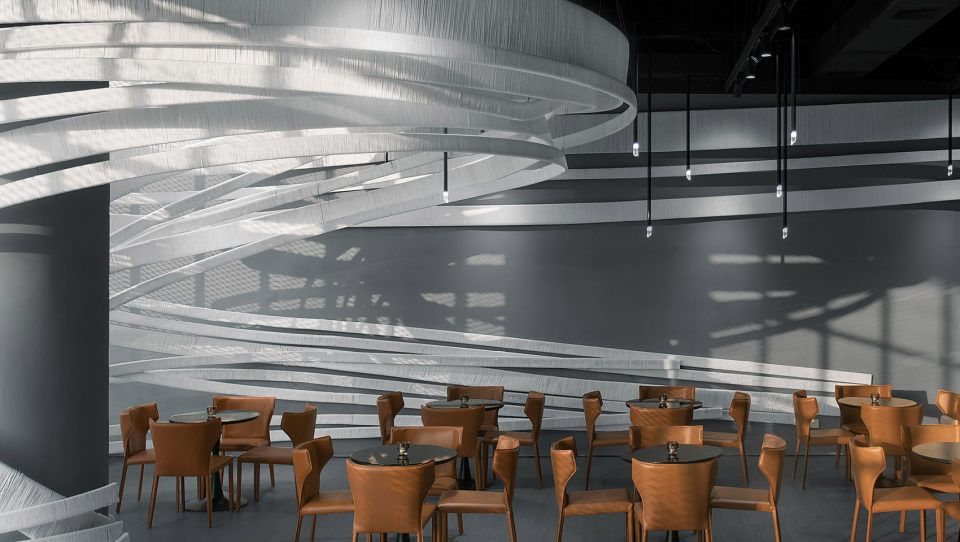
走道和回廊庭院只是拱形走道的复制品,或者对教堂元素的重新诠释。拱门被解构为半拱形模块化元素,并在不同轴线上旋转后进行改造,显然给建筑一个现代、开放的形象。效果是白色混凝土弯曲天花板。在建筑元素方面,走道采用发泡聚苯乙烯泡沫雕刻和石膏,形成白色曲线连续形状,而在其他地方,雕塑外观则采用白色砂洗成品混凝土。
Aisles and cloister courtyards are merely copies of arched aisles or reinterpretations of church elements. The arch is deconstructed as a semi arched modular element, and is transformed after rotating on different axes, which obviously gives the building a modern and open image. The effect is a curved ceiling of white concrete. In terms of architectural elements, the aisle uses foam polystyrene foam carving and gypsum to form a continuous shape of white curves, while in other places, the appearance of the sculpture is white sand washed concrete.


拱门和弧形墙的主题在建筑内部以各种形式重复,包括庭院中的雕塑楼梯,新娘从那里抛出她的花束。构成主厅外墙和回廊结构的拱门相互重叠,再次营造出动感。主厅天花板上拱形天窗檐口中的曲线被缩小,檐口元素被重新用作舞台后面墙壁饰面。弯曲墙壁和切口,以及柔软窗帘,创造一个难忘的,感性的空间。
The themes of arches and arc walls are repeated in various forms within the building, including a sculpture staircase in the courtyard from which the bride throws her bouquet. The arches which constitute the exterior wall of the main hall and the cloister structure overlap each other, creating a dynamic again. The curve in the cornice of the arched skylight on the ceiling of the main hall was reduced, and the cornice elements were re used as wall finishes behind the stage. Curved walls and incisions, as well as soft curtains, create an unforgettable, sensual space.

 PintereAI


