得德設計:錦日料餐廳 首
2021-05-11 14:16
文化創造的本質是發現、選擇、吸收和創造。 The essence of cultural creation is to discover, select, absorb and create. -- SALONE DEL SALON
與中國建築的宏大壯美相比,日本建築以洗練、素潔見長,更關注建築的結構構造、材料質感及色澤明度,擅於以小見大,細微處見真知。本案為一家高端日式料理店,得德設計擔綱室內設計,緊扣日本建築的簡素內核,大膽寫意,細膩描摹,將日本傳統文化意象演繹得精細、獨到,“接手本案時,無論是元素提煉、技法表達還是空間佈局,我們都希望通過意象的解構、重組,創造出全新的日式用餐體驗。” Compared with magnificent Chinese architectures, Japanese counterparts are characterized by succinctness and neatness, which emphasis more on the structure, material texture, and color brightness. They are very good at having the big picture reflected in small details, and revealing authenticity in subtlety. This project is a high-end Japanese restaurant, which commissioned SALONE DEL SALON as its interior design consultant. The design sticks to the simpleness at the core of Japanese architecture, crating the atmosphere in a bold way, yet focusing on representing the details, which having the traditional Japanese cultural imagery ingeniously interpreted. “At very the beginning of this design, we hope to create a brand new Japanese dining experience by deconstructing and reorganizing cultural images in the terms of design elements extraction, choices of design language, and the spatial layout.”
01 簡素與濃烈 相映成趣 Simple - Intense, a Delightful Contrast
簡素與濃烈,構成日本極致美學的矛盾體。簡素是枯山水寫意庭院式的侘寂美學,濃烈則是對極致的執著追求。日式料理店在簡素與濃烈之間尋找著平衡點,進入伊始,天地面帶來的不同視覺感受,恍若開啟了一段有趣的旅程。 Simple and intense, the two features constitutes the paradox of the extreme Japanese aesthetics. Simple lays in the wabi sabi aesthetics of the Japanese-zen-garden style, while the intense represents the unwavering pursuit of the ultimate. This Japanese restaurant strikes the balance between simple and intense-- the contradictory visual experience given by the ceiling and floor at the entrance tells the beginning of an intriguing journey.
極具吸睛的“蝴蝶穀”屏風裝置,是以藍綠酸洗做舊處理的銅板造型,配搭上年代感的實木木板,形塑出展翅迎客的蝴蝶。斑駁的銅綠呼應了日本建築銅構件常年曝露在濕潤海洋性氣候而形成的氧化效果,其內蘊的守靜、致遠,與日本審美觀極為相契。屏風裝置背後別有洞天,靠牆的白色軟包沙發,便於移動的幾案,搭配上紅色單椅,構成了靈活的散客區,於簡素之間添了一抹亮色,讓用餐更為愉悅。 The eye-catching “Butterfly Valley” screen installation depicts a butterfly welcoming guests with its wings wide open, which is made of blue-green pickling old-fashioned copper plates and antique solid wood plate. This mottled green color of copper echoes to the oxidized copper units of the Japanese architectures exposed to the humid maritime climate all year around, and the intrinsic tranquility and far-reaching nature matches perfectly with the Japanese aesthetics. Behind the installation, there are many things happening: a white sofa against the wall, flexible tables together with red single chairs form up the multi-function area for individual guest, adding this bright color to the simple tone so as to make the dining experience much more delightful.
日本在明治維新時期受西洋文化影響,文化於吸納、轉化中得以重塑。接待臺背牆選用Roberto Cavalli原版壁紙,融入西洋文化的自由、浪漫。從接待臺前往用餐區的廊道,日本傳統建築的屋簷元素創意性地融入天花造型設計中,“日本傳統建築的屋簷很有特色,結構重疊、穿插,我們從中抽出一部分作為元素進行數組複製,以現代手法表現,又隱隱透出傳統的影子。”得德設計主理人沙龍在闡釋時這樣說道。 Japan was influenced a lot by the Western culture during the Meji Restoration, and at that time their own culture got reshaped by absorbing and transforming other cultures. The authenic Roberto Cavalli wall clothing used at the reception desk introduces the spirit of freedom and romantic of the western culture into the restaurant. Traditional Japanese eaves are creatively used as the ceiling design elements of the gallery connecting the reception desk and the dining area. “Traditional eaves of Japanese architecture have distinguished features, such as the overlapping and interspersed structure. By extracting part of the eaves as the design element, we present it in a modern language with traditional flavor through array repetition.” Salone, the principal of SALONE DEL SALON, said when interpreting the design.
02 留白與重彩 寫意東方 Untouched Space - Protagonist Color, the Abstract Orient
從接待臺起,設計團隊以“口”字型進行動線規劃:散客區、六人、八人、十人包間依次鋪排,將最美的風景讓位給包間,引自然景觀入室,以建築技法描摹出寫意庭院的用餐氛圍;後廚、辦公及洗手間等置於最末端。這一以直線布排優化出最短距離的設計思路,有效解決了日式料理店送餐動線長的難點,也充分考量了商業轉化率及利用率。而房與房之間借由日式折疊推拉門,讓主通道的門牆盡可能規整,追求極致的簡素之美。 Start from the reception desk, design team follows the shape of Chinese character “口” in planing the circulation: individual guest area, six-pax PDR (Private Dining Room), eight-pax PDR, and ten-pax PDR arranged in order, leaving the best scenery to the PDRs with natural views introduced into the space, and a poetic garden atmosphere created through the architecture technique of imitation. The BOH kitchen, office and toilets are placed at the end of the layout. This idea of finding the shortest distance through a straight line arrangement has effectively met the needs of shorten long service circulation in Japanese restaurant, and is also a result of taking business conversion rate and utilization rate into fully consideration. Thanks to the sliding doors between different rooms, the main entrance is presented as neat as possible for the pursuit of ultimate simple aesthetics.
留白是東方的設計筆觸,以素潔為內核,講求餘韻繞梁的無言之美。本案作為高端日式料理店,東方寫意的留白被內化為空間背景,得德設計團隊將日本傳統的雅正紅融入空間,重彩雕琢。 To leave space “untouched” is an oriental way of doing design. With simple and neatness at its core, this language is all about the unspoken beauty that lingering around all the time. As a high-end Japanese restaurant, this “untouched” feeling from the abstract oriental aesthetics has become the background of its design, where SALONE DEL SALON has the elegant and authentic Japanese red introduced as the protagonist.
“我個人最喜歡日本紅,起初考慮以點綴方式融入空間,但大面積紅色的大膽使用,克制鋪陳,使其成為空間的重要線索,反而契合了尊重文化本身的思路。”得德設計主理人沙龍特別感慨,也慶倖理念能得到業主的認可,最終呈現也獲得了意想不到的妙趣。無論是天花屋樑造型兩側的牆面點綴,牆面腳踏線的反復詠歎,還是重彩的背景色,家私中的那抹紅,都恰如其分地遊走於留白與簡素中,濃淡相宜,相映成趣。 “Japanese red is my favorite color. I initially considered to use it as the accent of the space, but later I figure that to apply it in a radical yet not spoiled way, making it the crucial clue of the whole space, is somehow a more appropriate direction of design under this specific cultural context. ” Salone said when expressing his feelings and appreciations for the owner’s recognition and the unexpected interesting outcome. Whether it is the wall decorations along the eave-design gallery, the repetition at the skirting line, the bold-colored background, or the accent of the furniture, the red color wonders calmly around the “untouched” and simple style, creating a contradictory yet intriguing delight in the space.
03 傳統與現代的融合 匠心獨具 Integrate tradition - modernity, the Ingenious Craftsmanship
日式傳統精粹融合現代設計精神,守拙出新,方能締造出獨特的體驗感。日式榻榻米坐席營造的是樸拙的東方調性,而長桌型態則是呼應現代的自由精神,二者在本案中圓融互通。精緻細膩的牆紙質感,對應的是牆面肌理塗料粗獷而恣意的表達,材質肌理的對比與反差,納入矛盾美學的思索,就猶如步入日式庭園賞枯山水,侘寂之美於此情此景中了然於心,驀然頓悟了。 Through the integration of the essence of Japanese tradition and the spirit of modern design, a peculiar experience was created in an innovative way. The Japanese style tatami represents the simple attribution of the oriental style, while the long table speaks for the modern spirit of freedom, the two of which harmoniously coexist within this project. The sophisticated texture of the wall cloth is the contradiction of the rustic texture paint on the other side of the wall, which introduce the idea of paradoxical aesthetics. Walking into this space gives one the same feeling of wondering inside a Japanese zen garden-- the beauty of wabi sabi appears in mind, and all of a sudden, one acquires the answer of life.
燈光氛圍的營造也關係到空間情境的表達。得德設計以機場跑道點光源置入本案,正是基於日式料理店位處商場,無法避免公共區域的消防動線、安全通道指示、防火門等設施的存在,改用地面的引導光,減少頂部區域的公共光源,弱化標識,讓光也成為有表情、有情感的設計。 The lighting atmosphere also contributes to the overall expression of the spatial context. Taking the project’s shopping mall location into consideration, where the public life-safety circulation, safety indication and fire-proof door is inevitably exist, SALONE DEL SALON introduces the point light design on the airport runway as way the guidance light applied in this restaurant, so as to reduce the public lighting area on the ceiling, weakening the effect of signage, and to make lighting another unique expression of design.
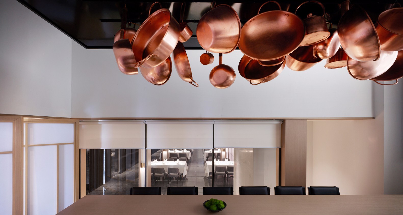
每間包房以日本地名命名,富士、京都、東京、神戶、千葉等銅制門牌嵌有光源,斑駁的光影投射於粗糲的牆面上,頗有幾分雅意。為了讓用餐者得到純粹的體驗感,設計師在軟裝陳設上也絲毫不敢鬆懈,從松柏藝術裝置、和服擺件到日式掛畫,無一不精到,甚至餐具擺盤也頗費心力,不同食材,對應的擺盤方式皆有考究。細微之美,卻蘊含著設計者質樸的匠心。 Each private dining room is named after local Japanese cities or provinces, such as Fuji, Kyoto, Tokyo, Kobe, Chiba, etc. Every copper-made name plate has its own spot light, which creates an elegant atmosphere when the light and shadow coexist on the rustic wall. In order provide a simpler dining experience for the guest, designers spares no effort in the FF-E design as well. From the cypress art installation, the kimono ornament, to the Japanese-style paintings, each and every detail tells the story of the exquisiteness of design. Even the way of table ware displaying can be quite “demanding”. Different ingredients will have various way of displaying. It is the beauty of subtlety contains the simple ingenuity of the designers.
04 設計·靈感 Design · Inspiration
專案名稱:鄭州·錦料理 專案面積:603m² 設計時間:2018年12月 竣工時間:2019年6月 室內設計:SALONE DEL SALON得德設計 主創設計:沙龍 設計團隊:鄭緯邦、嶽群飏、李淩風、趙天一、李斌 Project Name: Zhengzhou·Jin Japanese Restaurant GFA: 603㎡ Design Starts on: December, 2018 Completion Date: June, 2019 Interior Design: SALONE DEL SALON Chief Designer: Salone Design Team: Zheng Weibang, Yue Qunyang, Li Lingfeng, Zhao Tianyi, Li Bin
采集分享
 举报
举报
别默默的看了,快登录帮我评论一下吧!:)
注册
登录
更多评论
相关文章
-

描边风设计中,最容易犯的8种问题分析
2018年走过了四分之一,LOGO设计趋势也清晰了LOGO设计
-

描边风设计中,最容易犯的8种问题分析
2018年走过了四分之一,LOGO设计趋势也清晰了LOGO设计
-

描边风设计中,最容易犯的8种问题分析
2018年走过了四分之一,LOGO设计趋势也清晰了LOGO设计


 PintereAI


