品界设计新作 寻找空间“本质”—ALVIN(厦门)肖像馆|商业 首
2020-09-19 22:26


极简到极致,极简不仅仅是一种设计或风格,而是一种向上的建筑力量,令人振奋的精神支柱。
Minimalism to the extreme. Minimalism is not only a kind of design or style, but an upward architectural force, an inspiring spiritual pillar.


2020年ALVIN聚焦于肖像摄影艺术领域,传承ALVIN影像艺术基因里的高级质感,继续捕捉美,表达爱。旨在让肖像作品以一件艺术品的形式存在,打造具有纯粹情感、年轻状态、真实表达的肖像艺术品牌——『艾尔文肖像摄影』。
In 2020, ALVIN focuses on the field of portrait photography, which inherits the high-level texture in the ALVIN image art gene, and continues to capture beauty and express love. Alvin aims to make portrait works exist in the form of a work of art, and to create a portrait art brand with pure emotion, youthful state and true expression--Alvin Portrait Photography.


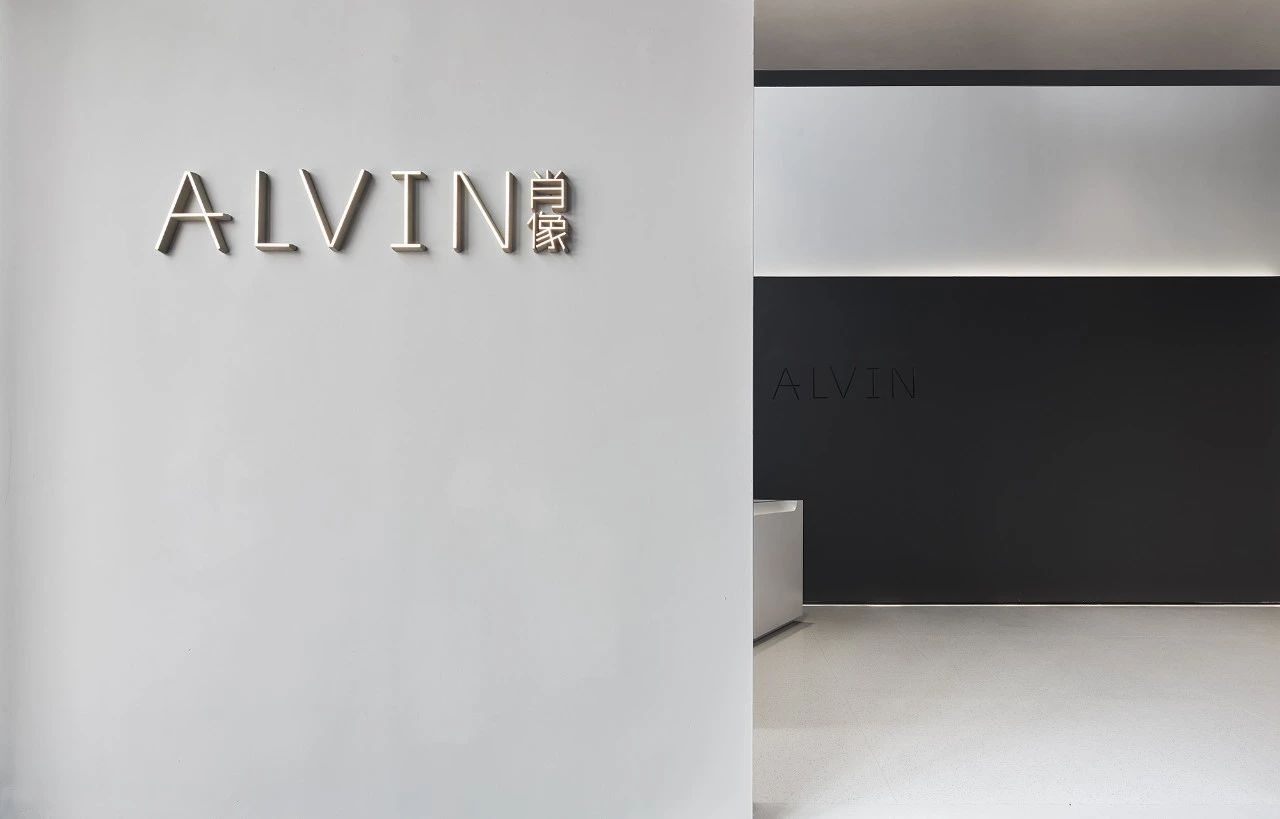
项目坐落于厦门-5A级写字楼国金广场4层。年初,业主与我们交流,希望做一个能够与肖像摄影相结合,体现行业先驱者且具有空间“本质”的艺术馆。
The project is located on the 4th floor of Xiamen Guojin Square, a 5A office building. At the beginning of the year, the owner communicated with us, hoping to build an art studio that can be combined with portrait photography, which will embody the pioneer of the industry and have the essence of space as well.


馆内主要划分为:大厅、画廊、礼服、化妆和选片等五大主要功能区域。我们有序地使用隔墙来进行划分,有
的半隔,有的离地,但又相通、穿插、迂回,模糊空间界限。黑白灰的场景氛围营造,结合“天光”,与光而行,阴影沿着光的边缘舒展,赋予进入者无限的想象空间,不仅让空间变得有趣,同时又有了人与空间的活跃性。
The museum is divided into five main functional areas: lobby, gallery, dress, makeup and film selection. We use partition walls to divide them in an orderly way. Some are half separated, some are separated from the ground, but they are interlinked, interspersed and circuitous, blurring the boundaries of space. The atmosphere of black, white and grey scenes is created by combining the sky light and walking with the light. The shadows stretch along the edge of the light, endows the visitors with infinite imagination space, which not only makes the space interesting, but also makes people and the space active.


但这种“有趣”并不是没有意义的,而是可以提升商业价值的一种感性的规划。我们以消费者与甲方为中心考虑,首先消费者从前厅进入,先欣赏一遍画廊里的肖像作品,他们会自然而然地被这些艺术作品所吸引,犹如参观一个展馆一样一步步地深入。
But this fun is not meaningless, but an emotional program that can enhance business value. We take consumers and Party A as the center of consideration. First of all, consumers enter from the front hall and first see the portrait works in the gallery. They will be naturally attracted by these works of art, just like visiting a gallery, and then go deeper step by step.


接着,当他们走出画廊,来到礼服区,又将会被这一件件唯美的礼服所感染,发自内心地想试穿一番。最后,再来到选片区,他们还可以了解到一系列的作品画册等等。在这个过程中,消费者“由内到外”受到了全方位的洗礼。
Then, when they walk out of the gallery to the dress section, they will be impressed by the beautiful dresses and want to try them on. Finally, when they come to the selection area, they can also learn about a series of works, albums and so on. In this process, consumers from the inside to the outside by an all-round baptism.


这样的规划动线一方面提高了消费者对肖像摄影的认知与审美,一方面又给甲方带来了商业价值。再走进去就是消费者最为需求的化妆室。每间最短距离对应着摄影棚,让消费者能够在化完妆穿上礼服后,以最短距离走进影棚拍摄属于自己的肖像。我们的设计就是将客户一步步的带入到品牌和产品之中,通过感官体验刺激精神反馈,感受空间的真实本质。
Such planning line not only improves consumers cognition and aesthetics of portrait photography, but also brings commercial value to Party A. Go in again it is the makeup room that consumer needs most. Each of the shortest distance corresponds to a studio, allowing consumers to walk into the studio to take their own portrait with the shortest distance after dressing up and putting on the dress. Our design is to bring customers step by step into the brand and products, stimulate spiritual feedback through sensory experience, feel the real nature of the space.


空间打破传统形式,再造“心境”之美。让人们对结构的记忆点高于装饰,在方寸之间以极致的自由令人获得震撼心灵的感官体验。设计构思以几何构成与“天光”为灵感,最终生成具有自己品牌的ALVIN美学。
The space breaks the traditional form and recreates the beauty of the state of mind. It allows people to remember the structure better than the decoration, and with the ultimate freedom between square inches, people can get a shocking sensory experience. The design concept is inspired by geometric composition and Skylight, and finally helps to generate ALVIN aesthetics that has its own brand.


主创设计师:翁德/梁剑峰

 PintereAI


