Mateusz Kuo Stolarski丨玩转色彩,对设计师的重要性 首
2020-08-10 09:57


Mateusz Kuo Stolarski
一切都应该尽可能的简约,但并不代表是简单。
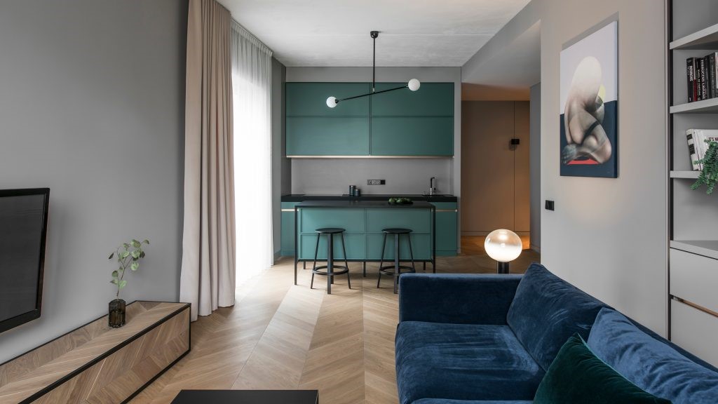
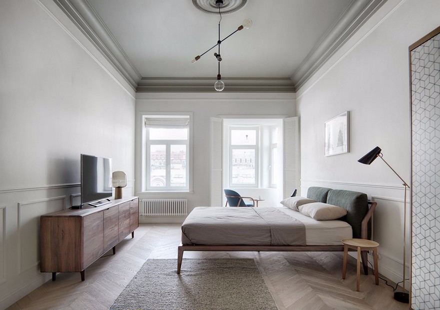
波兰设计公司Mateusz Kuo Stolarski,风格简约现代,或黑或白或灰,注重功能的实用性和细节的表达,少即是多,又十分的时尚!
Everything should be as simple as possible, but that doesnt mean its simple. Polish design company Mateusz Kuo Stolarski, simple and modern in style, black, white or gray, emphasizing functional practicality and detailed expression, less is more, yet very stylish!


整个客厅以黑色为主,搭配红色的家具,以简单的块面彰显优雅格调,注重点线面及细节处理,精致的软装设计,呈现一种感官上的时尚感。
The whole living room is given priority to with black, tie-in red furniture, show elegant style with simple block surface, note key point line surface and detail processing, delicate soft outfit design, present the fashionable feeling on a kind of sense.


简单而不空洞,空洞却有亮点,这是极简作品的代表,也是人们内心更安静的呼唤。极简主义强调功能至上,化繁为简,尽可能地摒弃多余而浮夸的修饰,让一切回归更纯粹的样子。
Simple but not empty, empty but bright, this is the representative of the minimalist work, but also peoples inner quieter call. Minimalism emphasizes the supremacy of function, simplifies the complex, as far as possible to abandon redundant and grandiose decoration, so that everything back to a more pure look.


 PintereAI


