新作 | FF STUDIO新办公室,上海 / 费弗空间设计 首
2020-07-01 15:15
简约、活泼、自然是这个空间想要给人的第一印象。极简设计、红色砖墙、园林造景与交错的空间······带来丰富的视觉体验和空间感受,当空间不仅仅是空间本身,它所表达的内容就有了更多被承载的意义。FF新办公空间是设计师为工作小伙伴们精心打造的一处“度假式”办公空间,意在通过办公空间的生活化,来弱化原有办公空间给人的刻板印象。为了避免大家找不到入口,我们把电梯口设置发光柱,白色电动移门打开后可以看见一个极简设计的logo和悬浮在水面上的白色盒体。

Simple, lively and natural is the first impression this space wishes to leave on others. Minimalist design, red brick walls, garden landscaping and interlaced space… bring a rich visual and spatial experience. When the space is not just the space itself, it carries more meaning in what it expresses. The FF new office space is a “resort-style” office space created by designers for office workers. It is intended to weaken the stereotype of the original office space through humanizing the space itself. In order to make it easier for everyone to find the entrance, light columns are set up at the elevator entrance. When the white electric sliding door opens, a minimalist-designed logo and a white box floated on the water will be seen.
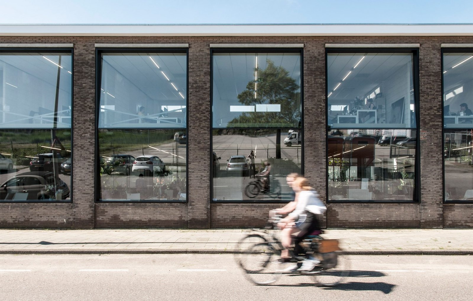
镂空的红砖墙不仅让中间的走道形成光影感,而且让空间变得更有层次,增强了空间流动性与光线穿透性的同时,也弱化了空间的独立性。这种“晾房”一般的红砖墙面处理,灵感来源于大城Sala Ayutthaya酒店。道道交错的红砖墙,营造出曲面的交错空间,轻松俘获了Fitch的心。虚实相间的红砖墙,打破了空间的枯燥乏味,再搭配极具趣味性的“水景汀步”,为整个室内增加闲适与轻松的氛围感。置于水面的盒体体态轻盈,日本艺术家野口勇的波点灯点亮整个盒体,宛若一个展示橱窗。黑木皮柜与定制办公桌简单实用,作为空间收纳被完美利用起来。纯手绘挂画让空白墙壁不再单调,多了一丝愉悦感。

The hollow-out red brick walls not only create a sense of light and shadow in the middle of the aisle, but also make the space more hierarchical, enhancing the fluidity and light penetration of the space, and weakening the independence of the space. This “air-drying-shelter-style” red brick wall design is inspired by the Sala Ayutthaya Hotel in Ayutthaya. The interlaced red brick walls create a curved space that easily captured Fitch’s heart. The hollow-out red brick walls connect the virtuality and reality and break the dullness of the space. Together with the very interesting waterscape and stepping stones on water surface, the interior has a sense of leisure and relaxation. The box placed on the water surface is light. The Akari light designed by Japanese artist Isamu Noguchi lights up the whole box and the box is like a display window.Black wood cabinets and custom-made desks are simple and practical, and are perfectly used as space storage. The hand-drawn painting makes the blank wall no longer monotonous, adding a touch of pleasure.

▼镂空的红砖墙让中间的走道形成光影感,hollow-out red brick walls create a sense of light and shadow in the middle of the aisle © FF DESIGN
▼水景汀步和置于水面的盒体,stepping stones and box on water surface © FF DESIGN
▼工作室入口,电梯口的光柱和白墙上的logo,entrance, light columns near the elevator and logo on white wall © FF DESIGN
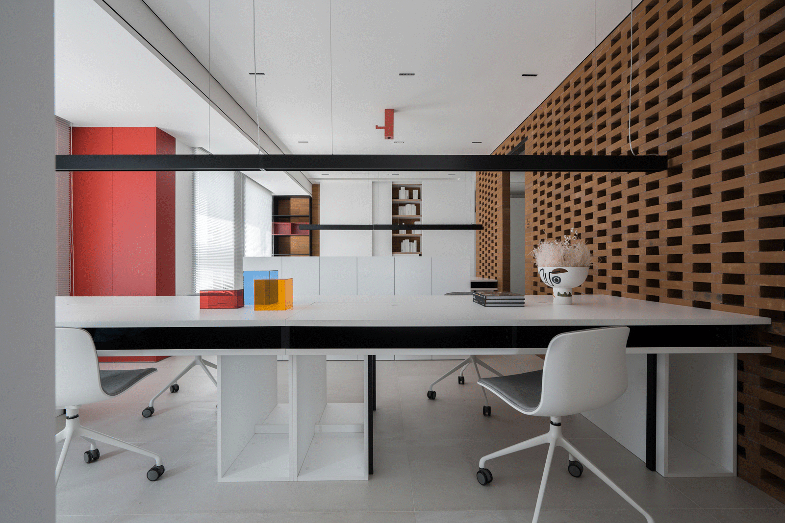
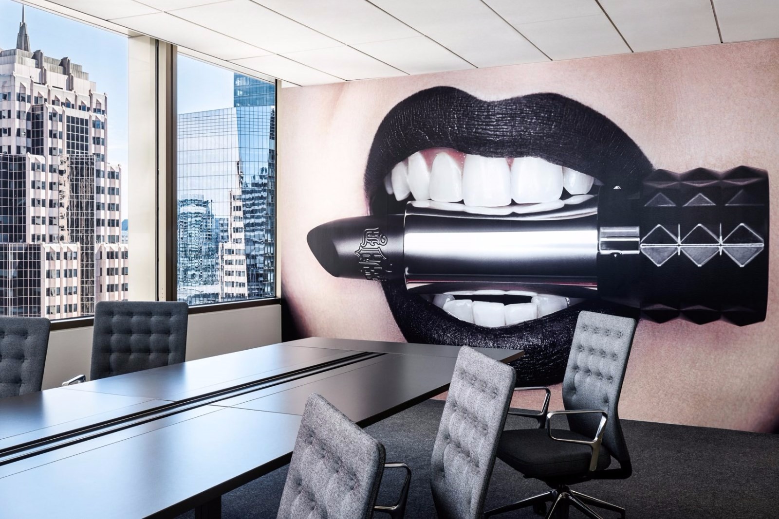
随处可见的KAWS玩偶用作空间装饰,与不同材质、不同颜色的室内陈设带来休闲玩趣的空间氛围,打破乏味工作环境的沉闷感。长长的白色会议桌被插入黑色盒体之内,红色移门可将会议室变成两间使用,灵活又方便。会议室在KAWS玩偶的注视下完美呈现,半开放式设计将空间一分为二,以门作为隔断使空间功能既相互联系又互不干扰。黑色质感钢丝置物架恰到好处的被放置在空间内部,架子上的小玩偶宛若办公空间的守卫,精致而巧妙地与空间融为一体。极简空间与园林造景的手法相结合,打破单一黑白两色的界定,使空间多了一份跳脱感,但又相互平衡。

KAWS dolls seen everywhere are used as space decoration, and indoor furnishings with different materials and different colors bring a casual and fun spatial atmosphere, breaking the boring working environment. The long white conference table is placed into the black box, and the red sliding door can turn the conference room into two rooms, which is flexible and convenient. The conference room is perfectly presented under the gaze of KAWS dolls. The semi-open design divides the space into two, and the door is used as a partition to make different spaces interconnect but not interfere with each other. The black steel wire rack is perfectly placed inside the space, and the small dolls on the shelf are like the guards of the office space, exquisitely and cleverly integrated into the space. The combination of minimalist space and garden landscaping breaks the boundary of black and white, which adds flexibility, but they are balanced with each other.

▼白色会议桌被插入黑色盒体之内,long white conference table is placed into the black box © FF DESIGN
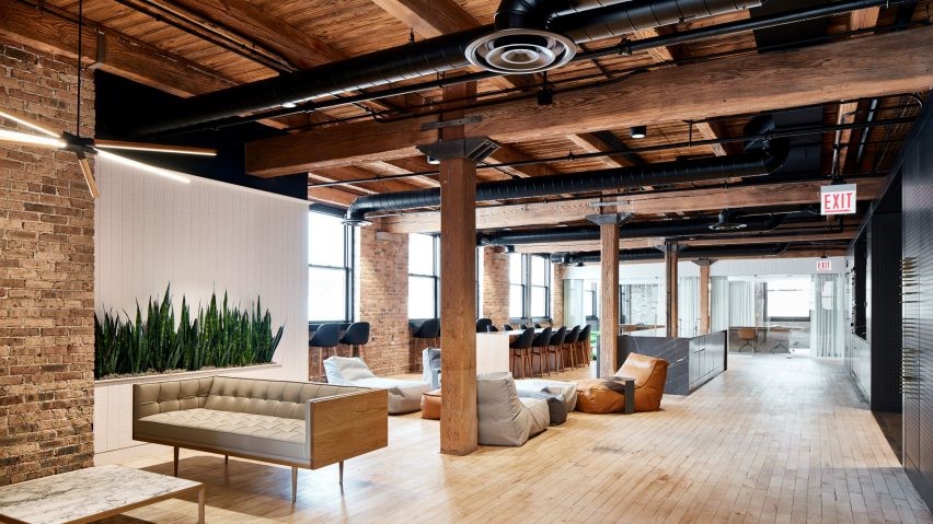
采光良好的办公区拥有完整而开阔的视野。与墙面融为一体的隐藏式白色柜体将空间完美利用,定制红砖、红色烤漆框体以及布满铁锈的金属板材相互叠加,弱化了单一材质带来的平面感。黑白色的室内陈设打造极致简约的空间气质,当自然光线投射进来时,显得整个室内整齐而干净。

The well-lit office area has a complete and wide view. The concealed white cabinet integrated with the wall makes perfect use of space. Customized red bricks, red paint frames and rusty metal plates are superimposed on each other, weakening the plane sense brought by one single material. The black and white interior furnishings create an extremely simple spatial experience. When natural light enters, the entire interior looks neat and clean.

▼采光良好的办公区,well-lit office area © FF DESIGN
▼KAWS玩偶用作空间装饰,带来休闲玩趣的空间氛围 ,KAWS dolls are used as space decoration, bringing a casual and fun spatial atmosphere © FF DESIGN
▼办公区拥有完整而开阔的视野,office area has a complete and wide view © FF DESIGN
办公室其实是一个回形动线,从选材区可以直接通向会议室。在狭长过道和留白墙体的衬托下更显空间秩序感,每一个不经意的转角,就是一方天地,丰富空间层次感的同时也加深了空间体验感。白色隔断之后,是玩偶和一盏简单的吊灯装饰的卫生间。
茶水间与办公区对望,空间顺着视线仿佛被串联又再分解成一个个独立的功能区。嵌入式推拉门将茶水间和办公区间分隔开来,一开一合之间,完美划分出空间功能,使得每个功能区都拥有自己独特的性格和特色。茶水间的一字铺红砖墙与外部砖墙设计呼应,纯天然材质能更好地与自然融合。

The pantry and the office area face each other, and the space seems to be connected along the line of sight and then decomposed into individual functional areas. The built-in sliding door separates the pantry and office area, and the function of two spaces is perfectly separated with the opening and closing of the door, so that each functional area has its own unique characteristics. The red brick wall in the tea room echoes the design of the external brick walls. Natural materials can have a better integration with nature.

▼空间串联又独立,space is connected then decomposed into individual functional areas © FF DESIGN
▼空间转角,inadvertent turn © FF DESIGN
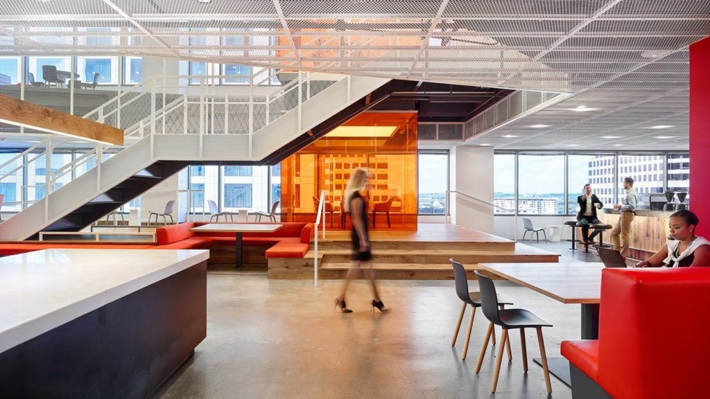
茶水间与室外休闲空间直接相连,完美迎合“度假式”办公的理念。餐厅与室外休闲空间相互串联,在视觉上形成室内与室外的延伸。室外布局则通过体块的分割和重组,形成高低不一的层次感,每一个区域都具有各自独立的功能。

The pantry is directly connected to the outdoor leisure space, perfectly catering to the concept of “resort-style” office. The restaurant is also directly connected to the outdoor leisure space, and the restaurant and outdoor terrace are connected to form a visual extension from indoor to outdoor. The outdoor design is based on dividing and reorganizing to form a layered sense of space, and each area has its own independent function.

▼茶水间与室外休闲空间直接相连,pantry is directly connected to the outdoor leisure space © FF DESIGN
项目名称:红墙之下
设计方:FF DESIGN
完工时间:2020年
项目地址:上海市宝山区水产路
建筑面积:120平方
摄影版权:FF DESIGN
合作方:F+oyes
采集分享
 举报
举报
别默默的看了,快登录帮我评论一下吧!:)
注册
登录
更多评论
相关文章
-

描边风设计中,最容易犯的8种问题分析
2018年走过了四分之一,LOGO设计趋势也清晰了LOGO设计
-

描边风设计中,最容易犯的8种问题分析
2018年走过了四分之一,LOGO设计趋势也清晰了LOGO设计
-

描边风设计中,最容易犯的8种问题分析
2018年走过了四分之一,LOGO设计趋势也清晰了LOGO设计


 PintereAI


