CACTUS 时尚概念店,西安 / 边界空间设计 首
2019-12-13 09:15
关于缘起
About the Origin

我有一座神秘的花园,虽然她并不属于我——
多年前的清晨,独自在一个荒废的苗圃写生。晨雾在朝霞的浸染下,泛着氤蕴的粉红,让人迷醉!那刻自觉这神秘的粉红花园仿佛是自己的 ……

位于西安市的服装品牌CACTUS概念零售店。委托方希望这间店铺有着粉色的空间和浪漫的气质。当我们在空空的场地游走踏勘,多年前那个清晨的花园竟反复出现在脑中,依稀有着氤蕰的粉色空间氛围与诗意,仿佛还带着那天的薄雾,有梦幻般的色彩,期待着我们的探寻……

I have a mysterious garden, although she does not belong to me:
It was early one morning many years ago, when I was alone sketching in an abandoned nursery. Immersed by the rosy dawn, the morning mist was suffused with dense charming pink! At that point, I felt like the owner of this mysterious garden in pink…

CACTUS, a clothing brand, has a concept retail store in Xi’an. The client expects it to be pink and romantic. The garden of that early morning years ago recurred in my mind as we wandered and explored the empty site. Vaguely, the pink atmosphere and poetic filled in the air, which brought me back to that day’s mist and fantastic colors, as if waiting for our exploration…

▼门店一览,overall view of the store ©Shen-Photo
关于场地
About the Site

店面的场地在一个街角,北向,周边店铺杂乱,门前台阶陈旧。有着40平方的首层和200多方的二层。首层开间面宽有限,承担着由外到内,由下到上的客人引导和交通,二层东北方有着很大的沿街L型开窗和开阔的空间,只是铝合金的方格幕墙上装着绿色的玻璃,外面很难看进来,空间之中突兀的竖着几根大的方柱,把空间无情的切割。西南角有两个高窗,仰望能看到杂乱的住宅区的窗户。

▼店铺立面,store front ©Shen-Photo
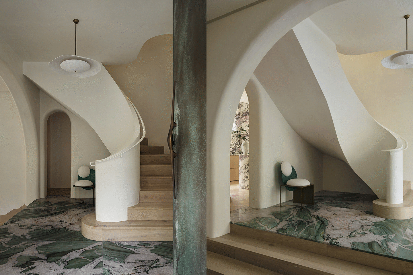
白色的旋转楼梯作为两层空间的“连通器”,在粉色的空间中盘旋而上。下方的圆形水槽倒映出楼梯和天花的轮廓,像通往花园台阶旁池塘的隐喻。高挑的空间接近九米,天花由几个异形同心圆错落嵌套,呈现出天空流云般的自由气韵,空间梦幻而迷人。

A white spiral staircase serves the “Communicating device” between the two floors and spirals up in the pink space. The outline of the stairs and ceiling is reflected in the circular sink below, like a metaphor leading to a pond by the garden steps. In a space nearly nine meters high, several irregular concentric circles are inlaid on the ceiling to form a scene of drifting clouds in the sky, demonstrating the appeal of freedom and bringing the space a fancy and charming sense.

▼白色旋转楼梯,white spiral staircase ©Shen-Photo
关于空间、光、服装和自己
About the Space, Light, Clothes and Oneself

大面积的粉色会给空间带来甜腻的味道,我们警惕这种甜腻。试图让空间自然、质朴,同时又能传达出CACTUS所倡导的坚韧与时尚的独有气质。

A large area of pink will bring an excessive sweet taste to the space, and we are vigilant against this sweet and greasy. Instead, we tried to convey the tenacity and fashion qualities advocated by CACTUS while maintaining the natural and pristine nature of the space.
直至二楼整个空间的光线都是微妙的,本是北向的开窗会有对面两栋大楼的幕墙次序反射的阳光进来,间断照射近三个小时。街上的车流熙攘,车窗反射的流光斜洒在店内的墙上,像意识流的电影,其中还叠加着店窗玻璃上的字体透印,浮光掠影,仿佛看见光阴的流动。单看着粉色的光影变换,可以看很久……

All the way to the second floor, there is a delicate light throughout the space. In spite that the windows are north facing, there will be sunlight reflected from the curtain walls of two opposite buildings in turn, which will last for nearly three hours intermittently. As the street bustles with traffic, the sunlight is reflected by the car windows before scattering on the wall of the store, like films of stream of consciousness. With the typeface on the store windows being weaved in it as well, the light is flickering and giving a glimpse of the scene, as if to see flow of time.Just looking at the transformation of pink shadow, you can see it for a long time …

▼楼梯通向二层,staircase connected to the second floor ©Shen-Photo
我们开始寻找本身带有粉色基因的主要材料,建造用的闽南旧陶砖进入我们的选项,质朴、粉红、它山之石。去除外幕墙的横档,更换透明玻璃,让视线内外通透,充分利用自然光线和内、外向的视野。租下隔壁橱窗,拓展店铺正面宽度。整合侧向坡道,首层内外空间转换得到有效梳理。旧窗上拆下的绿玻做成了一层的吧台,作为空间色系的补色。艺术品是空间的灵魂,希望空间里有大幅的关于女性的画,柔美、感性、有着粉色的调子。莫迪里阿尼的珍妮肖像在设计之初已选定,最适合不过。

In the search for materials with pink elements, we were intrigued by the old ceramic bricks for construction in Southern Fujian. In addition to its simple style and pink appearance, there was also the implication of “stones from other hills“. The transom of the exterior wall was removed and replaced with transparent glass, which not only brought more transparent views but also made full use of natural light and views inside and outside. The window next door was rented to widen the front of the store. Through the integration of lateral ramps, the conversion of interior and exterior spaces on the ground floor was effectively organized. The green glass removed from the old windows was made into a counter on the ground floor to complement the color scheme of the space. In view of the spiritual status of art in space, large paintings of women were selected and hung in the store, which were soft, emotional and in pink tones. As a work that was selected at the beginning of the design, Modigliani’s Portrait of Jennie perfectly integrated with the whole space.

▼空间以粉色为主色调,reception on the first floor, the space is in pink tone ©Shen-Photo
二楼用一个错裂的圆分配功能空间的同时整合出花园的意向,形成园内与园外的两种空间关系。园由钢构架空抬起,由红色的旧砖满铺,顶部大同而小异的错位粉色留空区呼应。中心由一条类T台的通道再次将花园解构划分,其连接园内外多个标高不同功能区域。使各个区域之间形成不同的层,通过层的转换完成了功能区之间的转换,同时又由起伏制造出类似中国园林的“山地感”。可此园又非彼园。

With a splintered circle, the space on the second floor was divided in to different functional areas, which presents the layout of a garden and forms two spatial relationships inside and outside. The garden is raised overhead by steel structure and paved with red old bricks. At the top of it, largely identical pink blocks with minor differences are misaligned to correspond to the theme. By a T-shaped passage extending from the center, the garden is deconstructed and divided again, while areas of different heights and functions inside and outside are connected. In this way, different layers are formed among different areas, and the transformation of layers is accompanied by that of the functional areas. In addition, the undulating surface creates a “sense of hilly area” similar to Chinese gardens, whereas obviously there are differences between the two.

▼二层空间一览,中部用圆形结构分割内外,overall view of the second floor with a circle defining different functions ©Shen-Photo
园后有一洞,似斜切般开墙破壁,洗手间与库房暗隐其内,却露着皮肉般的粉嫩脆弱山体。场地西北角距窗最远,实为背处。却有着南向住宅楼夹缝中的两个高窗,是场地唯一阳光直射的地方,在中午前后的一个小时。可我们却进行了遮蔽,做了“潜望镜”装置。遮挡望向窗外杂乱的视野、滤掉直射进来与室内反差太大的强光。两个压缩的视口让人禁不住想要望出去,望向内部装着滤光用的红色阳光板窗口,以及上面诗句和粉色光芒……

In the back of the garden lies a hole,which breaks through the wall in a diagonal cut. The washroom and storeroom are hidden in it, leaving the broken fragile walls exposed. Despite the northwest corner is farthest from the windows and is backlit, thanks to two high windows in the cracks between the south-facing residential buildings, it is the only place with direct sunlight for an hour around noon. Nevertheless, we shield it and equip with a “periscope” device. Apart from screening out the clutter outside the window, it filters out the bright light that comes straight in and forms a sharp contrast to the light inside. The two compressed viewports invite people to look out, into the windows with red sunboard filters inside, and into the verses and pink light on them…

▼斜切的入口隐藏卫生间和库房,behind the chamfered entrance contains the toilet and storeroom ©Shen-Photo
▼阳光带来不同的空间氛围,space atmosphere brought by sunlight ©Shen-Photo
关于探索
About Exploration

生命就是一场寻找和表达自己的过程——

我们都在用自己的生存方式表达自己,这是关乎情感,关乎温度。建筑和服装其实是人的另一层皮肤或庇护所,它可以保护、表达我们。它需要符合我们审美,适合我们的身形和气质,它需要被触摸,需要去体验。希望这个空间会让我们更好的感受服装,寻找自己,表达自己……

Life is a journey to find and express oneself:

Through the way we live, we are all expressing ourselves, which is about emotion and temperature. As another layer of skin or shelter of human beings, architecture and clothing provide us with protection and outlet of expression. They are expected to be aesthetically pleasing and appropriate to our body shape and temperament. Both of them need to be touched and experienced. It is hoped that the space will enhance our sense of clothing, thus finding and expressing ourselves…

▼细部,details ©Shen-Photo
项目名称:CACTUS 时尚店
项目地点:中国西安
竣工时间:2019
项目类型:店铺
项目面积:260 ㎡
设计单位:边界空间设计
主创及设计团队:黄三秀、施甫、高巍东、宋帅奇
委 托 方:仙人掌服饰
项目摄影:申强
撰    文:黄三秀
主要材料:混凝土、陶砖、钢材
邮箱:bsd_tom@aliyun.com
采集分享
 举报
举报
别默默的看了,快登录帮我评论一下吧!:)
注册
登录
更多评论
相关文章
-

描边风设计中,最容易犯的8种问题分析
2018年走过了四分之一,LOGO设计趋势也清晰了LOGO设计
-

描边风设计中,最容易犯的8种问题分析
2018年走过了四分之一,LOGO设计趋势也清晰了LOGO设计
-

描边风设计中,最容易犯的8种问题分析
2018年走过了四分之一,LOGO设计趋势也清晰了LOGO设计


 PintereAI


