KI Vincent Van Duysen
2019-10-09 14:40
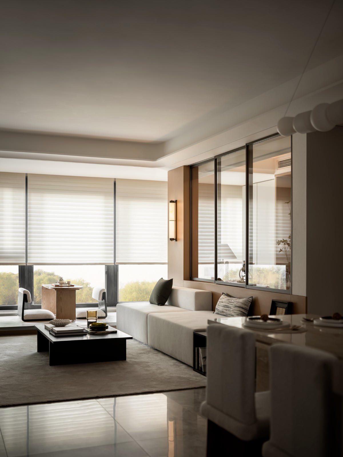
In the context of the urban centre of Ghent, a contemporary rooftop extension was added to an existing historic building. While the main volume facing onto the Korenlei was retained and thoroughly renovated, due to precious ornaments on the façade and interior, the rear façade and the roof were completely rebuilt. The main architectural elements – the gable roof and the chimney volumes – were finished in natural stone slabs in a neutral colour on the façade, so that the roof volume is also less explicitly present on the Graslei side. Contemporary workmanship subtly suggests the function of the new roof volume. The sloping roof, in natural stone, was conceived as a shell with open joints under which the effective waterproofing is located.
在根特市中心的背景下,在一座现有的历史建筑中增加了一个当代屋顶延伸部分。由于正面和内部的珍贵装饰品,科伦莱河上的主要空间得以保留和彻底翻新,但后立面和屋顶已完全重建。主要的建筑元素-山墙屋顶和烟囱体积-是用天然石板做成的,在外墙上是中性的,因此屋顶的体积在格拉斯莱面也不那么明显。现代工艺巧妙地暗示了新屋顶卷的作用。倾斜屋顶,在天然石料,被认为是一个壳与开放的节理,有效的防水定位。
The more enclosed roof space has a large asymmetrical dormer on the fourth floor, which was pushed halfway into the roof volume, creating a small terrace at the front with an astonishing panorama over the famous medieval towers of Ghent behind. On the third floor, behind the attic, the roof was cut across its entire width to provide sufficient light and air – however, this incision is not visible at street level because it is hidden by the roof’s cornice. At the rear, the new brick façade was given a classical treatment without ornament, and above this a contemporary extension indicates the roof levels at the third and fourth floor. The external details of the contemporary parts were conceived in steel, while the front and rear façades of the main volume with the smaller, more classical window panelling were given more traditional wood joinery. The contemporary design indicates the expansion and the renewed use of the project, but it also expresses respect for the original material, bluestone, which was used both for waterproofing and ornamentation. The end result is a harmonious whole in which the material use and details reference a contemporary architectural language as well as the historical context.
更封闭的屋顶空间在四楼有一个大的不对称的背脊,它被推到屋顶的体积中间,在前面形成了一个小的露台,在著名的中世纪塔楼上留下了惊人的全景。在三楼,在阁楼后面,屋顶在整个宽度上被切开,以提供足够的光线和空气。然而,这种切口在街道上是不可见的,因为它隐藏在屋顶的檐口。在后面,新的砖法石被赋予了一种未经装饰的经典处理,而在这一现代的扩展中,指出了第三层和第四层的屋顶水平。当代零件的外部细节是在钢铁中孕育的,而主卷的正面和背面则采用较小的、更经典的窗板,更传统的木材细木工。当代设计表明了该项目的扩展和重新使用,但它也表示对原始材料、硫酸铜(用于防水和装饰)的尊重。最终结果是一个和谐的整体,其中材料的使用和细节引用了当代建筑语言以及历史语境。
Photography: Koen Van Damme
摄影:KenvanDambi
 举报
举报
别默默的看了,快登录帮我评论一下吧!:)
注册
登录
更多评论
相关文章
-

描边风设计中,最容易犯的8种问题分析
2018年走过了四分之一,LOGO设计趋势也清晰了LOGO设计
-

描边风设计中,最容易犯的8种问题分析
2018年走过了四分之一,LOGO设计趋势也清晰了LOGO设计
-

描边风设计中,最容易犯的8种问题分析
2018年走过了四分之一,LOGO设计趋势也清晰了LOGO设计


