Natan Vincent Van Duysen
2019-10-09 14:37
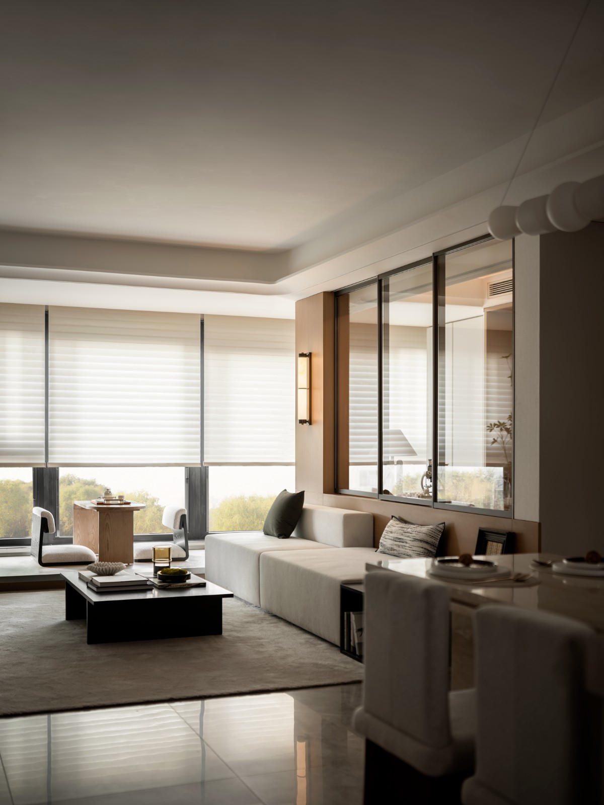
All the works designed for Natan are marked by an unmistakable style. The design is based on the pure essential lines of the space and the furnishings in which light is a fundamental factor for the perception of the geometry. The boutique in Brussels, on two levels, plays with the vertical delineation of the architectural volume, creating visual openings that allow the gaze to run freely over all the contours of the interiors.
所有为natan设计的作品都有明确的风格。该设计基于空间的纯基本线和其中光是对几何形状的感知的基本因子的家具。在布鲁塞尔的精品店,在两个层面上,在建筑体积的垂直划分方面发挥着作用,创造了视觉开口,让目光能够在内部的所有轮廓上自由运行。
Natural sunlight from the large windows on the upper level enters and saturates the stark white walls and dividing partitions: the staircase is enhanced and transformed from a mere functional element into a forceful architectonic ‘sign’ in contrast with the rarefied emptiness of the spaces.
来自上层大窗户的自然阳光进入并浸透了严酷的白色墙壁和分割的隔墙:与空间的稀薄空旷形成鲜明对比的是,楼梯从单纯的功能元素变成了一个强有力的建筑“标志”。
The furnishings are also reduced to the essential - display blocks that perfectly integrate with the neutrality of the space and the garments themselves, hung from minimal hooks, like artworks in a gallery.
家具也被减少到与空间和服装本身的中立性完美结合的必要显示块,悬挂在最小的挂钩上,如画廊中的艺术品。Photography: Alberto Piovano
摄影:阿尔贝托·皮奥瓦诺
 举报
举报
别默默的看了,快登录帮我评论一下吧!:)
注册
登录
更多评论
相关文章
-

描边风设计中,最容易犯的8种问题分析
2018年走过了四分之一,LOGO设计趋势也清晰了LOGO设计
-

描边风设计中,最容易犯的8种问题分析
2018年走过了四分之一,LOGO设计趋势也清晰了LOGO设计
-

描边风设计中,最容易犯的8种问题分析
2018年走过了四分之一,LOGO设计趋势也清晰了LOGO设计


