case meallin Mim Design
2019-10-08 15:46


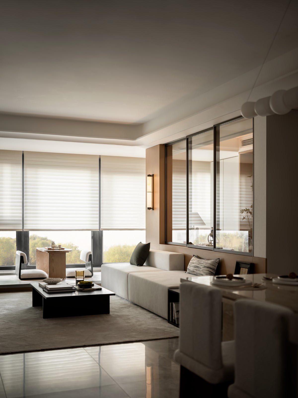
Melbourne Case Meallin The opportunity to integrate property consultancy group Case Meallin’s newly formulated brand, allowed Melbourne studio Mim Design to draw inspiration from shades of navy, indigo, ultramarine and teal. Throughout the office, thoughtful planning and clean architectural lines ensure spaces are connected, light-filled and well proportioned. The focal point of the office is a striking honed Vermont white granite reception desk backed by a concertina wall that acts as a textural contrast to the adjacent American Oak solid timber slats, which are repeated throughout the space. A Moroso Diesel Longwave Armchair takes pride of place in front of the desk, creating a sense of calm that juxtaposes the hustle and bustle of the world outside. Photograhy: Peter Clarke Close
墨尔本凯斯·梅林整合房地产咨询集团凯斯·米林新打造的品牌的机会,让墨尔本工作室米姆设计公司从深蓝色、靛蓝色、蓝藻色和泰尔色中汲取灵感。在整个办公室里,周密的规划和干净的建筑线路确保了空间的连通、轻盈和均衡。办公室的焦点是一个引人注目的磨练的佛蒙特州白色花岗岩接待处,后面是一堵协奏曲墙,与相邻的美国橡木实木板形成了质的对比,在整个空间中都会重复。一张莫洛索柴油车长波扶手椅在办公桌前占据了一席之地,创造了一种平静的感觉,将外面的喧嚣与喧嚣并列在一起。摄影:Peter Clarke Close


