academia-altimira-2 masquespacio
2019-09-26 15:32
Photography by Cualiti
库拉蒂摄影
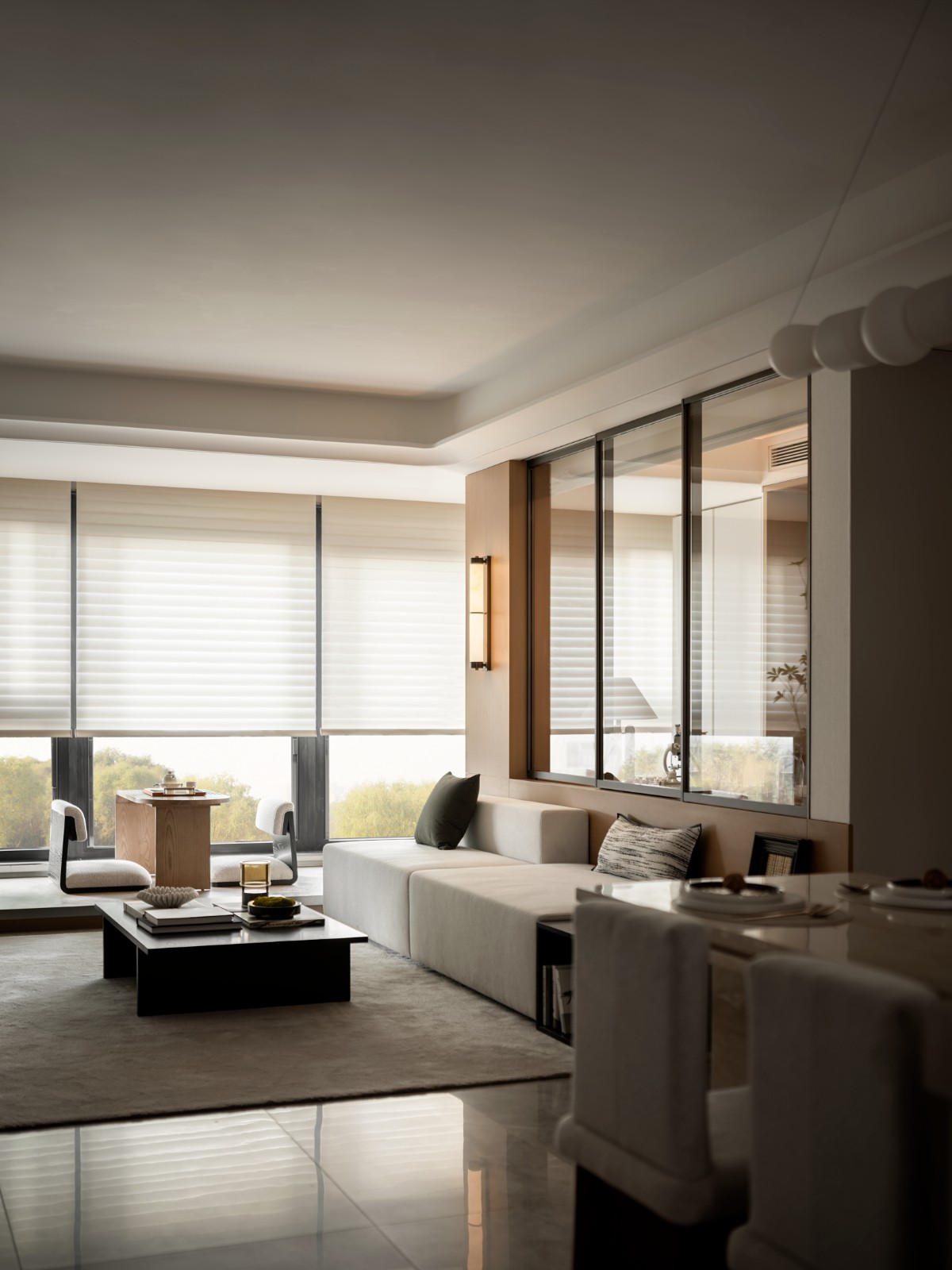
To celebrate the 15 years of existence of Acadèmia Altimira, Laura and Mónica, sisters and owners of the academy, contacted Masquespacio with the idea to redesign their brand and space. The project that was commissioned during the summer of 2014 started with the redesign of Acadèmia Altimira’s brand clearly focused on their different targets: kids, teenagers and young adults. The redesign of the brand and interior is inspired by “Constructing” oneself as a person and through learning, defined here by the specialization in recitation classes and preparation for college and university exams of the academy. Taking in mind the different age groups from the students in first case Masquespacio looked to create an image that could attract little kids, adolescents and young twentysomethings through a young design with actual colors and materials. The design of the interior starts with the construction of three-quarter height plywood walls with the aim to make the most from the little natural light that enters into the academy, besides offering acoustic solutions for the classrooms. The sliding doors made of wood strips meanwhile allow closing the classrooms at any time, without losing the entering light from the corridor. A ‘Face to Face’ zone is added to the project to offer one to one classes for the students, besides a study area, that maintains the aesthetic lines of the academy defined from the entrance to the final classroom.
为了庆祝AcadèMia Altimira、Laura和Mónica-学院的姐妹和所有者-成立15周年,他们与Masokpacio联系,提出重新设计她们的品牌和空间的想法。这个项目是在2014年夏天委托开发的,从AcadèMia Altimira品牌的重新设计开始,该品牌显然侧重于不同的目标:儿童、青少年和年轻人。品牌和内部的重新设计是由“建构”自己作为一个人和通过学习,在这里由专业的背诵课和准备学院的大学和大学考试。考虑到不同年龄组的学生在第一次案例中,马斯克帕西奥希望创造一种形象,可以吸引小孩子,青少年和20多岁的年轻人,通过一个年轻的设计与实际的颜色和材料。室内设计首先是建造四分之三高的胶合板墙,目的是最大限度地利用进入学院的小自然光,同时为教室提供声学解决方案。同时,用木条制成的滑动门允许随时关闭教室,而不会失去走廊的进入光线。该项目增加了一个“面对面”的区域,为学生提供一对一的课程,除了一个学习区域,保持学院从入口处到最终教室的审美线条。
 举报
举报
别默默的看了,快登录帮我评论一下吧!:)
注册
登录
更多评论
相关文章
-

描边风设计中,最容易犯的8种问题分析
2018年走过了四分之一,LOGO设计趋势也清晰了LOGO设计
-

描边风设计中,最容易犯的8种问题分析
2018年走过了四分之一,LOGO设计趋势也清晰了LOGO设计
-

描边风设计中,最容易犯的8种问题分析
2018年走过了四分之一,LOGO设计趋势也清晰了LOGO设计


