DENTAL PRACTICE - MINAS KOSMIDIS
2019-09-19 16:29
In the first floor of a 1950’s block of flats with a dominant modernist exterior, Minas Kosmidis [Architecture in Concept] studio, was asked to create a dental practice. The main intention was to create a flexible space, that will address the dental practice requirements, sited in such a way, creating a sense of flow in the interior while giving attention to the functionality and mixture of the classical aesthetic of the past spaces and the equipment technology, where the minimal approach, with linear and clear lines, underpins the meaning of order, organization and hygiene.
在1950年的第1层,他被要求创建一个牙医诊所,它的主要现代主义外观是米纳斯科思[建筑在概念]工作室。主要目的是创造一个灵活的空间,以这样一种方式处理牙齿实践要求,在内部创造一种流动的感觉,同时注意过去空间和设备技术的古典美学的功能和混合物,在这种情况下,具有线性和清晰线条的最小方法是秩序、组织和卫生的含义。
The plan of the space that designed and agreed with the client, includes four individual medical spaces, in a notional continuity and flow among them, so as to offer the greatest functionality for the three dentists and their staff. In addition, a spacious main reception is formed, along with auxiliary spaces for the clients and users, and a rest – kitchen room for the doctors and the staff.
设计并与客户商定的空间计划包括四个单独的医疗空间,在概念上是连续性和流动的,以便为三名牙医及其工作人员提供最大的功能。此外,还形成了一个宽敞的主接待处,为客户和用户提供辅助空间,并为医生和工作人员提供一个休息室。
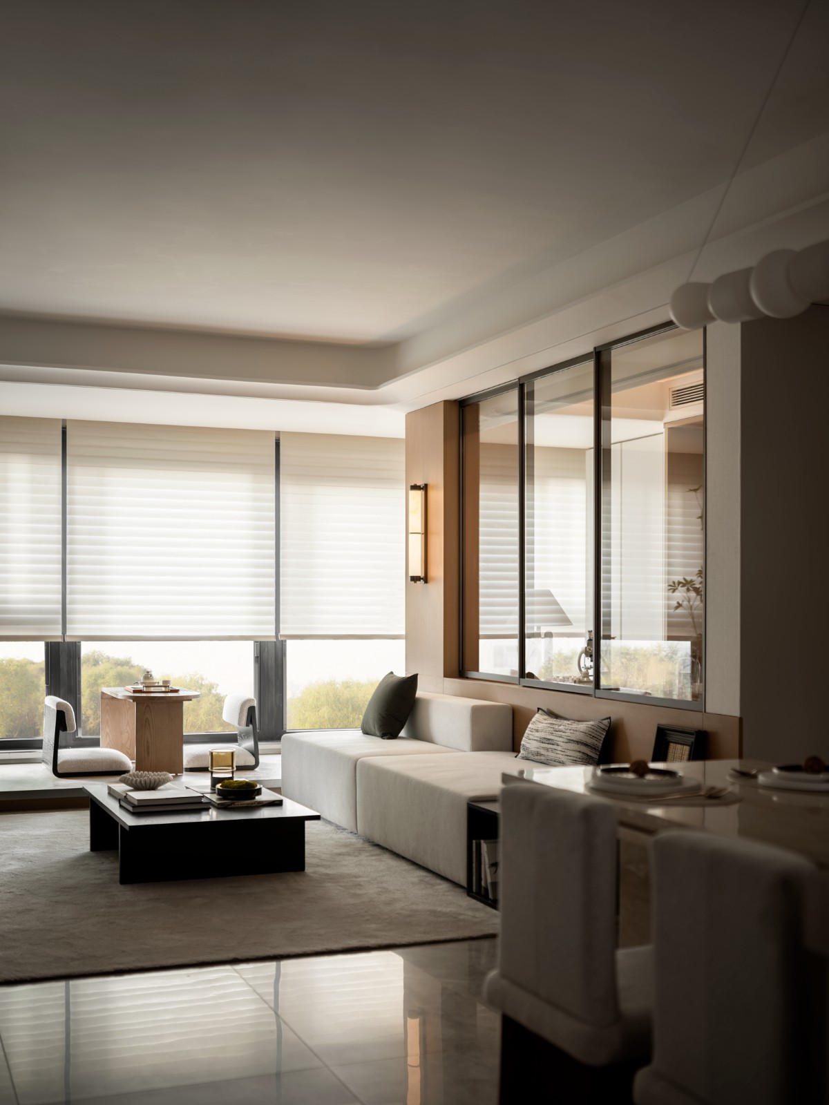
For this reason, most of the partitions were removed, allowing new spaces to emerge. Large parts in the interior were replaced with translucent walls, made of wood and glass, so as to capture the natural light in the reception space which is placed in the middle of the plan, with no direct relationship with the practice exterior openings.
因此,大部分分区都被删除,从而允许新的空间出现。内部的大部分由由木材和玻璃制成的半透明壁代替,以便捕捉放置在平面中间的接收空间中的自然光,与实践外部开口没有直接关系。
In a basis where everything has a meaning, retro tiles and timber were selected for the reception room while in the rest of the spaces, the same timber was used so as to give the sense of continuity. The furniture were designed in terms of the functionality, the abstraction and the clarity that they should evoke. Small details of the past and the use of works of art (client’s favorite) balance the sterile and cold look of the equipment, offering a sense of coziness and intimacy to the space.
在一切都有意义的基础上,为接待室选择了复古瓷砖和木材,而在其余的空间中,使用了相同的木材,以赋予连续性的感觉。家具设计的功能,抽象和清晰,他们应该唤起。过去的小细节和艺术作品的使用(客户的最爱)平衡了设备的无菌和寒冷的外观,提供了一种舒适和亲密的空间感。
The main colours of the walls and ceilings are beige and grey, which in combination with the white plaster decoration on the ceiling, reflect an accessible “luxury” and the nobility of the past. The atmosphere of the space is harmoniously completed with the selection of blue and white colour shades (client’s favorite colours), not only on the furniture but also on the dentists’ chairs.
墙壁和天花板的主要颜色是米色和灰色,这与天花板上的白色灰泥装饰相结合,反映了一种可接近的“奢华”和过去的高贵。该空间的气氛是和谐地完成与选择蓝色和白色阴影(客户最喜欢的颜色),不仅在家具上,也在牙医的椅子上。
Particular attention was given to the lighting plan. Retro wall lights and pendants are placed in the desks and kitchen table, in combination with the professional lighting, as well as spotlights to emphasize the works of art, creating a cozy environment.
对照明计划给予了特别的注意。复古墙灯和吊坠放置在桌子和厨房桌子上,与专业照明和聚光灯相结合,以强调艺术的工作,营造一个舒适的环境。
 举报
举报
别默默的看了,快登录帮我评论一下吧!:)
注册
登录
更多评论
相关文章
-

描边风设计中,最容易犯的8种问题分析
2018年走过了四分之一,LOGO设计趋势也清晰了LOGO设计
-

描边风设计中,最容易犯的8种问题分析
2018年走过了四分之一,LOGO设计趋势也清晰了LOGO设计
-

描边风设计中,最容易犯的8种问题分析
2018年走过了四分之一,LOGO设计趋势也清晰了LOGO设计


 PintereAI


