新作 | Sharecuse共享办公室,纽约 / Architecture Office 首
2019-09-19 10:15
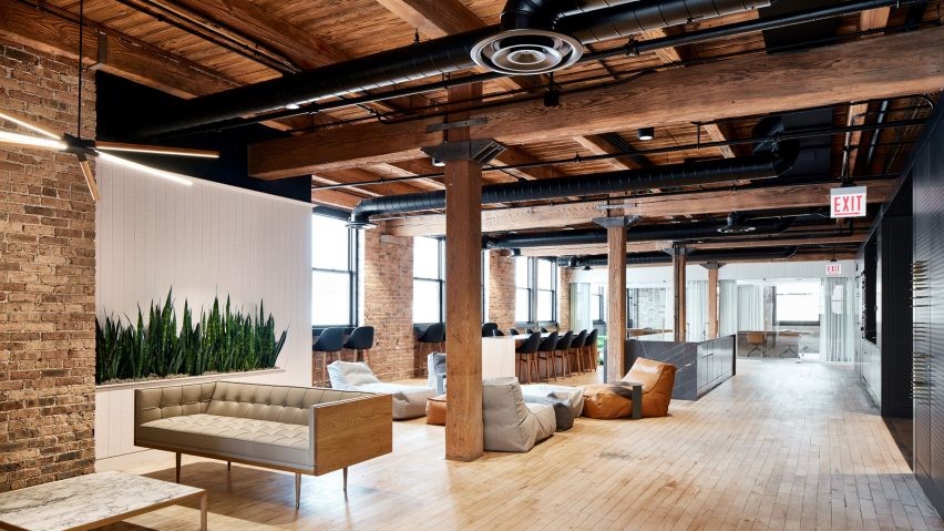
Architecture Office是一家位于德克萨斯州奥斯汀郊区的建筑设计公司,近日为Sharecuse共享办公室打造了其全新的旗舰店空间。空间地处市中心历史悠久的1928年建设的雪城大厦内,其设计汲取了大厦90年来作为办公空间的丰厚历史,同时加上设计团队对一系列工作空间进行的类型研究,ShareCuse的整体设计探索、扩展和复兴了办公隔间的概念。

▼项目概览,overview©Caylon Hackwith
Architecture Office, an architecture firm based outside of Austin, Texas, has designed the flagship work environment for ShareCuse, a new coworking space located within the historic 1928 Syracuse Building in the city’s downtown district. Drawing from the edifice’s rich 90-year history as an office building, and the firm’s own research into a range of workspace typologies, the design for ShareCuse explores, expands, and reinvigorates the notion of a cubicle.

▼ShareCuse的设计探索、扩展和复兴了办公隔间的概念,the design for ShareCuse explores, expands, and reinvigorates the notion of a cubicle©Caylon Hackwith
Sharecuse在现有钢骨混凝土结构建筑的二层,占地3200平方英尺,包含25个办公工位。Architecture Office将空间设计成一系列独立的黑色小隔间和中央厨房两部分,从而划定了整个开放式办公区域中的一系列休息空间,另外还有七间个人办公室、一间会议室以及一间电话室。

▼室内透视,perspective view
ShareCuse accommodates 25 members, and is set within a 3,200-square-foot room on the second floor of an existing concrete and steel building. Architecture Office’s design for the space is defined by an arrangement of freestanding black cubicles and a kitchen island within the interior of the space, that define a series of interstitial lounge spaces throughout the open office. Ringing the open workspace are seven private offices, a conference room and a telephone booth.

▼空间分为独立黑色小隔间和中央厨房两部分, the space is defined by an arrangement of freestanding black cubicles and a kitchen island within the interior of the space©Caylon Hackwith
▼独立的黑色小隔间,freestanding black cubicles©Caylon Hackwith
与传统的封闭式隔间不同,ShareCuse的隔间使用不透明的半围合材料与其相邻的工作空间分隔开来,黑色网格屏风可以遮住背后的空间。办公隔间远远看起来整体上像是一块黑色方体,当人们接近屏风时,屏风逐渐显现出其半透明的稀松布网特征,露出里面的办公空间和工作人员。

▼办公隔间远远看起来整体上像是一块黑色方体,from a distance the office cubicles appear monolithic as single black forms©Caylon Hackwith
▼黑色网格屏风可以遮住背后的空间,cubicles are crafted from black mesh screens that filter the appearance of the spaces behind©Caylon Hackwith
Unlike the traditional enclosed cubicle, separated by opaque half-walls from its neighboring workspace, the ShareCuse cubicles are crafted from black mesh screens that filter the appearance of the spaces behind. From a distance the office cubicles appear monolithic as single black forms. As one approaches the screens, the surfaces shift character into layers of translucent scrim that exhibit the offices and personnel within.

▼当人们接近屏风时,其半透明的稀松布网特征,展现出里面的办公空间和工作人员,the surfaces shift character into layers of translucent scrim that exhibit the offices and personnel within©Caylon Hackwith
“我们的目标是在满足办公功能的同时设计一个灵活的办公空间,”Architecture Office联合创始人Nicole McIntosh说道,“通过将隔间结构分组成象限,我们能够想象工作人员在它周围展开的一系列活动。”开放式工作空间的几何布局有助于定义其特殊的“休息”区域,同时促进互动和保证私密性。Architecture Office联合创始人Jonathan Louie说:“隔间作为一系列最小单元占据、框定和定义着更大的空间。隔间充当了室内工作空间的结构,长岛厨房则作为聚会和互动之所。

▼长岛厨房则作为聚会和互动之所,the long island acts as a conduit for congregation and interaction©Caylon Hackwith
“Our aim was to design a flexible office organization that does not kill the work environment”, says Architecture Office co-principal Nicole McIntosh. “By grouping the cubicle structures into quadrants, we imagine workers moving around the objects and interacting within the shared office landscape.” The arrangement of geometrically strict structures in the open workspace also serve to define unique “lounge” spaces that promote simultaneously interactive and private work environments. “[Cubicles] act as a series of minimal objects that occupy, frame, and define regions by inhabiting a larger room”, says Architecture Office co-principal Jonathan Louie. Whereas the cubicles act as a structure for working within, the long island acts as a conduit for congregation and interaction.

▼从厨房看个人办公室,view from kitchen to private spaces©Caylon Hackwith
隔间内有一系列3’x 7’的开口,人们可以在空间内进行短暂的停留共享工作空间。一些开口是隔间的门界,另一些则促成工作人员之间的信息传递或团队协同办公。所有隔间与开口尺寸既相互统合,又位置不一,从而创造出了不同的空间变化与空间的交互作用。模块化的隔间可以同时打开或关闭,显得既高效又俏皮。

▼隔间示意,cubicles illustration
Built into the cubicles are a series of 3’ wide x 7’ high openings that allow for moments of engagement between spaces and invite people to share across workspaces. Some openings are thresholds for entry, while others act as opportunities for members working in teams to pass information or share desks. Although the cubicles and their openings are all of uniform size, the placement of the openings are different, generating variety and different interaction with their surrounding spaces. The modular cubicle can appear simultaneously open and closed, efficient and playful.

▼模块化的隔间可以同时打开或关闭,the modular cubicle can appear simultaneously open and closed©Caylon Hackwith
设计灵感来自包括雅克·塔蒂的电影、罗伯特·欧文的作品在内的图像参考集锦,Louie和McIntosh指出有趣的变化和平纹棉麻网格旨在促进视觉联系。“我们的兴趣是了解如何在不细分隔间的情况下破除传统重复的隔间模式,鼓励个体和空间的联系与连接。传统隔间和其半围合材料营造出一个半私密的工作空间,但在视觉上却阻断了人和办公室的其他连接。我们发现这款平纹棉麻织物拥有十分有趣的视觉特性,用它作为围合材料,从不同的角度会呈现不同的视觉效果。”

Inspired by their collection of image references including the films of Jacque Tati, as well of the work of Robert Irwin, Louie and McIntosh note that the playful variations and scrim are meant to encourage a sense of visual connection. “We were interested in understanding how we could interrupt the traditional repetition of the cubicles without subdividing them, as well as encourage connection and the relationship between singular and shared office spaces. The traditional cubicle and its half-wall fosters a semi-private working space, yet visually disconnects you from the rest of the office. We found the visual properties of the scrim interesting as a semi-private wall that appears differently from different viewpoints.”

▼平纹棉麻网格旨在促进视觉联系,scrim meant to encourage a sense of visual connection©Caylon Hackwith
室内色调促进了视觉上的联系,同时调节了流动区域和休息区域二者之间的平衡。黑色隔间、长岛和桌子形成鲜明对比,一切都包裹在裸露的混凝土天花板、白墙以及现有建筑磨白的地板之内。浅粉、灰蓝的天鹅绒椅子搭配黄铜支撑,巧妙地标识了不同区域的空间功能,而深灰色圆点地毯则暗示了休息区域。

▼室内色调促进了视觉上的联系,同时调节了流动区域和休息区域之间的微妙平衡,the color palette further facilitates visual connection and the modulation of flow and lounge spaces©Caylon Hackwith
▼白墙以及灰色天鹅绒座椅,white wall & grey velvet chairs with brass legs©Caylon Hackwith
The color palette further facilitates visual connection and the modulation of flow and lounge spaces. Black cubicles, a long island, and tables sit as contrasting, minimal objects within the exposed concrete ceiling, white walls, and washed-out concrete floors of the existing building. The only accent colors are the desaturated pink, grey and blue velvet chairs with brass legs, that help to subtly articulate the different lounge areas, while not completely separating one from the other. The dark grey dot rugs mark seating areas.

▼休息区,lounge areas©Caylon Hackwith
▼暗灰色圆点地毯表示座位区,dark grey dot rugs mark seating areas©Caylon Hackwith
采集分享
 举报
举报
别默默的看了,快登录帮我评论一下吧!:)
注册
登录
更多评论
相关文章
-

描边风设计中,最容易犯的8种问题分析
2018年走过了四分之一,LOGO设计趋势也清晰了LOGO设计
-

描边风设计中,最容易犯的8种问题分析
2018年走过了四分之一,LOGO设计趋势也清晰了LOGO设计
-

描边风设计中,最容易犯的8种问题分析
2018年走过了四分之一,LOGO设计趋势也清晰了LOGO设计


 PintereAI


