UK office of parenting company Mayborn Group Offices created by Ben Johnson Ltd to reflect their playful values 由BenJohnsonLtd创立的英国育儿公司MaybornGroupOffices公司的办公室,以反映他们有趣的价值观。
2019-08-16 18:01
Amidst the calm but steady bustle of a town called Newcastle upon Tyne in the United Kingdom, a design company by the name of Ben Johnson Ltd has gone out of their way to create a friendly, playful, and accessibly motivating space for parenting products company Mayborn Group. Believe it or not, Mayborn Group is actually the head company behind the brand responsible for some of the best and most fun parenting products on the market, put out more directly by their secondary brand Tommee Tippee. They recently acquired a brand new large office space in North Tyneside, in a prime space called the Balliol Business Park.
在英国泰恩岛上一个叫纽卡斯尔的小镇平静而稳定的喧嚣中,一家名为本·约翰逊有限公司(Ben Johnson Ltd.)的设计公司走上了他们的道路,为养育子女的产品公司梅伯恩集团(Mayborne Group)创造了一个友好、有趣、容易激励的空间。信不信由你,梅伯恩集团实际上是该品牌背后的首席公司,负责市场上一些最好、最有趣的育儿产品,更直接地由他们的二级品牌Tommee Tippe推出。他们最近在北泰恩赛德收购了一个全新的大型办公空间,位于一个名为Balliol商业公园的黄金地段。
This new office is all part of their global growth plans and is simply the latest in a series of planned updates. Just because it’s not the last, however, doesn’t mean it isn’t their most impressive space yet! The goal of designers was to mirror the fun, playful, and colourful image associated with their brand in the decor, aesthetic, and atmosphere of their work and break spaces.
这个新办公室都是他们全球增长计划的一部分,只是一系列计划更新中的最新一个。然而,仅仅因为它不是最后一个,并不意味着它不是他们最令人印象深刻的空间!设计师的目标是在他们的作品和空间的装饰、美学和氛围中反映出与他们的品牌相关的有趣、有趣和多彩的形象。
At the forefront of the plans when this office was first conceptualized was the idea to make a global headquarters that might regularly enhance the experience of the company’s employees in simple, daily ways. It was also important to company executives that the space “bring parenting to life”.
在这个办公室最初构思的时候,这个计划的最前沿是建立一个全球总部的想法,这个总部可能会以简单、日常的方式定期提高公司员工的经验。对公司高管来说,“养育子女”的空间也很重要。
In short, teams wanted to create a fun, collaborative workplace of the kind that employees can take pride in working at. They wanted their atmosphere to attract talent at the same time as it reflects the image and strength of the brand on a scale that makes it truly recognizable internationally.
简言之,团队希望创建一个有趣、协作的工作场所,员工可以自豪地工作。他们希望他们的氛围同时吸引人才,因为它反映了品牌的形象和实力,使其在国际上真正能够识别。
Compared to its original office, the company’s new space encompasses a working area that is nearly double in size, spanning 33,000 square feet. This works very well in line with the company’s goals of expansion, giving them space to accommodate the new employees and spacial needs that will inevitably come along with a growing working infrastructure and a need for even more diverse kinds of talent as that takes place.
与原来的办公室相比,该公司的新空间包括一个占地面积近两倍的工作区域,占地面积为33000平方英尺。这很好地符合公司的扩张目标,为他们提供了空间,以适应新员工和空间需求,这些需求不可避免地伴随着不断增长的工作基础设施和对更多样化的人才的需求。
The atmospheric building begins immediately when guests enter through the front doors. Designers went out of their way to establish a reception space that is extremely welcoming, highly engaging, and interesting in the way it appeals to newcomers. The style of furnishing and decor relies heavily on the kinds of curved lines that mirror those seen in the company’s logo.
当客人通过前门进入时,大气大楼立即开始。设计师们走出了自己的道路,建立了一个非常欢迎、高度吸引人和有趣的接待空间。家具和装饰的风格在很大程度上依赖于与公司徽标中看到的曲线类型。
The brand is well known for and bears a strongly established colour scheme. This is heavy in cyan, gold, and pink, which contrast well against the clean white background provided by the walls of the area, which have been kept intentionally clean and minimal looking in order to allow the shapes and colours elsewhere to take centre stage.
该品牌以其稳固的配色方案而闻名。这是很重的青色,金色和粉红色,这与该地区墙壁提供的干净的白色背景形成了很好的对比,这些墙被故意保持干净和最小的外观,以便让其他地方的形状和颜色占据舞台的中心位置。
Colour and shape aren’t the only details that add some personality to the space. Designers actually chose to get extra creative in a way that makes use of novelty and gets crafty with unconventional supplies. Possibly our favourite example of this is the reflective, clear glass chandelier that also features several dangling baby’s bottles, hanging about the stairwell.
色彩和形状并不是给空间增添个性的唯一细节。设计师们实际上选择了一种利用新颖性的方式来获得额外的创造性,并对非传统的产品变得狡猾。我们最喜欢的例子可能是反光透明的玻璃吊灯,它还包括几个悬挂在楼梯间的婴儿奶瓶。
Of course, it would be remiss to design an entire office around the values of parenting and all it encompasses without providing a space that is catered to actual working parents. This is why the office’s large ground floor features a meeting area that, right outside its doors, features several spaces specifically designed for kids to play in while their parents conduct business.
当然,围绕育儿的价值来设计一个完整的办公室,并且它所包含的所有内容都不需要为实际工作的父母提供空间。这就是为什么办公室的大一楼有一个会议区域,就在其门外,有几个专门为孩子设计的空间,让他们的父母开展业务。
The first of these kids’ spaces is a play park and the second is a faux beach area complete with its own trees, colourful and rainbow inspired picnic tables, and swinging chairs suspended from the ceiling. This space might be geared towards kids, but its sized for humans of any age and adults who are waiting for meetings are encouraged it to use it just as much!
这些孩子们的第一个空间是一个游乐场,第二个是一个人造海滩区,里面有自己的树木,五彩缤纷的彩虹启发野餐桌,还有从天花板上悬挂下来的摇椅。这个空间可能是专为孩子准备的,但它适合任何年龄的人,也鼓励等待会议的成年人使用它!
In keeping with the kitschy upcycled baby bottle theme, designers custom made the office a truly giant and wonderfully illuminated Tommee Tippee logo from 800 colourful and very real baby bottles. This glows above several private small meeting rooms, each one themed around different toddler activities concentrated on by Mayborn’s various global locations.
为了配合时髦的婴儿奶瓶主题,设计师们为办公室定制了一个真正巨大而明亮的托米蒂皮标志,由800个五颜六色的非常真实的婴儿奶瓶制成。这闪耀在几个私人小型会议室,每一个主题围绕不同的幼儿活动集中在梅伯恩的各种全球地点。
Each of the individually themed meeting rooms is highly decorated to the utmost creative degree, making conducting work there more of an experience than a regular workday chose. Additionally, each one is fully equipped with a mother and baby feeding room. The themes of the meeting spaces include a garden, an American diner, a surf club, a tea room, and a library.
每个以个人为主题的会议室都高度装修,达到了极富创造性的程度,这使得在那里进行工作比平时选择的工作日更有经验。此外,每个房间都配备了一个母婴喂养室。会议空间的主题包括花园、美式餐厅、冲浪俱乐部、茶室和图书馆。
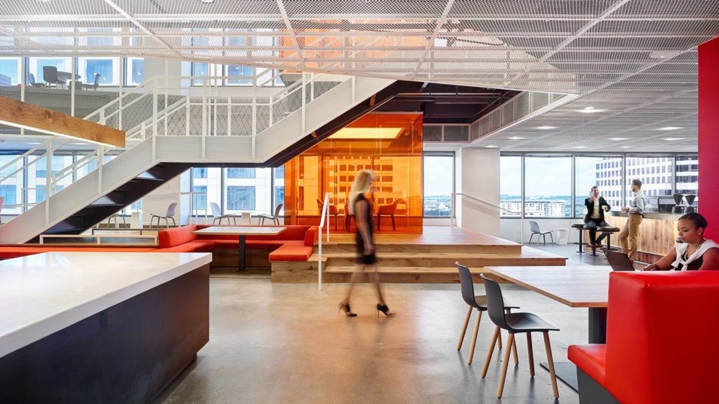
Of course, any workplace that truly wants to make their office the best experience for their employees needs a break space that will match how great their workspaces are! That’s why these designers chose to create an entire break wing that features a large variety of spaces centred around comfort. These include colourful seating zones, a cafe, and a lounge with tiered seating.
当然,任何真正想让他们的办公室成为员工最佳体验的工作场所都需要一个与他们的工作空间相当的休息空间。这就是为什么这些设计师选择创造一个完整的休息翼,以舒适为中心的空间种类繁多。这些设施包括色彩鲜艳的座位区、咖啡厅和有分层座位的休息室。
Entertainment during break times is important to the company for their employees as well. For those who don’t feel the need to rest on their breaks, there are televisions, pool tables, and differently arranged seating spaces designed for informal group seating. Sometimes these spaces are even used for large group presentations so that people can relax during those that are informal.
休息时间的娱乐对公司员工也很重要。对于那些不需要休息的人,有电视、台球桌和为非正式团体座位设计的不同安排的座位空间。有时,这些空间甚至被用于大型团体演示,以便人们可以放松在那些是非正式的。
This all takes place on the ground floor! Above that, on the first and second floors, are more formal workspaces that are a little bit less novelty and a little more business oriented. They are still aesthetically aligned with the quirky style presented in reception and they still follow the colour scheme; they are simply the necessary designated “business wing” that every head office needs.
这一切发生在一楼!在这一点上,在第一层和第二层上,更正式的工作空间有点新奇,更有业务导向。他们仍然在审美方面与前台提供的古怪风格保持一致,他们仍然遵循颜色方案;他们只是每个总部需要的必要的指定“商务翼”。
The business wing is fully equipped with the latest office technology and is laid out in a way that makes everything feel like it has good flow. These floors feature more conventional working areas for those who need more structure for concentration, as well as a plethora of comfortable meeting areas, some fun and colourful multi-purpose booths, and even some sound proof booths for those who need a little extra privacy and concentration on special projects. Each business floor also features a cheerful kitchen area!
商务部门配备了最新的办公技术,布局的方式使一切都感觉它有良好的流动。这些楼层为那些需要更多结构来集中注意力的人提供更传统的工作区,以及大量舒适的会议区域,一些有趣而多彩的多功能展位,甚至一些隔音亭,供那些需要额外隐私和专注于特殊项目的人使用。每个商务楼层也有一个令人愉快的厨房区域!
Besides the colours, themes, and branding, some things were intentionally prioritized to really make sure the space is as welcoming and conducive to productivity as possible. Large windows ensure that each room on each floor is filled with an abundance of natural sunlight while birchwood details and a large element of greenery (including whole indoor trees) ground the space, provide natural contrast, and create a sense of contentedness and calm.
除了色彩,主题和品牌,有些事情是有意的优先考虑,以确保空间是尽可能欢迎和有利于生产力。大窗户确保每一层楼的每个房间都充满了充足的自然阳光,而桦木细节和一大片绿色植物(包括整棵室内树木)将空间夷为平地,提供了自然的对比,并创造了一种满足和平静的感觉。
 举报
举报
别默默的看了,快登录帮我评论一下吧!:)
注册
登录
更多评论
相关文章
-

描边风设计中,最容易犯的8种问题分析
2018年走过了四分之一,LOGO设计趋势也清晰了LOGO设计
-

描边风设计中,最容易犯的8种问题分析
2018年走过了四分之一,LOGO设计趋势也清晰了LOGO设计
-

描边风设计中,最容易犯的8种问题分析
2018年走过了四分之一,LOGO设计趋势也清晰了LOGO设计


 PintereAI


