San Carlos Midcentury Modern Remodel by Klopf Architecture
2017-05-09 12:11
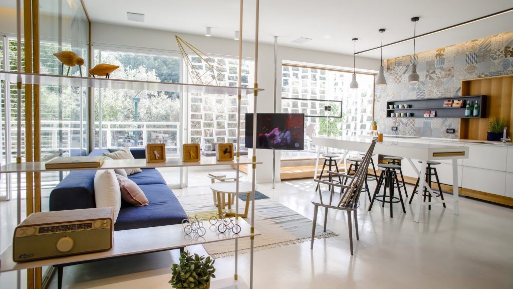
The previous owner of this 1960s modern home covered over the walls of glass with plywood and installed a massive awning at the rear of the house, blocking out most light and connection with the outdoors. The original interior had a maze-like layout starting with a small entry area and moving into too many hallways. In short, the house felt dark and closed-in. Nevertheless the new owners saw the potential in the home, purchased it, and hired Klopf Architecture to help them realize the potential. Today it is an open, light and bright, indoor-outdoor, clean and simple, modernist home for two professionals and their young son.
这座20世纪60年代现代住宅的前主人用胶合板覆盖在玻璃墙上,并在屋后安装了一个巨大的遮阳篷,遮住了大部分光线,并与室外连接起来。最初的内部有一个迷宫样的布局,从一个小的入口区域开始,移动到太多的走廊。总之,这所房子感到漆黑密闭.然而,新业主看到了房子的潜力,购买了它,并雇用了KlopfArchitecture来帮助他们实现潜力。今天,它是一个开放,轻和明亮,室内-室外,干净和简单的现代化的家,为两个专业人员和他们的年幼的儿子。
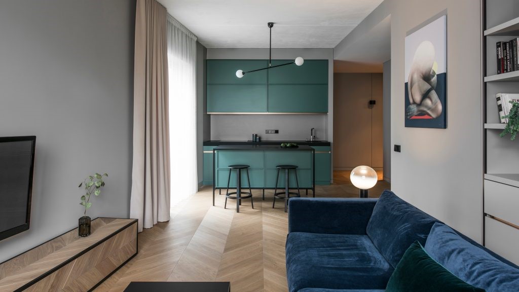
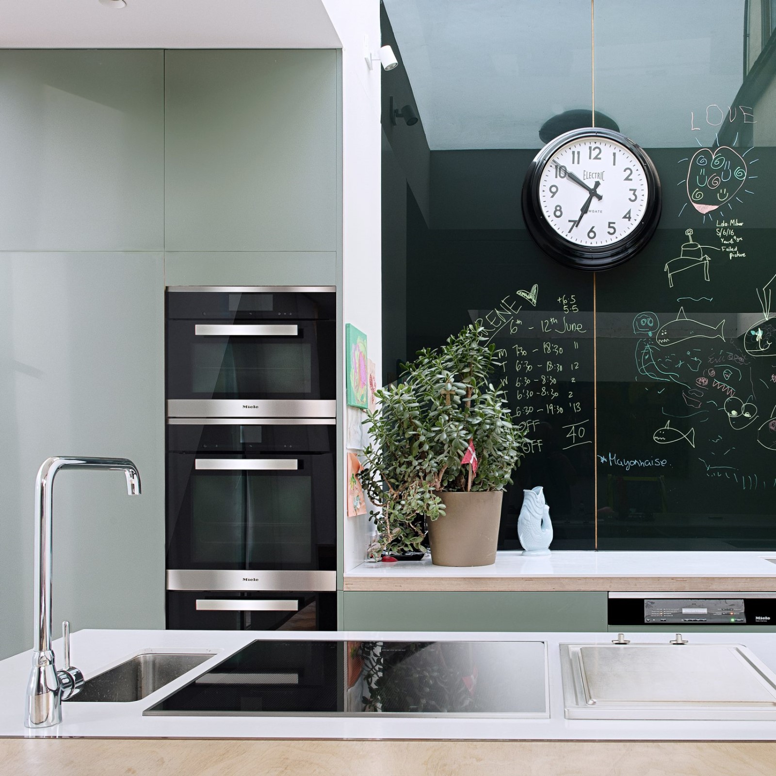
When touring the home with the new owners, Klopf saw immediate possibilities to reconfigure the house into a main living space including kitchen and dining, combining what used to be the old kitchen area and the under-utilized living room. The old kitchen was combined with a family room to the rear that became an office. The kitchen itself moved as Klopf designed in a utility “core” with pantry, laundry, and mechanical systems where the kitchen used to be. In the bedroom wing, the master suite was improved with a walk-through closet that leads to a bathroom with skylights above the sinks.
当与新主人参观房子时,克洛普夫立即看到了将房子重新配置成一个主要的生活空间的可能性,其中包括厨房和餐厅,将过去的厨房区域和利用率不足的客厅结合起来。旧厨房和后面的一间家庭房间结合在一起,变成了一间办公室。厨房本身的移动,就像克洛普夫设计的一个公用设施“核心”,有厨房的储藏室、洗衣房和机械系统。在卧室的侧翼,主套房被改进了,有一个穿行的壁橱,通向一个浴室,在水槽上方有天窗。
The layout emphasizes openness and flow, connection between indoors and outdoors, and privacy from the street with courtyards and fences creating outdoor spaces that act as buffer zones. Even though the master bedroom is on the street, the landscaped courtyard by Growsgreen between the master bedroom and the front fence makes it feel resort-like. Skylights bring light into the deeper areas of the house to even out the natural lighting so the inhabitants don’t need electric lights most of the time. It’s dramatic to track the sun coming in through the skylights and lighting up the kitchen on a sunny day.
布局强调开放和流动,室内和室外之间的联系,以及与街道的隐私,庭院和栅栏创造了作为缓冲地带的户外空间。即使主卧室在街上,主卧室和前篱笆之间的绿色花园也让人感觉像个度假胜地。天窗将光线带入房屋的较深区域,以平衡自然照明,因此居民们大部分时间都不需要电灯。在阳光明媚的日子里,跟踪太阳从天窗进来,照亮厨房是很有戏剧性的。
Klopf updated the entry sequence to flow more smoothly by removing a gate and opening up the front door and entry area with sidelites and clerestory windows.
克洛普夫更新了入口顺序,通过拆除大门并打开前门和入口区域,使其流动更加顺畅。
The builders opened up the house to the studs throughout and provided it with all new plumbing, electrical, radiant heat, roof, wall board, windows, insulation – the whole house is nearly new, but on the same footprint as the old one. Heath tile in the bathrooms, IKEA cabinets with custom faces in the kitchen and pantry, Daltile flooring tile, and painted drywall throughout the house create a sense of consistency and flow from space to space. Klopf and Growsgreen specified “timeless” exterior materials: plain smooth stucco, concrete, clear sealed western red cedar siding, and dark bronze anodized Western windows and doors.
建筑工人在整个过程中打开了房子,并为其提供了所有新的管道、电气、辐射热、屋顶、墙板、窗户、隔热材料--整个房屋几乎是新的,但占地面积与旧的一样。卫生间中的杂色瓷砖、厨房和厨房中带有定制面的宜家橱柜、Daltiltile地板瓷砖和整个房子内涂漆的干式墙,创造了从空间到空间之间的一致性和流动感。Klopf和Growsgreen规定了“永恒”外部材料:平整光滑灰泥、混凝土、透明密封的西侧红色雪松壁板和暗青铜阳极氧化的西方门窗和门。
By removing the old owner’s plywood, and increasing the openness with large windows, long folding wall systems, and wide sliding glass doors, the Klopf Architecture team connected the landscaped patios and courtyards by Growsgreen Landscape Design to the interior living areas of the house. One feels a sense of calm and relaxation spending time either in the interior spaces or the adjoining exterior rooms with lush plantings.
通过拆除老业主的胶合板,增加大窗户、长折叠墙系统和宽滑动玻璃门的开放性,克洛普夫建筑团队将GrowsGreen景观设计公司的美化庭院和庭院与房子的内部居住区域连接起来。你会感觉到一种平静和放松的感觉,无论是在室内空间里,还是在相邻的室外房间里,都有茂盛的植物。
Architects: Klopf Architecture Project: San Carlos Midcentury Modern Remodel Project Team: John Klopf, Chuang-Ming Liu and Ethan Taylor Landscape Design: Growsgreen Structural Engineer: Sezen and Moon Photography ©2016 Mariko Reed Location: San Carlos, California, USA Year completed: 2016
建筑师:Klopf建筑项目:圣卡洛斯中叶现代改建项目团队:John Klopf,Chang-ming Liu和Ethan Taylor景观设计:生长绿色结构工程师:Sezen和月亮摄影(2016年)Mariko Reed位置:美国加利福尼亚州圣卡洛斯年:2016年完成
 举报
举报
别默默的看了,快登录帮我评论一下吧!:)
注册
登录
更多评论
相关文章
-

描边风设计中,最容易犯的8种问题分析
2018年走过了四分之一,LOGO设计趋势也清晰了LOGO设计
-

描边风设计中,最容易犯的8种问题分析
2018年走过了四分之一,LOGO设计趋势也清晰了LOGO设计
-

描边风设计中,最容易犯的8种问题分析
2018年走过了四分之一,LOGO设计趋势也清晰了LOGO设计


 PintereAI


