This São Paulo House Has a Mixed Structural Design that Combines Concrete with Steel
2017-06-24 20:08
Architects: FGMF Arquitetos Project: Mattos House Team: Fernando Forte, Lourenço Gimenes, Rodrigo Marcondes Ferraz Area: 358.51 m2 Location: São Paulo, Brasil Photography: Rafaela Netto
建筑师:FGMF Armisetos项目:Mattos House团队:Fernando Forte,Louren o Gimenes,Rodrigo Marcondes Ferraz地区:358.51平方米位置:圣保罗,巴西摄影:Rafaela Netto
Design a house for a young family was the project’s main point. The steep-sloped site had a unique view to one of São Paulo’s main arterial roads. To use said site to our advantage in the creation of the house’s spaces, the attention to the circulation flows and the leisure area seemed to us like some of the most important questions to be addressed from the very beginning.
为年轻家庭设计房子是该项目的重点。这处陡峭的斜坡可以看到圣保罗主干道之一的独特景色。为了在创造房子的空间方面发挥我们的优势,对流通领域和休闲区的关注似乎是从一开始就需要解决的一些最重要的问题。
After further analysis of the site and the spatial organisation of the house, we decided to propose a level-oriented occupation. The first level contains the garage, the main access and a garden. The private areas are in this level, but the visitor can walks down a set of stairs, that follows the main hall, in order to access the second level. This second level houses the service areas, the gourmet kitchen and the dining room, accesses another garden level, and bears a double-height ceiling that links it to the home theatre and the above hallways. The last level also received higher ceilings and contains the living room, completely open to the view and an external plateau containing a solarium and the swimming pool.
在对场地和房屋的空间组织进行进一步分析后,我们决定提出一种以水平为导向的职业。第一层包括车库、主通道和花园。私人区域在这层,但游客可以走下一套楼梯,在大厅后面,以便进入第二层。第二层是服务区、美食厨房和餐厅,通往另一层花园,并有一个双高的天花板,把它与家庭剧院和上面的走廊连接起来。最后一层也有更高的天花板和客厅,完全开放的视野和外部高原包括一个日光浴室和游泳池。
The house is supported by a mixed-logic structural design in which a bare concrete wall, on the leftmost side of the house, connects the many levels and organises the main stairway that links them all. The rest of the house’s structure is composed of a lightweight steel-framing, allowing for larger-than-average glazed areas.
房子是由混合逻辑的结构设计支撑的,在房子的最左边有一堵裸露的混凝土墙,连接着许多层,并组织了连接它们的主楼梯。房子的其余部分由一个轻钢框架组成,允许比平均水平更大的玻璃区域。
One of the main approaches was the structural and enclosure designs: the contrast between the intimate area’s heavy monolithic volume above and the social area’s light, glazed volume sectioned by the plateaux always seemed to us like a typical paulista school architecture solution, adequate to the location and the project’s necessities. Counterpart to that solution is the mentioned concrete wall that, depending on the visitor’s viewpoint, works to unite the different levels, as well as the facade, walls, structure and flooring.
主要的方法之一是结构和围护结构设计:上面的密集区域的整体体积与社会区域的轻质,玻璃体积之间的对比在我们看来总是像一个典型的蓬布学校建筑解决方案,足以满足位置和项目的需要。与该解决方案对应的是上述混凝土墙,根据访问者的观点,该墙旨在统一不同的标高,以及立面、墙、结构和地板。
We approached the relationship between the inside and the outside areas with exceptional care, working with the differences in ceiling height in order to further denote their differences and respect the architectural design. The aesthetic adopted when working the interiors was also very important to us – the house, with an essentially Brazilian-modern design bore a heavy emphasis in the contrast between solids and voids and weight and weightlessness, but it also seemed very important to us the seeking of a furniture setting that respected and emblazoned the paulista modernism past while maintaining a more contemporary approach to the design logic. For such, we also used of both modernist and classic pieces, such as Earnes’ Plywood Chair and Saarinen’s Womb couch, as well as contemporary Brazillian designs such as those of Jader Almeida, Marcus Silveira, Felipe Protti, Natasha Shlobach and Estúdio Bola.
我们非常小心地探讨了内外区域之间的关系,处理天花板高度的差异,以进一步表示它们的差异,尊重建筑设计。在处理室内设计时采用的美学对我们来说也非常重要-这座房子基本上是巴西风格的-现代设计非常强调固体与空隙、重量和失重之间的对比,但对我们来说,寻找一种尊重和印证了过去的保利斯塔现代主义的家具环境,同时对设计逻辑保持一种更现代的方式,似乎也非常重要。为此,我们还使用了现代派和古典作品,如Earnes的胶合板椅和Saarinen的子宫沙发,以及当代巴西的设计,如Jader Almeida、Marcus Silveira、Felipe Protti、Natasha Shobach和Estúdio Bola的设计。
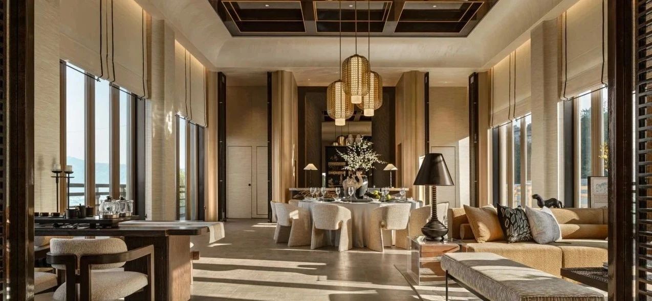
The spatiality, almost minimalist in nature, was defined by glass panes, dark coating of the upper block and concrete on the walls and floors, which were all referenced by the choice of furniture. The finishing touch was perhaps the large lighting fixture hanging above on the dining room’s double-height ceilings. Composed by 36 individual pieces and designed in a joint effort by our office and the Prole studio. It can be seen from many different angles, including the living room, the dining room, the hallway that accesses the bedrooms and home theatre, working as another element that further integrates and links these different levels.
空间性在本质上几乎是极简主义的,它的定义是玻璃、上部块的深色涂层以及墙壁和地板上的混凝土,所有这些都是家具选择时所参照的。最后的感觉也许是挂在餐厅双层天花板上的大型照明装置。由36件个人作品组成,由我们的办公室和Prole工作室共同设计。它可以从许多不同的角度看,包括客厅、餐厅、通往卧室和家庭剧院的走廊,作为进一步整合和连接这些不同层次的另一个要素。
 举报
举报
别默默的看了,快登录帮我评论一下吧!:)
注册
登录
更多评论
相关文章
-

描边风设计中,最容易犯的8种问题分析
2018年走过了四分之一,LOGO设计趋势也清晰了LOGO设计
-

描边风设计中,最容易犯的8种问题分析
2018年走过了四分之一,LOGO设计趋势也清晰了LOGO设计
-

描边风设计中,最容易犯的8种问题分析
2018年走过了四分之一,LOGO设计趋势也清晰了LOGO设计


 PintereAI


