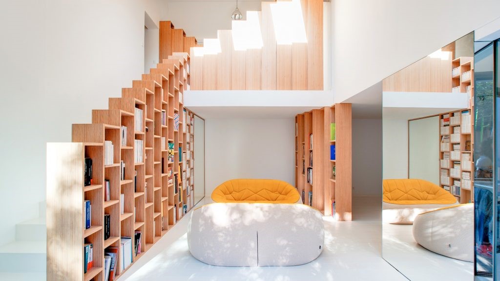
Renovation of an Apartment in Turin / Marcante – Testa
2017-03-22 19:54
The project by Andrea Marcante and Adelaide Testa for the refurbishing of an apartment of about 160 sqm in the center of Turin attempts to construct an identity in an interior that was completely lacking in character, in spite of the impressive 19th-century outer facade, since it had completely lost its distinctive features from the period of the building’s construction: a tabula rasa as a starting point, to rewrite a story in a delicate balance of citations from the past, reinterpreted and in constant evolution.
安德烈·马尔坎特(Andrea Marcante)和阿德莱德·泰斯塔(Adelaid Testa)在都灵市中心翻修了一套面积约160平方米的公寓。该项目试图在一个完全缺乏特色的室内建筑中建造一个特色,尽管它有着令人印象深刻的19世纪外墙,因为它已经完全失去了建筑建造时期的独特特征:一个塔图拉萨(Tabula Rasa)作为起点,改写了一个故事,它微妙地平衡了过去、重新解读和不断演变中的各种引用。
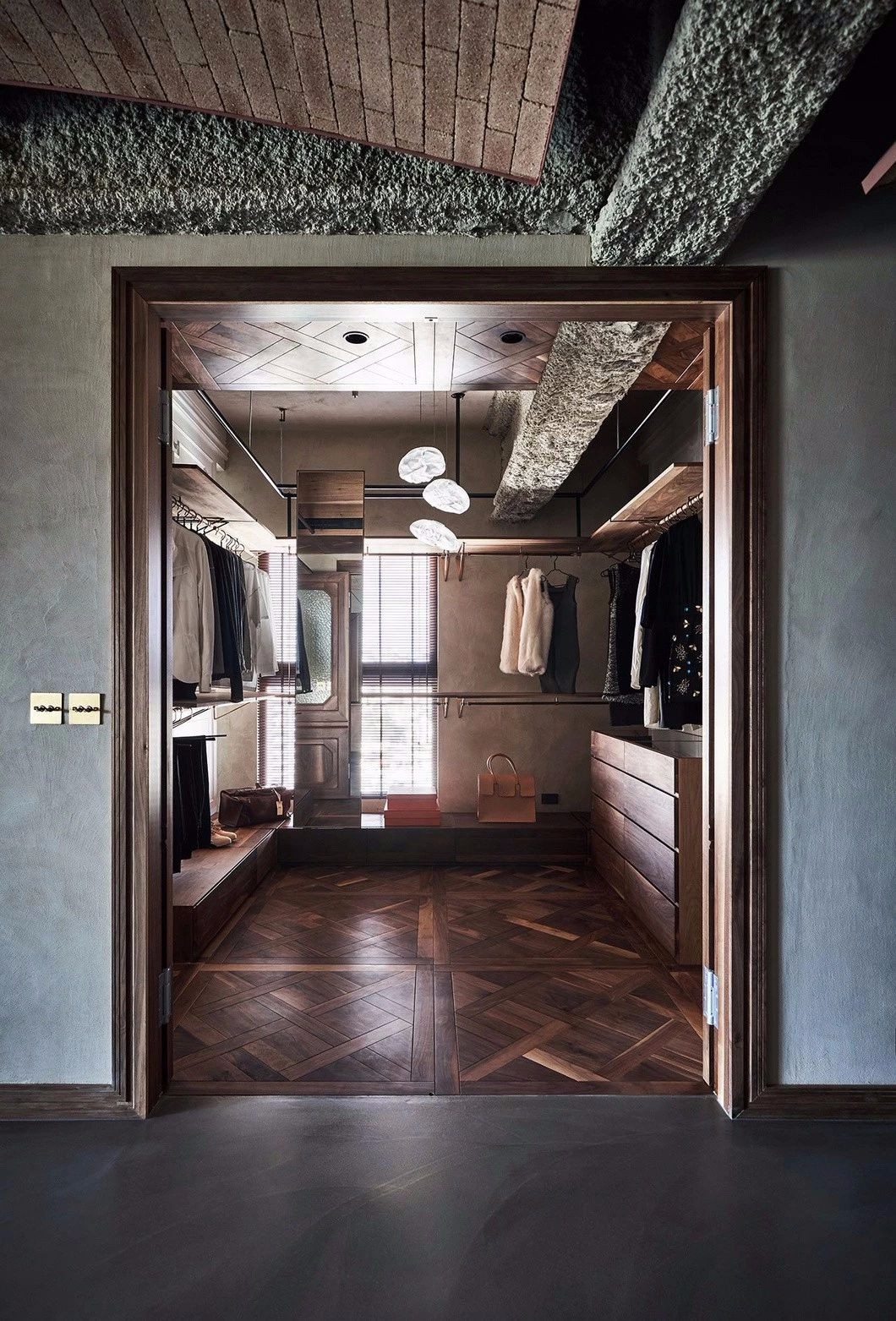
The small size of the windows facing the street and the different heights of the rooms immediately suggested a reversal of the traditional functional layout with respect to the outside: the living room and kitchen have been placed towards the tree-lined courtyard (where local building regulations permit the enlargement of windows to make glass doors), while the bedrooms and bathrooms have been shifted towards the main facade, with the addition of a loft zone to create a studio and a closet.
面对街道的窗户很小,房间的高度也不同,这立刻表明传统的外部功能布局发生了逆转:起居室和厨房被安置在树衬庭院(当地的建筑法规允许扩大窗户以制造玻璃门),而卧室和浴室已经转向主立面,增加了一个阁楼区,以创建一个工作室和一个壁橱。
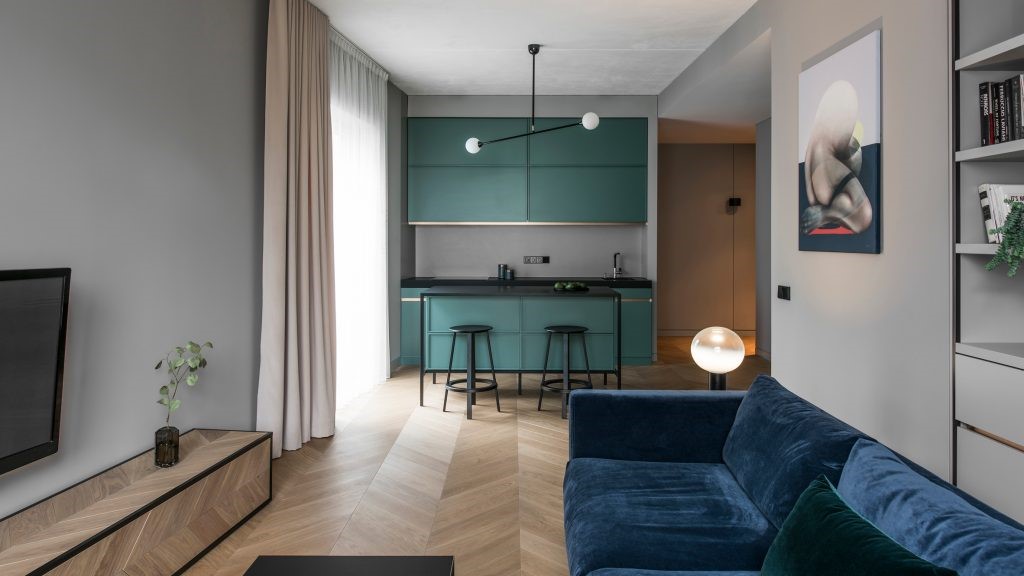
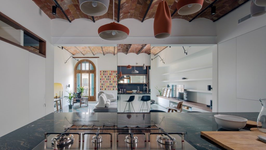
On one side, rediscovered dignity for the living area, thanks to the relationship with the outside, the height of the ceilings and the new seminato flooring; on the other, maximum rationalization of space, to bring functional quality to the bedroom-bath zone. The passage between the two dimensions is emphasized by the two-story volume of the kitchen/laundry: a work of architecture inside architecture, from which metal frames extend to create new visual trajectories, but above all to act as tools capable of dividing the perception of spaces for entertaining, food consumption and preparation, without physical barriers that would reduce the space, the light and the view towards the outside.
一方面,重新发现了起居区的尊严,这要归功于与外界的关系、天花板的高度和新的半调地板;另一方面,最大限度地合理化空间,为卧室-浴室区带来功能品质。厨房/洗衣房的两层卷强调了这两个维度之间的通道:建筑内部的建筑作品,金属框架延伸到创造新的视觉轨迹,但最重要的是作为工具,能够划分娱乐空间,食物消费和准备空间,没有物理障碍,减少空间,光线和向外的看法。
The division is not only made in terms of the different areas in the plan: the project is also vertically layered through three levels that form different backdrops, as was customary in the past, in order to highlight – starting from below – first the furnishings ordered by the design of the seminato floors, then the system of metal frames that support the lighting fixtures and generate axes of light, and finally the plaster frames arranged on the wall, separating and enhancing the various pastel tones of the surfaces, and on the ceiling, where they echo the positioning of the furnishings below.
这一划分不仅是根据计划中的不同区域进行的:该项目还按照过去的惯例,通过三层垂直分层,形成不同的背景,以便突出-首先是从下开始-由半个楼层设计的家具,然后是支持照明装置并产生光轴的金属框架系统,最后是在墙上布置的灰泥框架,将表面和天花板上的各种色彩斑斓的色调分隔开来,在天花板上,它们与下面家具的定位相呼应。
The details referencing the past are clearly displayed: the plaster frames, like the seminato, seem to have always been there, though on closer observation the decoration on the ceiling is off-center with respect to the table, the design of the floor has a clear modern matrix, while the design of the kitchen, on the other hand, has an unabashed contemporary look, relying on textures and materials that accompany existing furnishings like the table and chairs already owned by the clients.
参照过去的细节被清晰地展示出来:石膏框架,就像半音符一样,似乎一直都在那里,尽管仔细观察,天花板上的装饰与桌子相比是不中心的,地板的设计有着清晰的现代矩阵,而厨房的设计则有一种毫不掩饰的当代风格,依赖于现有家具的纹理和材料,比如已经为客户拥有的桌椅。
A home of light and shadows, with perceptive “leaps” between the daytime area and the bedroom zone, where still empty parts alternate with others packed with functions, and the large openings towards the outside world of the living area form a contrast with the “loophole” frames offering a view of the tree-lined avenue below from the bedrooms: a house where the future is also in the past, when filtered by the present… just little bits of history repeating….
一个光线和阴影的家园,在白天和卧室区域之间有明显的“跳跃”,在那里仍然空着的部分和其他充满功能的部分交替,而向外部世界的大开口形成了一个与“漏洞”框架形成对比的“漏洞”框架提供了从卧室到卧室下面的林荫大道的景象:当被现在的…过滤的时候,未来也在过去的房子。只是历史上的一些小片段-重复…..
Architects: A. Marcante / A. Testa (UDA Architects) Project: Apartment in Turin Team: Mattia Inno, Giulia La Delfa, Giada Mazzero, Marilivia Minnici Area: 160 sqm Location: Turin, Italy Photographer: Carola Ripamonti
建筑师:A.Marcante/A.Testa(UDA建筑师)项目:都灵小组公寓:Mattia Inno,Giulia La Delfa,Giada MazZero,Marilivia Minnici地区:160平方米地点:都灵,意大利摄影师:Carola Ripanonti
 举报
举报
别默默的看了,快登录帮我评论一下吧!:)
注册
登录
更多评论
相关文章
-

描边风设计中,最容易犯的8种问题分析
2018年走过了四分之一,LOGO设计趋势也清晰了LOGO设计
-

描边风设计中,最容易犯的8种问题分析
2018年走过了四分之一,LOGO设计趋势也清晰了LOGO设计
-

描边风设计中,最容易犯的8种问题分析
2018年走过了四分之一,LOGO设计趋势也清晰了LOGO设计


 PintereAI


