San Francisco Home With a Minimalist White Interior and a Generous Vertical Space
2017-07-01 19:51
Architects: Edmonds Lee Architects Project: Remember House / four-story San Francisco Home Location: San Francisco, California, United States Photography: Joe Fletcher
建筑师:EdmondsLeeArchitectsProject:RememberHouse/fourstorySanFranciscoHomeLocation:SanFrancisco,California,UnitedStatesPhotophy:JoeFletcher.
For this four-story family residence, the architects experimented with vertical circulation and crisp white materiality to create a spacious, vibrant, and geometrically engaging house. Organized around a singular central spine, the project is an exploration of fluid continuity and volumetric adventure. On a down-sloping hillside parcel of land in San Francisco’s Noe Valley sits this four-story project that embraces vertical stacking and crisp materiality for a tightly-knit family unit of three.
对于这座四层楼的家庭住宅,建筑师们尝试了垂直流通和洁白的物质性,以创造一个宽敞、充满活力和几何吸引力的房子。这个项目围绕着一个奇异的中央脊柱组织起来,是对流体连续性和体积探险的探索。在旧金山诺伊山谷的一片山坡上,坐落着一个四层高的项目,它包含了一个紧密相连的三口之家的垂直堆叠和清晰的物质性。
Four-story massing usually leads to a space that feels tight or repetitive, so the architects worked to make the vertical circulation both evocative and valuable, forgoing the pancake-style San Francisco home, and instead opening the house in section, maximizing a feeling of spaciousness and a sense of architectural adventure. That meant a small sacrifice in terms of physically usable space, but a huge gain in terms of enjoyable architecture. Double-height spaces and a staircase centered within the central spine of the house encourage the clients and their visitors to engage with each level.
四层楼的聚集通常会导致空间紧张或重复,因此建筑师们努力使垂直循环既令人联想又有价值,放弃了煎饼式的旧金山住宅,而是在部分打开房子,最大限度地提高了空间感和建筑冒险感。这意味着在物理可用空间方面做出了很小的牺牲,但在令人愉快的建筑方面却获得了巨大的收获。双高空间和一个楼梯中心在中央脊柱的房子鼓励客户和他们的游客参与每一层。
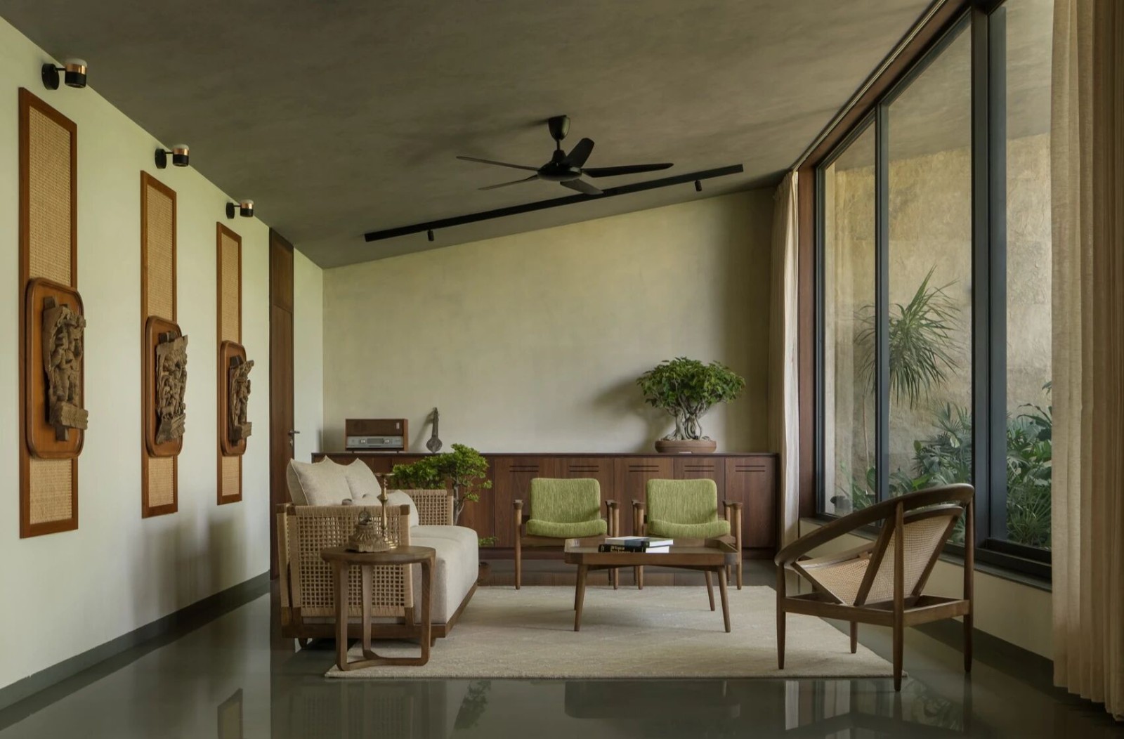
On the interior, the architects started with materiality first, working within the inherited geometry of the project, and from an all-white palette that began with the very first design choice, white Douglas fir floors from Dinesen. Because of the clients’ general aesthetic focus—on white, spare, minimalism—and their enthusiasm for treating interiors the same way Edmonds Lee do: like galleries or museums where the main visual interest pops from the decor, the art, and the furniture.
在内部,建筑师首先从物质性开始,在项目的继承几何学范围内工作,从第一个设计选择开始的全白色调色板,来自迪内森的白色道格拉斯冷杉地板。由于客户对白色、备用、极简主义的普遍审美关注,以及他们对室内设计的热情,就像埃德蒙兹·李(Edmonds Lee)所做的那样:比如画廊或博物馆,那里的主要视觉兴趣来自装饰、艺术和家具。
The architects explore how a house could operate similarly to a gallery, as a neutral canvas – and that neutral canvas became seamless, with spaces that flow from end to end, and with a continuity of materials that favor fluid transitions over the sharp disconnects so often found in modernist projects.
建筑师们探索了房子如何与画廊类似,作为中性画布--中性画布变得无缝,空间从始至终地流动,并且具有连续性,有利于流体转换,而不是现代项目中经常发现的尖锐断开。
The sharpest moment is in the choice of exterior palette. Because the project was a renovation that required working within existing bones and an existing ground parcel, the street-side massing needed to remain consistent. Offering a counterpoint to the interior’s spreading white-ness, and to the two neighboring houses, both of which are white, the architects chose to wrap the front in a dark cladding, differentiating the house from its neighbors and also from what it contains.
最尖锐的时刻是在外部调色板的选择。由于该项目是一项改造,需要在现有的骨骼和现有的地块内工作,因此街道边的聚集需要保持一致。对于室内白度的扩展,以及相邻的两座房子,都是白色的,建筑师们选择用一个黑色的包层把房子的正面包裹起来,把房子和邻居以及它所包含的东西区分开来。
The architects also designed the interior furnishings, working with an ongoing notion of seamlessness all the way though the project. Working on a schematic level, the architects thought about materiality and space, (the big ideas of capital-A Architecture), but also furniture and interior design.
建筑师们还设计了室内陈设,在整个项目中一直在使用无缝的概念。建筑师们在原理图的层面上思考了物质和空间(资本-A建筑的伟大理念),同时也考虑了家具和室内设计。
Their aesthetic focus explored everything from the greatest mass to the smallest detail – which allowed for a precise and vibrant spatial, material, and architectural choreography, like the sliding doors, for which the architects introduced a large window frame to bring a sense of solidity, history, and heft, or those Douglas fir floorboards, two-inch thick pieces of wood that create what the designers and clients see as an incredibly haptic experience.
他们的审美焦点探索了一切,从最大的质量到最小的细节允许精确而充满活力的空间、材料和建筑编排,比如滑动门,建筑师们为此引入了一个大窗框,以带来坚实、历史和厚重的感觉,或者那些道格拉斯冷杉地板,两英寸厚的木头,创造了设计师和客户认为是一种令人难以置信的随意体验。
 举报
举报
别默默的看了,快登录帮我评论一下吧!:)
注册
登录
更多评论
相关文章
-

描边风设计中,最容易犯的8种问题分析
2018年走过了四分之一,LOGO设计趋势也清晰了LOGO设计
-

描边风设计中,最容易犯的8种问题分析
2018年走过了四分之一,LOGO设计趋势也清晰了LOGO设计
-

描边风设计中,最容易犯的8种问题分析
2018年走过了四分之一,LOGO设计趋势也清晰了LOGO设计


 PintereAI


