Modern Pavilion Designed Like a Extension to an Existing Residence
2017-09-29 07:28
Architect: Branch Studio Architects Project: Modern Pavilion Lead architect: Nicholas Russo Location: Balnarring, Australia Area: 85 m2 Year 2017 Photography: Peter Clarke
建筑师:工作室建筑师项目:现代馆首席建筑师:尼古拉斯·鲁索地点:澳大利亚巴尔纳林地区:85平方米2017年摄影:彼得·克拉克
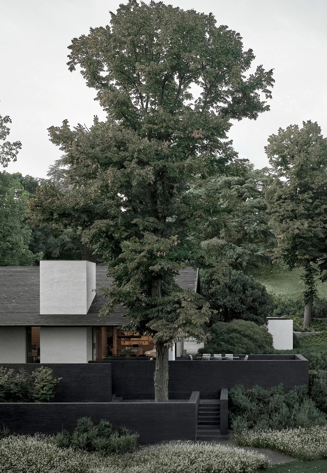
When presented with the opportunity to design this modern pavilion like a small addition to an existing residence, it was exciting to discover a number of established and significant trees sporadically arranged across the proposed site immediately to the west of the existing building.
当有机会设计这座现代化的展馆时,就像一座现有住宅的一小部分附加物一样,令人兴奋的是,它发现了一些已建成的、重要的树木,它们散落在拟议的建筑西面。
The brief for a new master-suite consisting of a bedroom, an ensuite and incorporated robes/ancillary spaces also asked for a strong connection to the landscape and the contextual surrounds of the various garden areas.
新主套房的简介包括卧室、套间和合并的长袍/附属空间,这也要求与各种花园区域的景观和周边环境有很强的联系。
The existing dwelling itself – a 1990’s owner-build that our client’s inherited with the purchase of the property – posed little architectural significance and interacted poorly with its context. The strategy for dealing with the existing building was for the additions to be ‘semi-detached’ from the existing residence… this creates a separation from the main house, giving the pavilion it’s own identity amongst the landscape, while also providing the private spaces contained within ‘room to breathe’ and a sense of calm, intimacy away from the large open plan family home.
现有的住宅本身-1990年的业主-是我们的客户在购买房产的过程中继承下来的建筑-几乎没有什么建筑意义,而且与其环境的互动也很差。处理现有建筑的策略是在现有住宅…中添加“半独立”的内容。这创造了一种与主屋的分离,使展馆在景观中具有自己的身份,同时也提供了包含在“呼吸室”内的私人空间,以及一种远离大开放式家庭的平静、亲密的感觉。
It was resolved early on that the trees on the site would not make way for the new building – and in fact the concept would explore the opposite – as a more meaningful connection with the landscape could be achieved with the building giving way to, and interacting with, the trees.
早期的决议是,工地上的树木不会为新建筑让路-事实上,这一概念将探索相反的东西-因为随着建筑物让位给树木并与之相互作用,可以实现与景观更有意义的联系。
The result of this approach is a slender form to fit between the existing trees linking the three distinct programmatic areas in a linear fashion and arranged with an overall modernist logic - aesthetic. Starting as a simple rectangle, the plan evolved through a series of restrained but deliberate formal gestures to directly reference the existing context. A small gouge was made, creating a courtyard space to house an existing silver birch tree to the south. This courtyard acts as the threshold between the bathroom areas and the rest of the modern pavilion providing separation between the ensuite and the main bedroom spaces. External and internal seating is arranged around the courtyard providing opportunities for contemplation, rest and relaxation. The other formal interventions consist of two extruded window boxes that are pulled out to directly interact with the existing trees adjacent, and, the angular slice to the end of the modern pavilion to orientate the space towards a view corridor through existing vegetation, towards the setting sun to the west.
这种方法的结果是在现有的树木之间形成一种细长的形式,以线性的方式将三个不同的规划区域连接起来,并与整个现代主义逻辑相结合。
Entry to the modern pavilion is provided via the extension of an exiting central corridor from the main house. This central ‘boardwalk’ splits the ensuite areas into two distinct spaces before peeling away into two circulation paths around a central arrangement of joinery dividing and defining the robes. As the spaces unfold the floor level rises gradually (to about 1m above ground level) via a series of platforms that subtly ascend and divide the spaces across the length of the building. With the rise of the building, each programme internally possesses a different relationship with the garden context;
现代展馆的入口是通过从主楼出去的中央走廊延伸而来的。这个中央的‘木板路’把套间分成两个不同的空间,然后剥离成两条循环路径,围绕着细木工的中央布置来划分和定义长袍。随着空间的展开,地板水平逐渐上升(约1米以上的地面),通过一系列平台微妙地上升和划分空间跨越建筑物的长度。随着建筑的兴起,每个项目内部都与花园环境有着不同的关系;
– The ‘bathing’ area of the ensuite incorporates both an indoor - outdoor shower and a bath on the threshold of the internal-external building line. Large full height folding glass doors open to include the narrow external courtyard as part of the bathroom space giving it a direct connection with the garden. A half height rammed earth wall and a steel mesh screen provide privacy from the expansive property beyond without interrupting the views of the treetops and sky from the bath and outdoor shower.
– The robes float just above ground level and both sides have a direct link to the landscape. The south side (Georgina’s Robe) incorporates built-in seating arranged around the aforementioned silver birch tree/courtyard moment which internally provides the most literal example of the building giving over to the existing landscape. A long integrated seat, come side-board, come dresser extends the length of the southern side of the pavilion anchoring itself to the rammed earth wall while taking on different functions as the floor level falls away beneath. The north side (Adrian’s Robe) is more subtle in it’s relationship to the landscape. Large canopy trees provide filtered northern sunlight through highlight windows above the joinery which also provide a visual connection from inside to the leafy green canopy above. An extruded window box projects out under the canopy of the larger trees providing an open and transparent seating space within what is otherwise a private ‘locker room’ type robe space.
-长袍浮在地面上方,两边与景观有直接联系。南侧(乔治娜的长袍)包括内置的座位,围绕着前面提到的白桦树/庭院时刻,这提供了最字面上的例子,该建筑屈服于现有的景观。一个长而完整的座椅,来侧板,来梳妆台延长展馆南侧的长度,将自己锚定在夯实的土墙上,同时随着地板水平的下降而发挥不同的功能。北面(阿德里安的长袍)与景观的关系更为微妙。大树冠提供过滤的北方阳光通过突出窗户以上的细木工,这也提供了一个视觉连接从内部到绿叶冠层上方。一个挤出来的窗框突出在更大的树木的檐下,提供一个开放和透明的座位空间,否则是一个私人的‘更衣室’类型的长袍空间。
– While the robes and bathroom areas are split into separate portions for function and privacy, the bedroom – where the building reaches maximum elevation above the ground – is the area where the previously individual zones come together as one space. The central joinery ‘forrest’ that previously divided the ‘his’ and ‘hers’ robe zones morphs into a low height bed head joining the space as one. Built-in cabinetry skirts the perimeter of the bedroom enclosing the area with a series of informal seating and day-bed areas. A second and larger window box extrudes out from the solid rammed earth wall framing views of the fruit tees and stables beyond. The connection to the trees from the bedroom is more about being amongst the branches than beneath them and this is most apparent when standing in the large suspended window box or siting at the very point of the space, where the full height ‘cut end’ glazing slides open to the outdoors as you hang well above the ground and gaze towards the greenery beyond.
-虽然长袍和浴室区域被分割成不同的部分,用于功能和隐私,但卧室-建筑物在地面上达到最高高度的地方-是以前各个区域合并为一个空间的区域。中央细木工“福勒斯特”以前将“他”和“她的”长袍区划分为一个低高度的床头,将空间连接为一体。内置的橱柜在卧室的周长周围,环绕着这个区域,有一系列的非正式座位和日间床。第二个和更大的窗口盒从实心夯实的土墙框架中挤出水果三通和马厩以外的视野。卧室与树木的连接更多的是在树枝之间,而不是在树枝下面。当你站在大的悬挂窗框里或坐在空间的正点上时,这一点就最明显了。当你悬挂在地面上方,凝视远处的绿色植物时,整棵“切割的末端”玻璃滑向室外。
The external material palette of charcoal rammed earth, timber, steel and glass is purposefully natural and raw in response to the rural context, designed to weather and patina naturally, the building will continue to embed itself into its surrounds over time. Internally the materials are of a similar aesthetic although the detailing is treated with a preciousness which gives the unpretentious materiality a sense of finery. Charcoal rammed earth, timber and honed bluestone are the predominant internal materials with concrete and steel also used for some of the joinery. Brass trims accentuate material junctions, celebrating these intersections and expressing the construction methodologies.
木炭夯实土、木材、钢和玻璃的外部材料调色板是有目的自然和原始的,以适应农村的环境,以适应自然天气,随着时间的推移,建筑将继续嵌入其周围。在内部,这些材料具有相似的美学,虽然细节是以一种珍贵的处理,这给朴素的物质感一种华丽的感觉。木炭夯土、木材和磨碎的青石是主要的内部材料,混凝土和钢也用于一些细木工。黄铜装饰强调材料连接,庆祝这些交叉和表达的建设方法。
Creating the right atmosphere was a major focus internally. Given that bedroom areas are habited predominantly at the beginning and end of each day, it was important to adequately capture the moods of these times (waking-up/unwinding, washing and dressing) within the space. This master-suite pavilion aims to provide its occupants with a space away from the influences of excessive artificial light and create a more natural atmosphere in which to begin and end the day. This is achieved through the use of indirect lighting which ensures that the rooms are not over lit and thus provides the apparent quietness and intimacy appropriate for such spaces.
创造适当的氛围是内部的一个主要重点。鉴于卧室区域主要居住在开始和结束的每一天,这是重要的是充分捕捉这些时候的情绪(醒着/放松,清洗和穿衣)在空间内。这个主套房展馆的目的是为居住者提供一个空间,远离过度的人工光线的影响,并创造一个更自然的气氛,在其中开始和结束的一天。这是通过使用间接照明来实现的,这种照明可以确保房间不被过度照明,从而为这些空间提供明显的安静和亲密。
The discrete, earthly approach to the lighting also allows the tones and textures of the individual materials to reflect the ambience of the current external climate at any given time; A moody grey day outside will impart those connotations over the internal spaces, the rammed earth will feel darker and heavier, the timber will reflect a monochromatic grey light and the bathroom areas will feel cave-like with the stone floors and walls. Alternatively, a bright, sunny day will cast dappled light across the spaces through the tree canopies above, the warmer tones of the earth and timber will be uncovered and the rich textures of the raw materials will be highlighted by the vibrancy of the natural light.
这种离散的、世俗的照明方式还可以让不同材质的色调和纹理在任何特定时间反映当前外部气候的氛围;外面喜怒无常的灰色一天将把这些内涵传递给内部空间,夯实的泥土会感觉更暗、更重,木材会反射出单色的灰色光,浴室区域会感觉到洞穴-就像石头地板和墙壁一样。或者,阳光明媚的一天将透过上面的树冠在空间中投射出斑驳的光,地球和木材的温暖色调将被揭开,原材料的丰富纹理将被自然光的活力所突显。
There is no attempt to block out the external environment and create a ‘synthetic’ interior, instead, this building aims to preserve the sensory qualities that we enjoyed before the days of alarm clocks and electricity, when we went to sleep when it got dark and woke up with the sun.
我们没有试图封锁外部环境,创造一个“合成的”内部,相反,这座建筑的目的是保持我们在闹钟和电之前享受到的感官品质,当我们在天黑和太阳下醒来时,我们就睡着了。
 举报
举报
别默默的看了,快登录帮我评论一下吧!:)
注册
登录
更多评论
相关文章
-

描边风设计中,最容易犯的8种问题分析
2018年走过了四分之一,LOGO设计趋势也清晰了LOGO设计
-

描边风设计中,最容易犯的8种问题分析
2018年走过了四分之一,LOGO设计趋势也清晰了LOGO设计
-

描边风设计中,最容易犯的8种问题分析
2018年走过了四分之一,LOGO设计趋势也清晰了LOGO设计


 PintereAI


