240 sqm Duplex Apartment Transformed into a Contemporary Colourful Family Space
2017-10-06 18:17
Designer: Yael Perry Project: 240 sqm Duplex Apartment Location: Netanya, Center District, Israel Photography: Itay Benit
设计师:YaelPerry项目:240平方米双面公寓位置:以色列中心区Netanya摄影:ItayBenit。
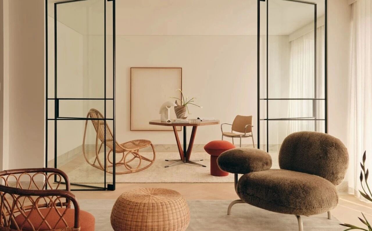
The 240 sqm duplex apartment, located in the Sharon region of Israel, intended for a home of a young couple who works in the high-tech field - expecting a baby. The couple commissioned Interior Designer Yael Perry to renovate their 240 sqm duplex into a contemporary colourful space for their family - friends.
这套240平方米的复式公寓位于以色列的沙龙地区,是一对年轻夫妇在高科技领域工作的住宅。
The designer renovated the duplex including a living space, kitchen, master guest suite, kids room - some small spaces for relaxation.
设计师翻新了复式公寓,包括客厅、厨房、主客房、儿童房。
The 50 sqm master bedroom, located on the upper level include sleeping area, bathroom, wardrobe, home working space - has 2 sliding doors that open on to a 40 sqm balcony.
面积50平方米的主卧位于高层,包括卧室、浴室、衣柜、家居工作空间。
The Main Floor: The floor was covered with bright oak parquet - the designer, who wanted to create a sense of a young contemporary aesthetic, chose to cover the walls with colourful geometric shapes.
The couple likes to entertain; therefore, a large modular sofa was selected for their living room - a dining bar was custom made to fit their needs. The wall behind the dining bar was covered with concrete in order to add industrial touch. The entrance wall was painted in black - the couple leaves notes on it for each other on a daily basics.
这对夫妇喜欢娱乐,因此他们选择了一张大沙发作为起居室。
The guest master suite - the kids room are located on the main floor as well. The designer wanted to give the apartment’s main floor a sense of bright, airy - young space; to bring a new fresh style to the apartment - instead of hanging art on the walls or cover it with paint or wall covers, she added flashes of colours in geometric shapes and now the walls became the art itself.
The Staircase: the staircase is very narrow - its ceiling is very high. In order to balance the proportion, the designer chose to hang the lighting red cable between the walls in order to give a sense of a lower ceiling.
The Upper Floor: The upper floor was dedicated for the couple - designed as a vacation unit. the main wall between the staircase - the master bedroom was replaced with a minimalist matte glass. The old floor was replaced by a beautiful wood parquet - the master bedroom walls were painted in dark green colour. The wardrobe doors were covered with mirrors - a minimalist home office cube was designed in order to provide the couple the ability to stay - work from home once the baby arrives.
 举报
举报
别默默的看了,快登录帮我评论一下吧!:)
注册
登录
更多评论
相关文章
-

描边风设计中,最容易犯的8种问题分析
2018年走过了四分之一,LOGO设计趋势也清晰了LOGO设计
-

描边风设计中,最容易犯的8种问题分析
2018年走过了四分之一,LOGO设计趋势也清晰了LOGO设计
-

描边风设计中,最容易犯的8种问题分析
2018年走过了四分之一,LOGO设计趋势也清晰了LOGO设计


 PintereAI


