建业艾美酒店设计,郑州 / 如恩设计
2019-08-10 11:50
总部位于中国上海的如恩设计研究室,将位于河南省省会城市郑州的建业艾美酒店,打造为郑州的全新地标。河南,曾是中国古老的政治经济及文化中心,也是帝王定都之地,如今吸引着世界各地的旅人。为了通过艺术(文学,自然,饮食,戏剧以及图案)展现河南的历史,建筑师的设计理念就是将新旧手工艺品“归档”,形成为当地居民与旅客的观光热点。

In their design for Le Meridien hotel, Shanghai-based firm Neri&Hu envisions a new landmark for Zhengzhou, the capital of Henan province. Henan, once the ancient political, economic and cultural center of China and home to many Emperors, today welcomes the international traveler. To showcase Henan’s history through its Arts (of Literature, Nature, Food, Theater, and Pattern) the architects conceived of the building as an “archive” of new and old artifacts that becomes a point of discovery for residents and travelers alike.
档案理念在建筑立面上表现为一系列堆叠的盒子,以彼此错落的方式堆叠组成,切分原始的庞大结构,同时又与周围的建筑产生生动的视觉对比。为区分盒子的大小,盒子的玻璃幕墙分别采用稍显不同的绿色,而盒子之间则用了无色的玻璃。由黑色及咖啡色金属饰板构成的盒子侧面以穿孔的方式构成一种河南本地的花卉——月季花的纹理。由多根铜杆支撑着的两个悬浮天蓬引领游客进入主入口。

Externally the archives are expressed as cantilevered stacked boxes, each carefully composed with subtle ins and outs to break down the bulky proportions of the original structure, while offering a dynamic visual counterpoint to the neighboring buildings. To differentiate the volumes the glass front of the each box is a slightly different tint of green and the negative space between boxes is clear glass. The sides of the boxes are clad in black and coffee colored metal panels textured with perforations patterned after the local Henan wild rose. Two floating canopies supported by a cluster of bronze poles leads the visitor to the main entrance.
这座25层的建筑由5层高的裙房公共区域以及350间客房的主楼组成。裙房的灵感来源于附近的历史遗迹龙门石窟——将中国佛教文化开凿于石灰石绝壁的山洞之中最精美的实例之一。挖掘与雕刻的建筑概念极强地表现在中心中庭周围开凿的不同孔洞,视觉上连接了多层的公共区域。通过上方的天窗,自然光束进入整个空间,在沉积的灰色中国砂岩镶嵌的墙面上变幻。绿色的窗户及定做的吊灯装置悬挂在空间上方。

The 25-storey building consists of a 5-storey podium of public functions and a tower of 350 private guestrooms. For the podium, inspirations are taken from the nearby historic Longmen Caves, one of the finest examples of Chinese Buddhist art carved into limestone cliffs. The architectural expression of excavation and carving is most strongly experienced in the various openings surrounding the central atrium that visually connect the public spaces across multiple floors. Skylights above pierce the space with shafts of natural light that highlight the sedimentary pattern on the grey sandstone clad walls. Green tinted windows and an extensive custom designed chandelier installation fill the high space with a diffusion of light and color.
中庭上方的周围,洞穴概念更细致与低调的体现在折叠而下的木盒。木盒是反复出现的建筑元素,将有机体的轻巧与石墙的厚重并列。宴会前厅整个天花板及墙面都由折叠的核桃木盒构成,不规律但严格地摆放在同一个高度。特定的盒子成为了看向中庭空间的窗户,理疗空间的盒子成为了嵌入其中的镜子。

Near the top of the atrium, the cave is represented by a more delicate articulation of dark timber boxes which fold down onto the walls. These wood boxes are a recurring architectural feature, a filigree of organic lightness juxtaposed against the heavy stone. In the Pre-function area the entire ceiling and wall is dominated by the folding waffle boxes arranged irregularly but rigidly at the same height. Certain boxes become windows looking across the atrium space, and in the Spa a few boxes become inset mirrors.
木质箱柜的特征尤为引人注目地在日式特色餐厅中实现,整个天花板上的核桃木盒高低起伏,许多大的木盒向下降低创造出了半开放的私人包房。地面模仿上方天花板的图案,像起伏的景观,铺盖着不同高度的橡木平台,有些用于就餐。一条之字形白色水磨石小路切入剩余的空间作为主动线。从室内延展至室外,木盒的概念继续体现到了屋顶花园,其中就有照亮中庭的天窗。

The timber coffer is perhaps most spectacularly realized in the Japanese Restaurant where the entirety of the ceiling of walnut boxes is constantly shifting in both height and size, several of the largest drop down low enough to form semi-private dining rooms. The ground beneath mimics the pattern of the ceiling above, and like an undulating landscape, it is populated by oak platforms of various heights, some meant to be occupiable by diners. A zigzagging path of white terrazzo carves its way through the leftover space as the main circulation. Extending from interior to exterior, the language of wood boxes continues seamlessly onto the Roof Garden, which is occupied by the very skylights that light up the atrium.
郑州建业艾美酒店还有两间餐厅,通过底板上的垂直开口在视觉上互相连接。中式餐厅私人包房是一系列黑色突出的网状盒子,通过开口延伸到下方的全日餐厅。在下方它们以悬浮灯盒体块出现,照亮自助餐区域铺开的美食。全日餐厅的地板和墙壁饰面为定制的瓷砖,结合了古典的代尔夫特蓝色陶瓷和中国传统绘画的笔触,同时混合灵感来自于附近著名的少林寺功夫的主题。

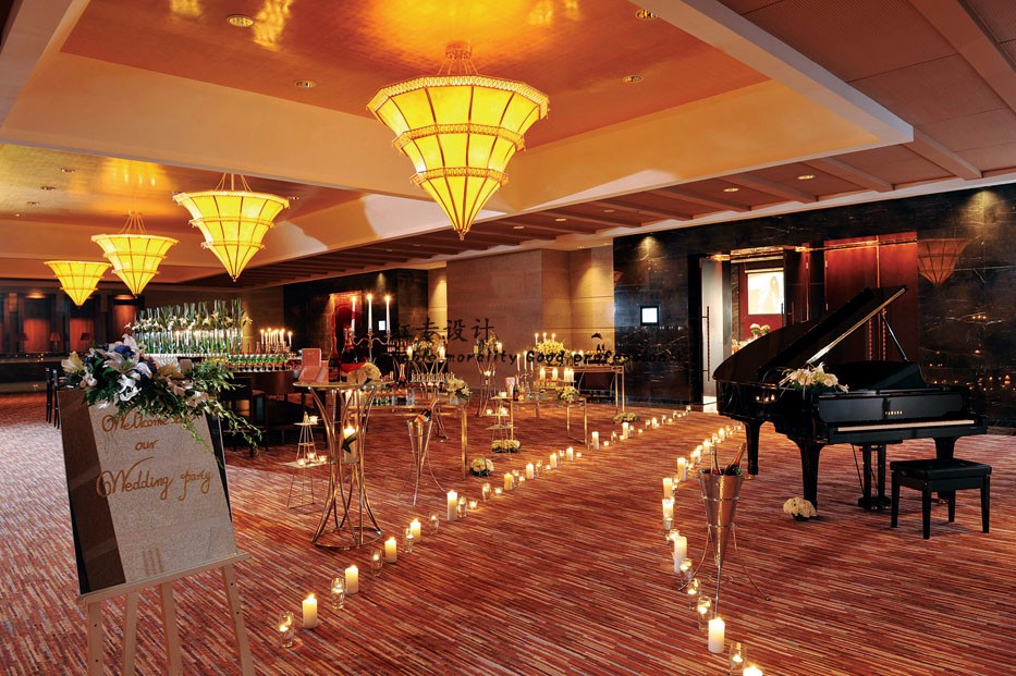
酒店最闪耀的场所是三楼的舞会厅,设计的设想是悬挂金色金属网和水晶吊灯的笼子,戏剧性地彰显着奢华质感。墙面向内倾斜,开拓出一条通道的空间,这是酒店另一独特的特征。这条诗意小径不仅为注重健康的客人提供了跑道,也是一条观景的休闲步道。这一环路在途中缓缓升起,在最高处可以欣赏屋顶花园的全景,接着再回落到达地下,与其他健身俱乐部设备连接。

The hotel features two more restaurants which are visually connected vertically with strategic cuts in the floor. The Chinese Restaurant Private Dining Rooms are a series of black mesh volumes which then extend down into the All Day Dining Restaurant through the cuts. From below they appear as floating light boxes which illuminate the culinary delights laid out on the buffet stations below. The floors and walls of the All Day Dining are clad in custom designed tiles that combine the classic look of Delft blue ceramics with the traditional brush stroke of Chinese painting, while incorporating a Kungfu motif inspired by the proximity of the project to the renowned Shaolin Temple.

The jewel of the hotel is the Ballroom which is conceived of as a hanging cage draped with gold metal mesh and crystalline pendant lights, a theatrical celebration of opulence. The walls slope inwards near the top of this room and allow space for a path to be carved out, serving as another unique feature of the hotel. The Poetry Walk functions as both a running track for the fitness-motivated guest, or a casual strolling path complete with scenic landscape views. This looping track slopes gently upwards culminating in a panoramic outlook towards the Roof Garden and then descends back into the subterranean where it links up with other Health Club facilities.
客房设计的核心概念是明暗对比。起居及卧室区采用灰色墙面与核桃木壁板,而最小的卫浴则全部使用白色瓷砖,外立面围绕着带有月季花的蚀刻玻璃。

The core concept of the Guestroom design is a contrast of light and dark. The living and sleeping areas are defined by a palette of grey walls and a stained timber wainscot, while the minimal bathrooms are clad exclusively in white subway tiles and enclosed by a glass panel etched in white with the same floral motif as the exterior.
为了突破典型酒店电梯大堂和客房走道无止尽的重复和单调,整个客房塔楼由一系列的三层高的中庭组成,空间有艺术装置的成列。每一个中庭代表了一个不同的主题,如神话,自然及文化,利用垂直性将故事的片段分布在客房的每一层。

To break through the endless repetition and monotony of typical hotel elevator lobbies and room corridors, the entire Guestroom tower features a series of three story atriums, spaces reserved for art installations. Each atrium represents a different theme such as Myth, Nature, or Culture, and takes advantage of the verticality to give each guestroom floor a unique fragment of the story.
这是如恩设计研究室目前接手过的规模最大、范围最广的多元化设计:任务包括在原有基地完成全新建筑设计,从客房、公共空间到特色餐厅的全部室内,定制家具、标识、景观概念及其中的一些艺术装置。通过探索不同的比例、肌理、材料及空间,如恩设计用各种各样的框架创造了一个档案陈列所。通过与客户紧密的合作以及对于城市背景的引用,如恩设计策划了一栋对于旅人而言,不仅是一场空间的旅途也是叙述的序列,去享受城市的建筑。

This is the most extensive and largest scale inter-disciplinary design project Neri&Hu has undertaken, including: a re-design of the architecture from its previous concrete shell, full interior design from guest rooms to public spaces and restaurants, custom furniture design, signage design, landscape concept, and a few of the art installations.  Through exploring different scales, textures, materials, and spaces, Neri&Hu created a showcase of archives by various ways of framing.  Working closely with the client and the contextual references, Neri&Hu has curated a not only a spatial journey but a narrative sequence to serve the traveler and their experience of the city.
Project Name: Le Meridien Zhengzhou
Site Address: Zhengzhou, China
Project Type: Hospitality – Hotel Public Areas (excluding restaurants)
Interior Architect & Interior Designer: Neri&Hu Design and Research Office
Completion Date: November 2013
Design Period: September 2009 – November 2013
Gross square footage: 43,000sqm
采集分享
 举报
举报
别默默的看了,快登录帮我评论一下吧!:)
注册
登录
更多评论
相关文章
-

描边风设计中,最容易犯的8种问题分析
2018年走过了四分之一,LOGO设计趋势也清晰了LOGO设计
-

描边风设计中,最容易犯的8种问题分析
2018年走过了四分之一,LOGO设计趋势也清晰了LOGO设计
-

描边风设计中,最容易犯的8种问题分析
2018年走过了四分之一,LOGO设计趋势也清晰了LOGO设计


 PintereAI


