King David Apartment in the Heart of Tel Aviv / Kedem Shinar Design
2018-01-24 19:48
Architects: Kedem Shinar Design - Architecture Project: King David Apartment Location: Tel Aviv, Israel Photography: Gidon Levin
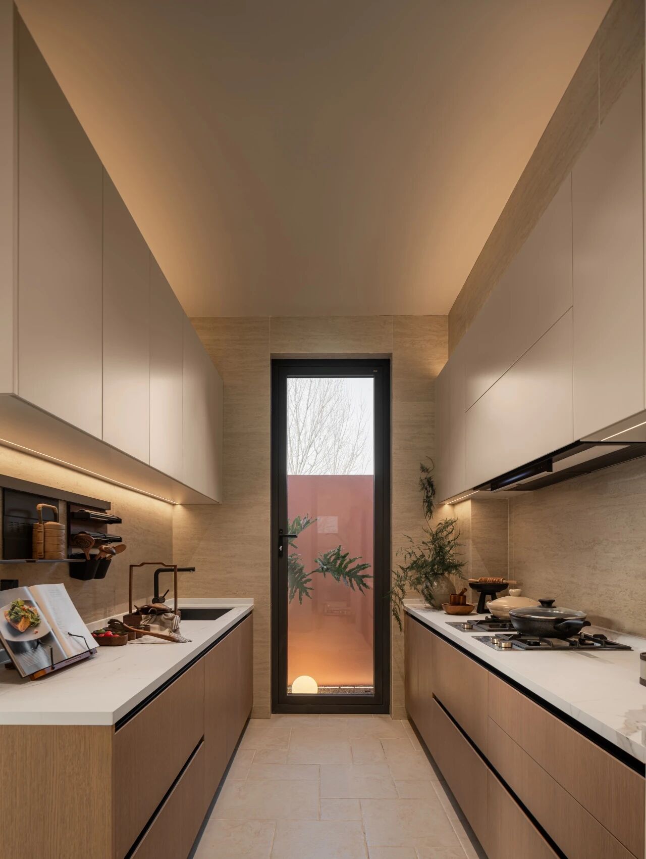
Originally a 1960’s 110 sqm apartment in the heart of Tel Aviv, this apartment was designed with a new internal division of functions, including an an enlarged living room dining room and kitchen, as well as a master bedroom and two children bedrooms.
这套公寓最初位于特拉维夫市中心,面积为1960年的110平方米,设计时有一个新的内部功能部门,包括一个扩大的客厅、餐厅和厨房,以及一个主卧室和两个儿童卧室。
The unification of the original spaces along the facade of the house enabled the creation of a large open space with a long stretch of large windows running along it. This enabled an increased penetration of light as well as a sense of loftiness throughout the apartment, thus creating one large central public space including an open kitchen, a dining area and a study with a long counter serving as a work table.
房子正面原有空间的统一,创造了一个很大的开放空间,沿着它延伸着一长段大窗户。这增加了整个公寓的透光和高贵感,从而创造了一个大的中央公共空间,包括一个开放式厨房、一个就餐区和一个有一个长柜台作为办公桌的书房。
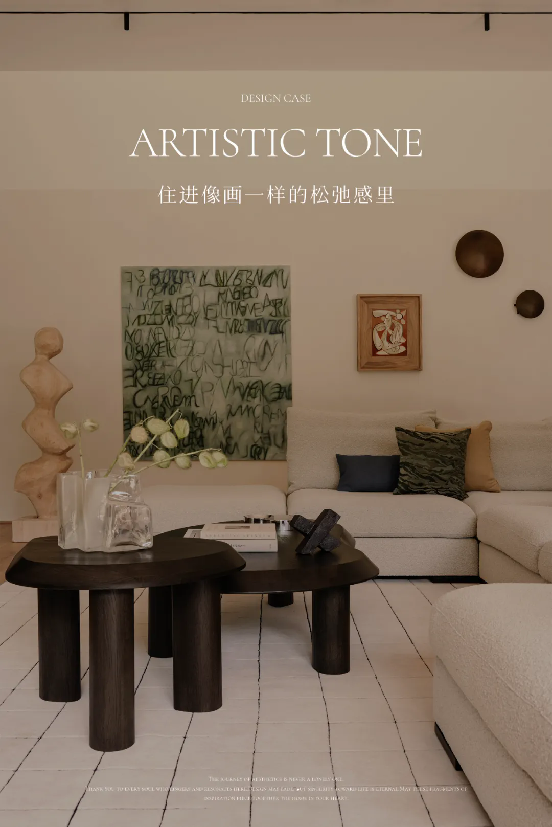
Inspired by two-dimensional graphic design, the King David apartment contains graphic elements such as a custom-made lamp in the living room which “climbs” up the wall in straight angles, white tile cladding with colorful grout in two bathrooms, thus creating grid-like graphic compositions. A light gentle grey hardwood floor was applied in order to mimic the tone of concrete but to add warmth to the main space.
在二维平面设计的启发下,大卫王的公寓中包含了一些图形元素,比如客厅里的一盏定制的灯,它以直角“爬”在墙上,白色的瓷砖覆层和两个浴室里的彩色浆液结合在一起,从而形成了网格状的图形构图。采用轻柔的灰色硬木地板,以模仿混凝土的色调,但也为主空间增添了温暖。
A minimalist and delicate design, including custom-made carpentry in natural french oak and a refined palette of colors, contribute to the sense of a quiet and soft atmosphere. Several elements of the previous apartment were preserved by displaying original items from the 1960’s, such as the display of an original 1960’s iron as well as a camera of the period on the shelving system, or the framing of an original poster marketing the building project in which this apartment is in.
一个极简和微妙的设计,包括定制的木匠在自然法国橡木和一个精致的调色板的颜色,促成了一种安静和柔和的气氛。前一套公寓的几个元素是通过展示上世纪60年代的原始物品来保存的,比如展示1960年的原版熨斗,以及摆架系统上那段时期的照相机,或者设计一幅宣传这套公寓所在建筑项目的原创海报。
 举报
举报
别默默的看了,快登录帮我评论一下吧!:)
注册
登录
更多评论
相关文章
-

描边风设计中,最容易犯的8种问题分析
2018年走过了四分之一,LOGO设计趋势也清晰了LOGO设计
-

描边风设计中,最容易犯的8种问题分析
2018年走过了四分之一,LOGO设计趋势也清晰了LOGO设计
-

描边风设计中,最容易犯的8种问题分析
2018年走过了四分之一,LOGO设计趋势也清晰了LOGO设计


 PintereAI


