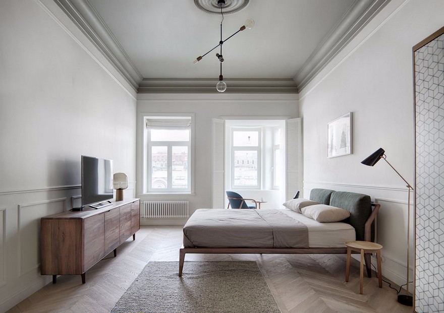
Whitworth Locke Hotel in Manchester, England / Grzywinski Pons
2019-04-09 14:07
Project: Whitworth Locke Hotel Architecture and Interior Design: Grzywinski Pons Location: Manchester, England Year 2018 Photography: Nicholas Worley
项目:Whitworth Locke酒店建筑和室内设计:Grzywinski Pons地点:英格兰曼彻斯特2018年摄影:尼古拉斯·沃利
Description by Grzywinski Pons: Whitworth Locke is a 160 room hotel with a bar, cafe, lounge and co-working space at the ground floor that we designed in Manchester, England. This adaptive reuse project was an addition, complete gut renovation and comprehensive fit out of a collection of three linked buildings on an island site in Central Manchester with elevations on Princess Street, Whitworth Street, and the Rochdale Canal.
Grzywinski Pons描述:Whitworth Locke是一家160个房间的酒店,我们在英国曼彻斯特设计了一个酒吧、咖啡厅、休息室和合作办公空间。这个适应性的再利用项目是一个额外的,完全的肠道翻新和综合适合的三个连接的建筑物在曼彻斯特中部的一个岛屿地点与海拔公主街,惠特沃斯街和罗切代尔运河。
The Whitworth Locke hotel is comprised of three linked blocks, Heritage assets all, that were built in separate phases: Central House, Dominion House and Johnson House. This commission had special resonance for us as the beautiful former textile warehouses and showroom were highly reminiscent of some of the earliest work we did designing interventions to 19th century masonry buildings — functional and stylistic contemporaries to these Mancunian structures — in our native New York City. The proportions, materials, textures and quality of light we inherited felt a bit like home and demanded to be exalted.
惠特沃斯洛克酒店是由三个相连的街区,遗产资产,这些都是建立在不同的阶段:中央大厦,自治领大厦和约翰逊大厦。这个委员会给我们带来了特别的共鸣,因为美丽的前纺织品仓库和陈列室让我们想起了我们设计19世纪砖石建筑的一些最早的工作-这些曼库尼亚建筑的功能和风格同时代的人-在我们的家乡纽约市。我们继承的光的比例、材料、质地和质量感觉有点像家,需要提高。
Our alteration of the property was principally driven by the intent to preserve and celebrate the richness of the historic 19th Century building fabric whilst obliterating a poor previous alteration to the building from the 1980’s, all while creating a distinct new language commensurate to the new life and purpose we hoped to foster within. We paid special attention to the thresholds into the building and the dialogue between our interventions and the beauty of the Victorian blocks.
我们对这座建筑的改造主要是为了保护和庆祝19世纪历史建筑结构的丰富性,同时抹掉了20世纪80年代以来对这栋建筑进行的一次糟糕的改造,同时创造了一种与我们希望促进的新生活和目标相适应的独特的新语言。我们特别注意建筑物的门槛,以及我们的干预措施与维多利亚时代街区之美之间的对话。
At the center of the three blocks we removed previous alterations and simplified the glazed barrel volume of the atrium to maximize transparency of the assembly and in turn reestablish the vestigial visibility of the elevations of Central and Dominion Houses on to what was formerly a little road called Galbraith Street. We finished the structure in color we found tonally close to Manchester skies, and as such regressive, deferential to the both the prominence of the historic facades and all we designed within. We put in a floor — contiguous both inside and out — of granite block pavers that draws in passerby and guests alike, the new life and conviviality clearly legible to the street. These choices set the stage for our larger approach of maximizing light, texture and crafting an interior throughout that extolled the virtue of the heritage assets via studied contrast.
在这三个街区的中心,我们删除了以前的改动,简化了中庭的玻璃桶体积,以最大限度地提高集会的透明度,进而重建中央和自治领住宅高地的残留能见度,这些高地以前叫做加尔布雷斯街(Galbraith Street)。我们完成了结构的颜色,我们发现接近曼彻斯特天空,并作为这样的倒退,尊重两个突出的历史外观和所有我们设计的内部。我们在里面和外面都有一块紧邻的地板-花岗岩砌块铺路,吸引着路人和客人,街道上的新生活和欢乐是显而易见的。这些选择为我们最大限度地利用光线、纹理和内部结构的更大方法奠定了舞台,通过研究对比来赞美遗产资产的优点。
Our aim in fostering tension between our new interiors and the stolid bones of the Victorian fabric was for one to exalt the other. We seized upon a palette and language inspired by research into vintage visual communications promoting commercial industrial links that historically connected Manchester to far flung (and often warmer and brighter) corners of the globe. We loved the link between Merseyside and the equatorial, and as we designed most of the furniture and all of the joinery in the project, we took this as inspiration for both material and formal choices.
我们的目标是,在我们的新内饰和维多利亚时代的坚韧不拔的骨骼之间促进紧张,我们的目标是让另一个提升。我们抓住了一种调色板和语言,灵感来自对老式视觉通信的研究,这些研究促进了商业工业的联系,这些联系历史上将曼彻斯特与地球上遥远的角落(往往更温暖、更明亮)联系在一起。我们喜欢默西塞德和赤道之间的联系,当我们设计了项目中的大部分家具和细木工时,我们把这作为对材料和形式选择的启发。
We designed the lighting and crafted the palette of warm materials and tones that at once envelop occupants and maximize the impact of the texture and rustication we both discovered and created throughout the property. We like to think we were just deferential enough to the heritage and beauty of the existing buildings, but there is an unabashedly new and bold language to the Whitworth Locke project. This conspicuous evolution reflects the way Manchester continues to grow and change. We hope our addition to this city can catalyze the dynamism we found up North that so inspired us.
我们设计了照明,并制作了温暖的材料和色调的调色板,这立刻包围了居住者,并最大限度地影响了纹理和乡村的影响,我们都发现和创造了整个物业。我们喜欢认为我们只是对现有建筑的遗产和美丽给予足够的尊重,但对于惠特沃斯洛克项目,我们有一种毫不掩饰的新的大胆的语言。这一引人注目的演变反映了曼彻斯特继续增长和变化的方式。我们希望我们对这个城市的加入能够促进我们发现的北方的活力,这给我们带来了极大的鼓舞。
 举报
举报
别默默的看了,快登录帮我评论一下吧!:)
注册
登录
更多评论
相关文章
-

描边风设计中,最容易犯的8种问题分析
2018年走过了四分之一,LOGO设计趋势也清晰了LOGO设计
-

描边风设计中,最容易犯的8种问题分析
2018年走过了四分之一,LOGO设计趋势也清晰了LOGO设计
-

描边风设计中,最容易犯的8种问题分析
2018年走过了四分之一,LOGO设计趋势也清晰了LOGO设计


