Studio Vara creates modern Palo Alto house 工作室VARA创建现代PaloAltoHouse
2019-08-07 16:12
This new home for a family of five in Palo Alto is the brainchild of San Francisco based Studio Vara. Photography: Matthew Millman
Creating a generous home for a 5-strong family in a relatively compact site, full of constraints – such as zoning laws and neighbour’s rights of light – is a considerable challenge for any architect. However, it is one that Studio Vara took in their stride, when tasked with a similar project by a young Palo Alto couple.

在一个相对紧凑的地方,为一个5岁的家庭创造一个慷慨的家园,充满了限制,比如分区法律和邻居的光权利,对任何建筑师来说都是一个相当大的挑战。然而,当一个年轻的帕洛阿尔托对一个类似项目的任务时,工作室VARA在他们的步幅中占据了一席之地。
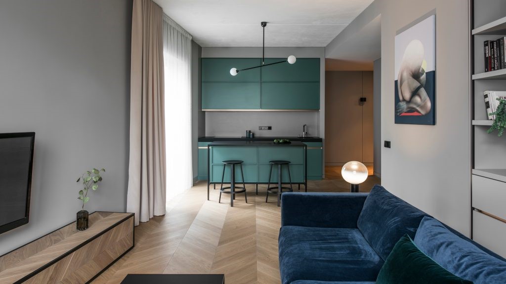
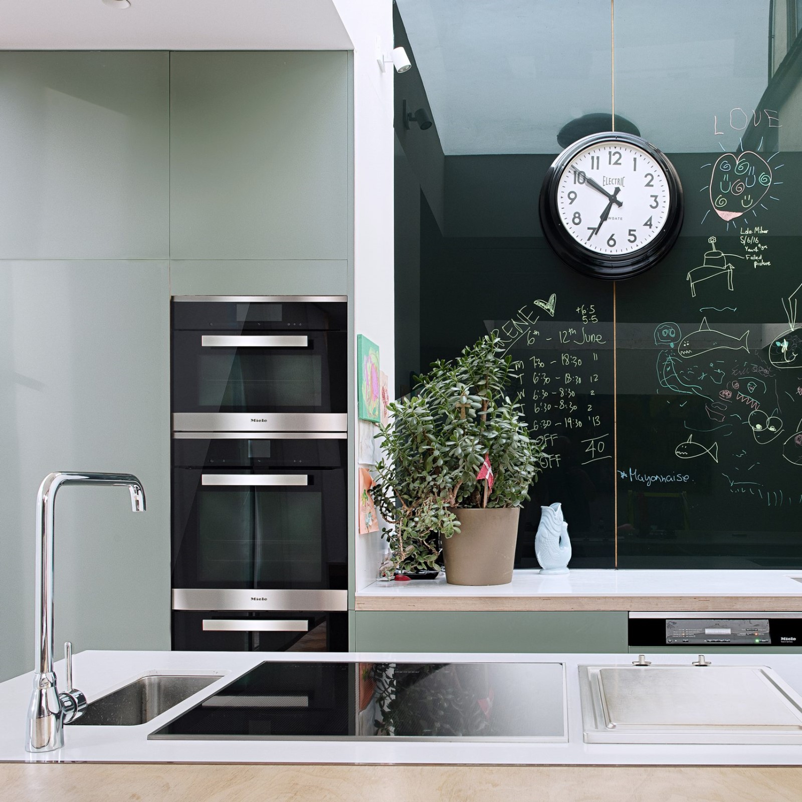
The San Francisco based architects were ‘challenged to squeeze in a generous kitchen, living room, six bedrooms and seven bathrooms, plus a family room, office, gym and wine room into this tight envelope’, explains the team, headed by Maura Fernandez Abernethy and Christopher Roach. Situated in a prominent corner plot of the Old Palo Alto neighbourhood, the residence is placed on the site’s outermost corner, in order to preserve the rear yard for breathing space and garden.

旧金山的建筑师们被要求挤进一个宽敞的厨房、客厅、六间卧室和七间浴室,再加上一间家庭房、办公室、健身房和红酒室,这是由莫拉·费尔南德斯·阿伯内西(Maura Fernandez Abe Nethy)和克里斯托弗·罗奇(Christopher Roach)领导的团队。位于老帕洛阿尔托街区的一个显眼的角落,住宅被放置在遗址最外面的角落,以保护后花园的呼吸空间和花园。
The ground level centres on a small, open air courtyard. This move, not only helps flood the interior with light, enhancing the open plan’s airy feel, but also helps to blur the boundaries between inside and outside, bringing a little bit of the lush garden foliage in. Around it flows a sequence of kitchen, dining, and living areas.

地面的中心是一个小的露天庭院。这一举动,不仅有助于让室内透光,增强开放式设计的通风感,而且还有助于模糊内外的界限,带来一点郁郁葱葱的花园树叶。它周围有一系列厨房、餐厅和生活区。
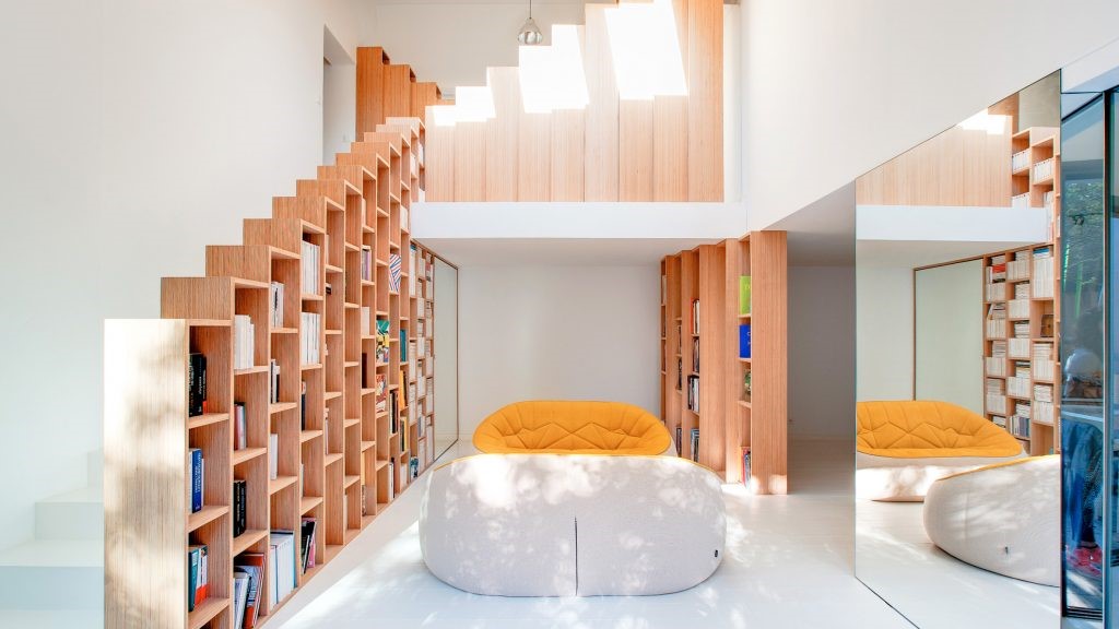
A slender, transparent staircase leads up to the first floor, where bedrooms and bathrooms are located, in a more conventional series of independent spaces. A basement, generously lit by light wells and openings, completes the living spaces, hosting a family room, an exercise room and a guest bedroom. Combining comfort and lightness, the architects focused on finding the right balance between open and closed areas, different materials and volumetric compositions throughout the design.

一个纤细透明的楼梯通向一楼,在那里卧室和浴室位于一个更传统的独立空间系列。地下室,明亮的水井和洞口照明,完善的生活空间,容纳一个家庭房间,一个锻炼室和一个客人的卧室。结合舒适和轻盈,建筑师集中在找到适当的平衡开放和封闭的地区,不同的材料和体积组成的整个设计。
‘From the street, the house appears to hover lightly above the ground, the effect of slightly elevating the first floor above grade and recessing the basement below decks and wing walls around the perimeter,’ says the team. ‘Overall, the exterior reads as a composition of stacked volumes, an effect that is emphasized by giving each level a unique primary material: board-formed concrete for the basement, cedar and larch siding for the main level, and dark panelised zinc for the top floor.’ §

研究小组说:“从街道上看,这座房子似乎在地面上空轻轻盘旋,其效果是将一楼稍微抬高了一层以上,并在周围甲板和机翼墙下将地下室凹了下来。”总的来说,外部是由堆叠的体积组成的,这种效果是通过给每一层提供一种独特的主要材料来强调的:地下室用板状混凝土,主层是雪松和落叶松墙板,顶层是深色嵌板锌。
 举报
举报
别默默的看了,快登录帮我评论一下吧!:)
注册
登录
更多评论
相关文章
-

描边风设计中,最容易犯的8种问题分析
2018年走过了四分之一,LOGO设计趋势也清晰了LOGO设计
-

描边风设计中,最容易犯的8种问题分析
2018年走过了四分之一,LOGO设计趋势也清晰了LOGO设计
-

描边风设计中,最容易犯的8种问题分析
2018年走过了四分之一,LOGO设计趋势也清晰了LOGO设计


 PintereAI


