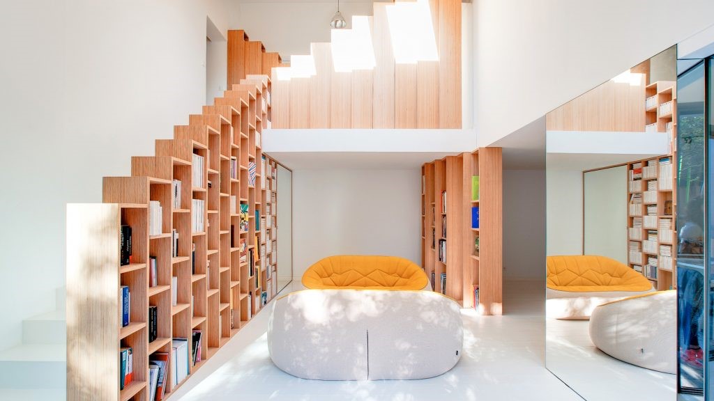
1960s home updated to create the contemporary Bent Annexe by BENT Architecture 20世纪60年代家庭更新以创建当代Bent Annexe的Bent建筑
2019-08-05 17:58
In the mid-century neighbourhoods of Melbourne, Australia, a lovely old 1960s home called Bent Annexe has received a stylish updating by BENT Architecture that has brought it into the contemporary age in terms of architectural design and style.
在澳大利亚墨尔本的20世纪中期,一个可爱的20世纪60年代的老房子名为Bent Annexe,它受到了Bent建筑的时尚更新,这使得它在建筑设计和风格方面进入了当代时代。
The primary change in the home is an extension that was directly inspired by the layout and concept of a traveling caravan. The home is fortunate enough to already be surrounded by lush greenery from the natural environment around it and the installation of wonderfully large floor to ceiling windows draws in abundant amounts of natural light. These are partially intended to provide light and lovely views, but they’re also part of an energy efficient system in the home based on passive solar principles.
在家庭的主要变化是一个扩展,这是直接启发的布局和概念的旅行商队。这所房子很幸运,它周围的自然环境已经被茂密的绿色植物包围了,安装了非常大的地板到天花板的窗户,吸引了大量的自然光。它们的部分目的是提供光线和美丽的景观,但它们也是基于无源太阳能原理的家庭节能系统的一部分。
The extension was built for the new owners who recently purchased the original home; a young family of four with two dogs and a huge love for all things outdoors. This partially influenced designers’ choices to incorporate as much sunlight and blending of indoor-outdoor space as possible. They also prioritized an improvement on ventilation than what the original midcentury home had to offer.
扩建工程是为新主人建造的,他们最近购买了原来的房子;一个四口之家,带着两只狗,以及对户外一切事物的巨大热爱。这在一定程度上影响了设计师将尽可能多的阳光和室内-室外空间融合在一起的选择。他们还将改善通风状况列为优先事项,而不是最初的世纪中叶住宅所能提供的。
In the new iteration of the home, the primary living spaces of the house now sit in the addition or new annexe. This left increased space elsewhere in the house for more diverse and flexible use, so designers took the opportunity to update parts of the existing dwelling to take better advantage of that space.
在新的住宅迭代中,房屋的主要居住空间现在位于新增的或新的附件中。这使得房子的其他地方有了更多的空间供更多样化和更灵活的使用,因此设计师们抓住机会更新了现有住宅的部分,以更好地利用这一空间。
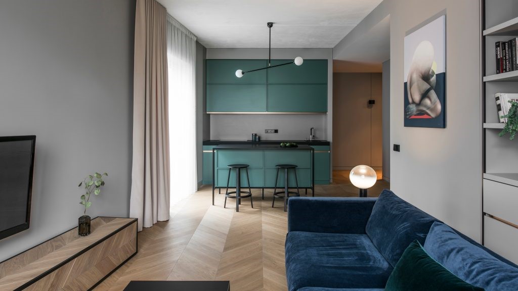
As a result of these updates, the finished house now has much larger bedrooms than before, a large family bathroom, and a whole second living space that functions more as a casual family and media room than a formal living room. The larger, new living spaces sit further towards the original backyard and garden, but the annexe doesn’t take up so much space as to consume the home’s entire available outdoor area.
由于这些更新,完工后的房子现在有比以前大得多的卧室,一个很大的家庭浴室,还有一个完整的第二个起居空间,它更像是一个休闲的家庭和媒体室,而不是一个正式的客厅。更大的,新的居住空间位于更远的原来的后院和花园,但附件没有占用那么多的空间,以消耗家庭的整个可用的户外区域。
Instead, designers put in great effort to make the annexe actually feel like part of the garden. They blended it, rather than just popping it in the middle, by creating new green spaces on both sides around it. Now, the green space down one side of the annexe juts inward to separate the original building from the far wall of the addition, creating a sort of calming inner courtyard.
相反,设计师们付出了巨大的努力,让附件看起来像花园的一部分。他们把它混合在一起,而不仅仅是把它放在中间,在它周围的两边创造新的绿色空间。现在,沿着附件一边的绿色空间向内突出,将原来的建筑与远处的附加墙分开,形成了一种平静的内部庭院。
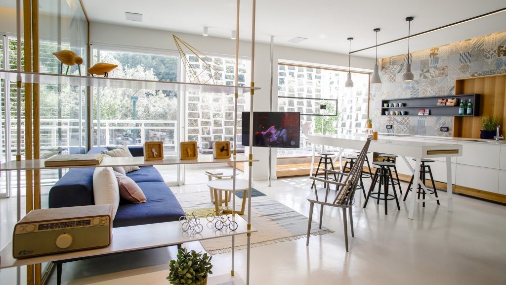
This courtyard is an enjoyable place to spend time together outside for the owners and their family, but it also serves practical functions for the home. Now, the master bedroom has an extra outer wall with large windows that give it much more natural light, as do both of the living areas. These huge windows create the illusion of continuous space, which lets them feel blended with the greenery outside, making them feel spacious and welcoming.
这个庭院对业主和他们的家人来说是一个愉快的外出消磨时间的地方,但它也为家庭提供了实用的功能。现在,主卧室有一堵额外的外墙,窗户很大,这给了它更多的自然光,就像两个生活区一样。这些巨大的窗户创造了连续空间的错觉,让他们感到与外面的绿色植物融为一体,使他们感到宽敞和亲切。
In order to make sure that the house doesn’t let is so much light as to get too hot, designers also installed a built-in shading system over several of the largest glass encasements. This is where the caravan inspired element is perhaps the most visually apparent; these retractable shading devices create cool spaces on the deck and outdoor dining area while also working with the louver style windows and thermal mass concrete floors to passively heat or cool the house at large.
为了确保房子不让光线太热,设计师还在几个最大的玻璃外壳上安装了内置遮阳系统。这可能是大篷车灵感元素在视觉上最明显的地方;这些可伸缩的遮阳装置在甲板和室外餐厅区域创造了凉爽的空间,同时还与百叶窗和热大体积混凝土地板一起工作,以被动加热或冷却整个房子。
 举报
举报
别默默的看了,快登录帮我评论一下吧!:)
注册
登录
更多评论
相关文章
-

描边风设计中,最容易犯的8种问题分析
2018年走过了四分之一,LOGO设计趋势也清晰了LOGO设计
-

描边风设计中,最容易犯的8种问题分析
2018年走过了四分之一,LOGO设计趋势也清晰了LOGO设计
-

描边风设计中,最容易犯的8种问题分析
2018年走过了四分之一,LOGO设计趋势也清晰了LOGO设计


 PintereAI


