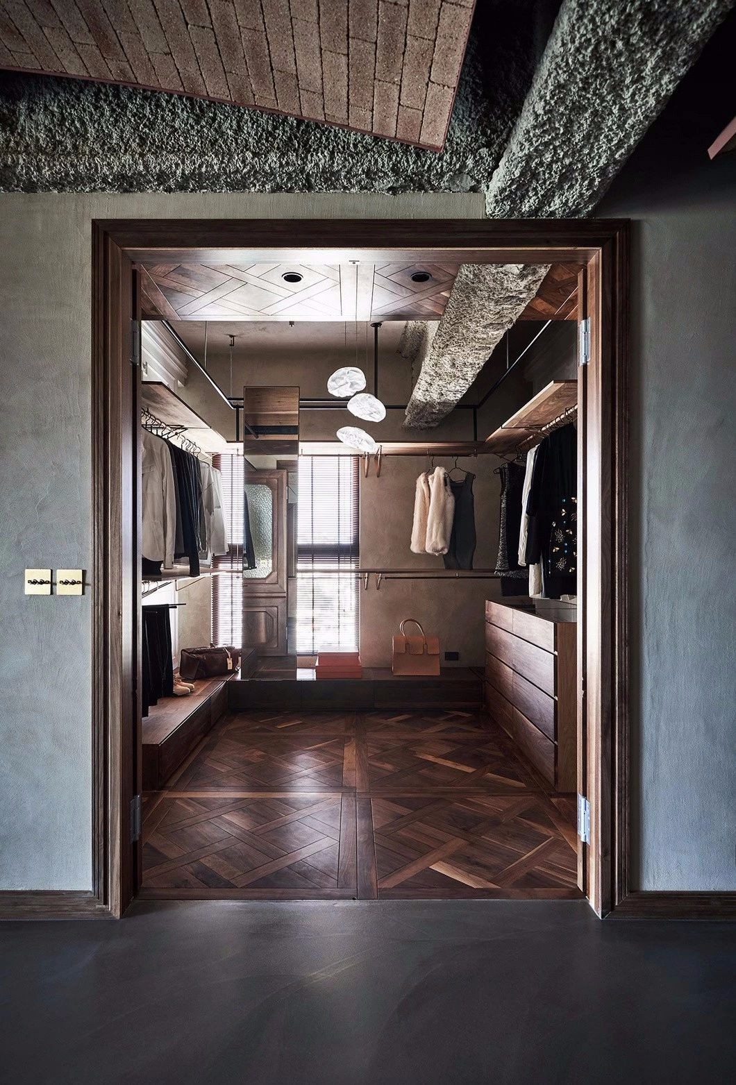
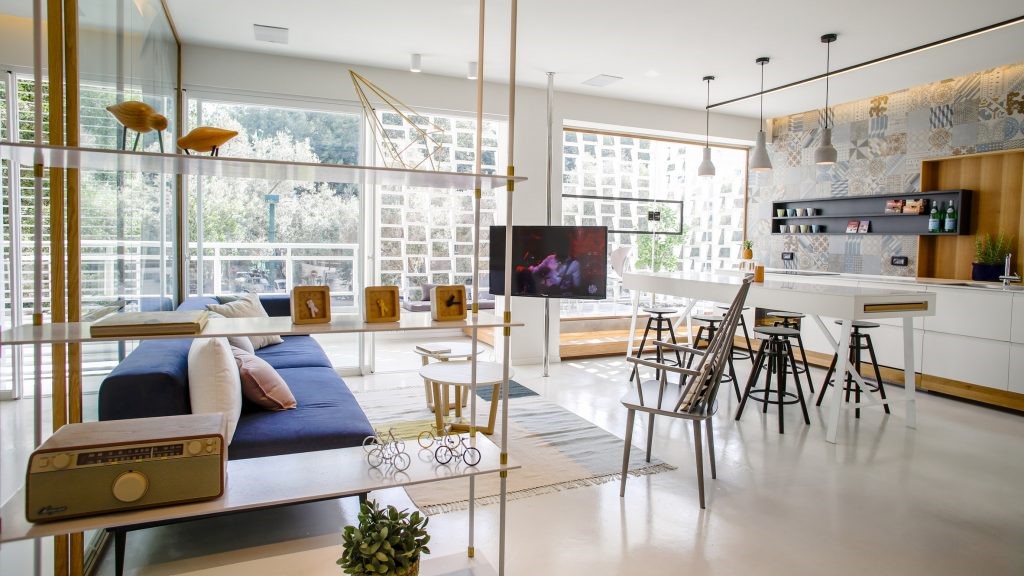
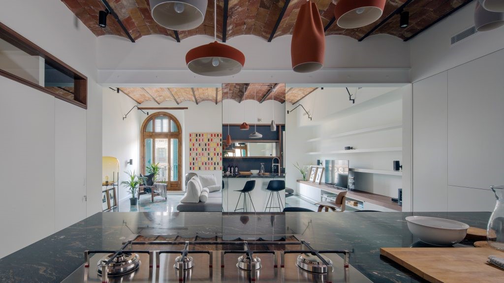
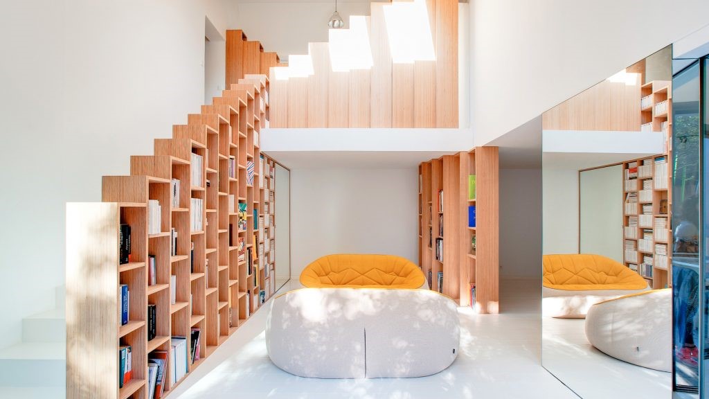
Sigar Bespoke Menswear Store, Foshan, Guangdong Province, China
2019-08-05 17:10
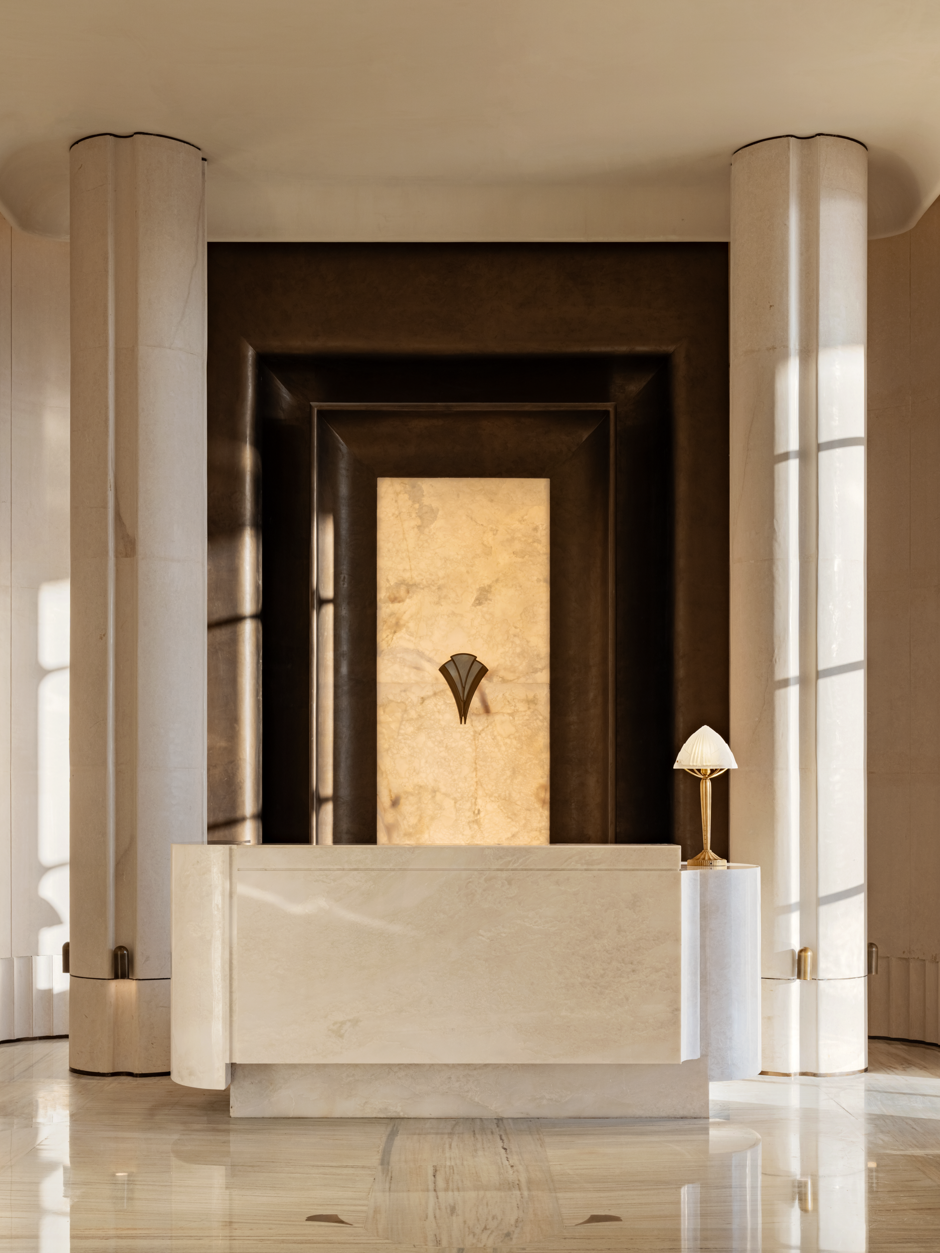
Designers Chen Xiejin and Wen Wei of Construction Union have created a smoothly masculine bespoke menswear store, Sigar Bespoke, in their home town of Foshan, China.
建筑工会的设计师陈喜进和文伟在他们的家乡佛山创建了一家男装店,名叫西加·贝斯波克(SigarBespoke)。
With its dark, hard and sleek ambiance, the two-level, 110 square-metre (1184 sq. ft) store covers some familiar gentlemen’s store clichés.

它的黑暗,坚硬和光滑的氛围,两层,110平方米(1184平方米).英国“金融时报”(FT)商店覆盖了一些熟悉的绅士店陈词滥调。
But by focusing on the limitations and possibilities of the existing space and on displaying the suiting itself, and by aiming for a modern look, they’ve managed to bypass the antiques-and-dark-leather-chairs obsession of many a gentlemen’s store.

但是,通过关注现有空间的局限性和可能性,以及展示适合自己的空间,通过追求现代的外观,他们成功地绕过了许多绅士商店对古董和深色皮椅的痴迷。
With the suiting fabric being the critical starting point of every bespoke suit, the designers took their inspiration from the weaving of fabric, textile manufacturing and the textures of fabric.

以适合的面料为每个定制服装的关键起点,设计师们从面料的编织、纺织制造和面料的纹理方面得到了灵感。
Crisscrossing metalwork simulates textile weave, surfaces textures imitate fabric and bent sheets of metal imitating fabric coming off a loom create curving walls.

纵横交错的金属制品模拟织物编织,表面纹理模仿织物,仿织物的弯曲薄片从织机上产生弯曲的壁。
As the newly established brand’s design budget was limited and massive changes in the space were out of the question, the designers made the most of the existing features.

由于新建立的品牌的设计预算有限,空间上的巨大变化是不可能的,设计师们充分利用了现有的特色。
For example, in the long and narrow middle space, there are stairs right in the middle.

例如,在狭长的中间空间,中间有楼梯。
The designers made the staircase a dividing partition of the entire space and separated the staircase itself from the rest of the store with heavy, flowing drapery.

设计师们将楼梯划分成整个空间的分隔部分,并用厚重流畅的窗帘将楼梯本身与商店的其他部分隔开。
They also made the most of the windows situated at varying heights and used mirrors to create reflections and to evoke a sense of additional space. Tuija Seipell.

他们还充分利用了位于不同高度的窗户,并使用镜子来产生反射,并唤起一种额外的空间感。托伊亚·塞佩尔。
 举报
举报
别默默的看了,快登录帮我评论一下吧!:)
注册
登录
更多评论
相关文章
-

描边风设计中,最容易犯的8种问题分析
2018年走过了四分之一,LOGO设计趋势也清晰了LOGO设计
-

描边风设计中,最容易犯的8种问题分析
2018年走过了四分之一,LOGO设计趋势也清晰了LOGO设计
-

描边风设计中,最容易犯的8种问题分析
2018年走过了四分之一,LOGO设计趋势也清晰了LOGO设计


 PintereAI


