Monoarchi office renovation, Shanghai, China
2019-08-05 15:12
Too often, we see office, residential, hospitality and retail design where the designer seems to have been unable to stop.
通常,我们看到办公室、住宅、酒店和零售设计,设计师似乎无法停止。
Perhaps it is our minimalist sensibilities, but much of the time, we get the feeling that half of what’s there is superfluous, not necessary, not adding anything. And all that excess takes attention away from whatever good features there are. It’s just visual noise, distraction upon distraction.
也许这是我们极简主义的情感,但大部分时间,我们感觉到一半的“S”是多余的,不是必要的,而不是增加任何东西。所有多余的东西都会引起人们的注意,不管那里有什么好的特征。只是视觉噪音,注意力分散注意力分散。
So, whenever we see a clear idea executed boldly, we pay attention. Such is the case with Monoarchi’s Shanghai office.
所以,每当我们看到一个清晰的想法被大胆地执行,我们就会注意。Monoarchi在上海的办事处就是这样。
Monoarchi is an architecture firm based in Shanghai and Rotterdam.
Monoarchi是一家总部位于上海和鹿特丹的建筑公司。
The three founders, Xiaochao Song, Keming Wang and Nan Zhou, each have multiple degrees from European, Canadian and Chinese universities, and varied interests in architecture, urban planning, cultural history, revitalization and preservation.
这三位创始人宋晓超、王克明和南周各有欧洲、加拿大和中国大学的多个学位,在建筑、城市规划、文化史、振兴和保护方面有着不同的兴趣。
It is no wonder, then, that their own new office in Shanghai is an example of careful and considered restoration.
因此,毫不奇怪,他们在上海的新办公室是一个谨慎和深思熟虑的修复的例子。
The 100 square-metre (1,076 sq.ft) office is located on the ground floor of a building with real history – a 1940s villa in the French Concession.
100平方米(1,076平方英尺)的办公室位于具有真实历史的建筑的底层,这是一个1940年代法国特许权的别墅。
For nearly 100 years, this residential area was under French control that ended with World War II.
近100年来,这个住宅区在法国的控制下结束了第二次世界大战。
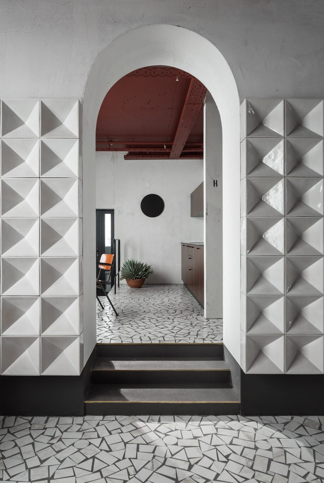
Monoarchi took its cues from the arches prevalent in the area and then had the courage to not over-design.
Monoarchi从该地区盛行的拱门中提取线索,然后有勇气不过度设计。
We love the graphic emphasis of the arched form achieved by black steel bars. Contrasting these black lines against the solid grey concrete of the vaulted doorways, walls and floors creates a crisp structure.
我们喜欢用黑色钢筋实现的拱形形式的图形强调。将这些黑线与拱形门道的实心灰色混凝土对比,墙壁和地板形成了一个酥脆的结构。
The small space looks larger than it is because of this pared-down inventory of ideas, and seems to accommodate everything easily.
小的空间看起来比它要大,因为这个减少了的想法清单,而且似乎很容易适应所有的东西。
They needed working space for eight staff and display areas for work in progress and prototypes. By leaving much of the space undesignated to any one particular function, they have achieved flexibility while avoiding the dreaded look of an open-plan office. Tuija Seipell.
他们需要为8名工作人员和展示区提供工作空间,以取得进展和原型。通过留下许多未被指定给任何一个特定功能的空间,它们已经达到了灵活性,同时避免了一个开放计划办公室的可怕外观。TuijaSeiell。
 举报
举报
别默默的看了,快登录帮我评论一下吧!:)
注册
登录
更多评论
相关文章
-

描边风设计中,最容易犯的8种问题分析
2018年走过了四分之一,LOGO设计趋势也清晰了LOGO设计
-

描边风设计中,最容易犯的8种问题分析
2018年走过了四分之一,LOGO设计趋势也清晰了LOGO设计
-

描边风设计中,最容易犯的8种问题分析
2018年走过了四分之一,LOGO设计趋势也清晰了LOGO设计


 PintereAI


