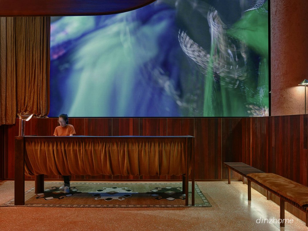
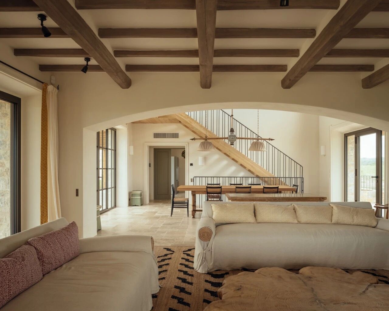
Sleek, open concept Business Center Binet created by AZC Architectes using minimalist values, concrete, and wood to create a multipurpose space 使用简约值、混凝土和木材创建一个多用途空间的由AZC建筑公司创建的时尚、开放概念商务中心Binet
2019-07-17 15:33
In a historic neighbourhood located just northwest of Paris’s 18th arrondissement in France, AZC Architectes has finished the stunningly minimalist Business Center Binet, presenting those who use it with nearly endless spacial possibilities.
在法国巴黎第18区西北的一个历史街区,AZC建筑公司完成了极简主义的商务中心比内,给那些使用它的人提供了几乎无穷无尽的空间可能性。
The centre is located in the Porte de Montmartre neighnourhood, bordering the stunning town of Saint-Ouen. Freshly renovated in several areas and capacities, the place where the new business centre sits is part of an extensive urban renewal project taken on by the city of Paris in order to better facilitate modernizing changes to its historical local architectural fabric.
中心位于蒙马特港附近,毗邻令人叹为观止的圣欧恩镇。新商业中心所在的地方在几个地区和能力上进行了新的翻修,这是巴黎市为更好地促进对其历史上当地建筑结构的现代化变革而开展的一个广泛的城市重建项目的一部分。
In fact, this is actually one of the several projects that were named priority in its particular location! This business large complex was created to provide a brand new home for up to 59 businesses. Alongside those premises, it also features shared spaces like communal areas, a large multi-purpose hall, a fully equipped conference room, and a cafeteria. There are even 33 easily accessible underground parking spots!
事实上,这实际上是在其特定位置被命名为优先级的几个项目之一!这个大型的商业综合体是为了为多达59家企业提供一个全新的家。除这些场所外,还设有公共区域、大型多用途大厅、配备齐全的会议室和自助餐厅等共享空间。甚至有33个容易到达的地下停车场!
Besides providing new (or newly moved) businesses with flexible, modern, and diverse spaces to work out of, the goal with this business complex was to provide a structure for local businesses that is actually sustainable. The building’s solid facade and simple but sophisticated interior communicates a certain quality of life and business and takes fantastic advantage of available space.
除了提供具有灵活、现代和多样化空间的新(或新移动)业务之外,该业务复杂的目标是为本地企业提供实际上可持续的结构。建筑的实体立面和简单但复杂的内部传达了一定的生活质量和商业,并充分利用了可用空间。
Most spots up for grabs to businesses are generously open in their arrangement and concept. Many offer terraces and uniquely shaped workspaces, with spots for individualized tasks and collaborative efforts. At the same time as it offers several things that are practically useful for a workplace, the building also gives employees and clients there breathtaking views and carefully landscaped green spaces that contrast in a lovely way with the still quite urban setting in which the building sits.
对于企业来说,大部分的位置在其安排和概念上都是慷慨开放的。许多提供平台和独特的形状的工作空间,为个性化的任务和协作努力的地点。在提供一些对工作场所有实际意义的东西的同时,这座大楼还为员工和客户提供了令人叹为观止的景观和精心美化的绿地,这与这栋建筑所在的仍然十分都市的环境形成了鲜明的对比。
In terms of its actual layout, the building turns at a right angle into a sort of L-shape, letting it run parallel to two different roads. This shape affords it more window spaces in each business premises, making the rooms bright and well lit no matter where they’re located within it. Large, spacious hallways are featured right from the ground floor upwards, with elevators easily accessible, central, and simple to find on each floor so that movement through the building is simple and flows well.
根据它的实际布局,建筑物以一个直角变成一种L形,让它平行于两条不同的道路。这种形状为每个商务场所提供了更多的窗口空间,使房间无论位于何处都明亮。大型宽敞的走廊从底层一直延伸到上面,电梯在每一层都很容易到达、中央和简单,因此通过建筑物的运动是简单的,流动的很好。
The building also offers a certain level of welcoming, contemporary transparency throughout the floors, where the fronts of most office and work spaces are comprised of stunning, glazed floor to ceiling windows just as tall as those on the outside of the building letting daytime pour in. This lights flow throughout the whole building itself, traveling through the rooms rather than hitting them all individually and differently but then being collected and left to sit still in the interior of each.
该建筑还提供了一定程度的欢迎,包括整个地板上的现代透明,其中大多数办公室和工作空间的前部由令人惊叹的玻璃地板和天花板窗户组成,就像建筑外部的屋顶一样高,让白天倾倒。这光线在整个建筑本身中流动,穿过房间,而不是单独地和不同地撞击它们,然后被收集并留在各自的内部。
In fact, the emphasis on natural sunlight and its flow was so high on the designers’ lists when they began planning the new business centre that it was actually listed as being inspired by the concept of building a “daylight factory”! The clean, simple materiality inside lets sunlight bounce off polished concrete floors and warm smooth, light wood in a way that gives each space plenty of character before they’re even occupied and furnished by a business.
事实上,设计师们开始规划新的商业中心时,对自然阳光及其流动的重视是如此之高,以至于它实际上被列为是受建造“日光工厂”概念的启发!内部干净、简单的物质让阳光从抛光的混凝土地板上反弹,温暖的光滑的轻木,使每个空间在被企业占用和提供之前都有足够的特性。
This heavy emphasis on maximizing the amount of sunlight that reaches an interior space is actually one of the main ways the business centre displays its little bit of Westernized influence, since that’s actually a North American architectural priority. In other places, however, the building is still distinctly European, as can be seen in the fact that it’s topped by a sunny, quiet rooftop terrace, something that isn’t as common across the pond from Paris and its outlying towns.
这一重点在于最大化到达内部空间的阳光的量实际上是商务中心显示它对西化影响的小一点的主要方式之一,因为这实际上是北美的建筑优先事项。然而,在其他地方,这座建筑仍然是很明显的欧洲,正如人们可以看到的那样,它的顶部是一个阳光明媚的屋顶露台,从巴黎和它的外围城镇穿过池塘,这一点并不常见。
CATEGORIES: Interior Design
 举报
举报
别默默的看了,快登录帮我评论一下吧!:)
注册
登录
更多评论
相关文章
-

描边风设计中,最容易犯的8种问题分析
2018年走过了四分之一,LOGO设计趋势也清晰了LOGO设计
-

描边风设计中,最容易犯的8种问题分析
2018年走过了四分之一,LOGO设计趋势也清晰了LOGO设计
-

描边风设计中,最容易犯的8种问题分析
2018年走过了四分之一,LOGO设计趋势也清晰了LOGO设计


 PintereAI


