Australian Maximus Offices created by Siren Design to give business consultants a dynamic, modern workspace 由Siren设计公司创建的澳大利亚Maximus办公室,为商业顾问提供一个动态的、现代的工作空间
2019-07-17 15:31
In the heart of Melbourne, Australia, innovative designers at Siren Design have recently completed an entire office wide renovation on the newly improved and wonderfully contemporary Maximus Offices!
在澳大利亚墨尔本的中心,Siren设计公司的创新设计师最近完成了整个办公室范围内的新改进和奇妙的当代极大值办公室的改造!
From the outset, the goal of this renovation was to improve the sense of space for employees. Company heads wanted their business management consultancy team to feel a sense of individuality even while the office itself bears several similarities with the Sydney location, for the sake of cohesiveness and brand consistency.
从一开始,这一翻新的目标是改善员工的空间感。公司负责人希望他们的企业管理咨询团队能感受到一种个性感,即使办公室本身与悉尼的位置有几处相似之处,这是为了保持凝聚力和品牌一致性。
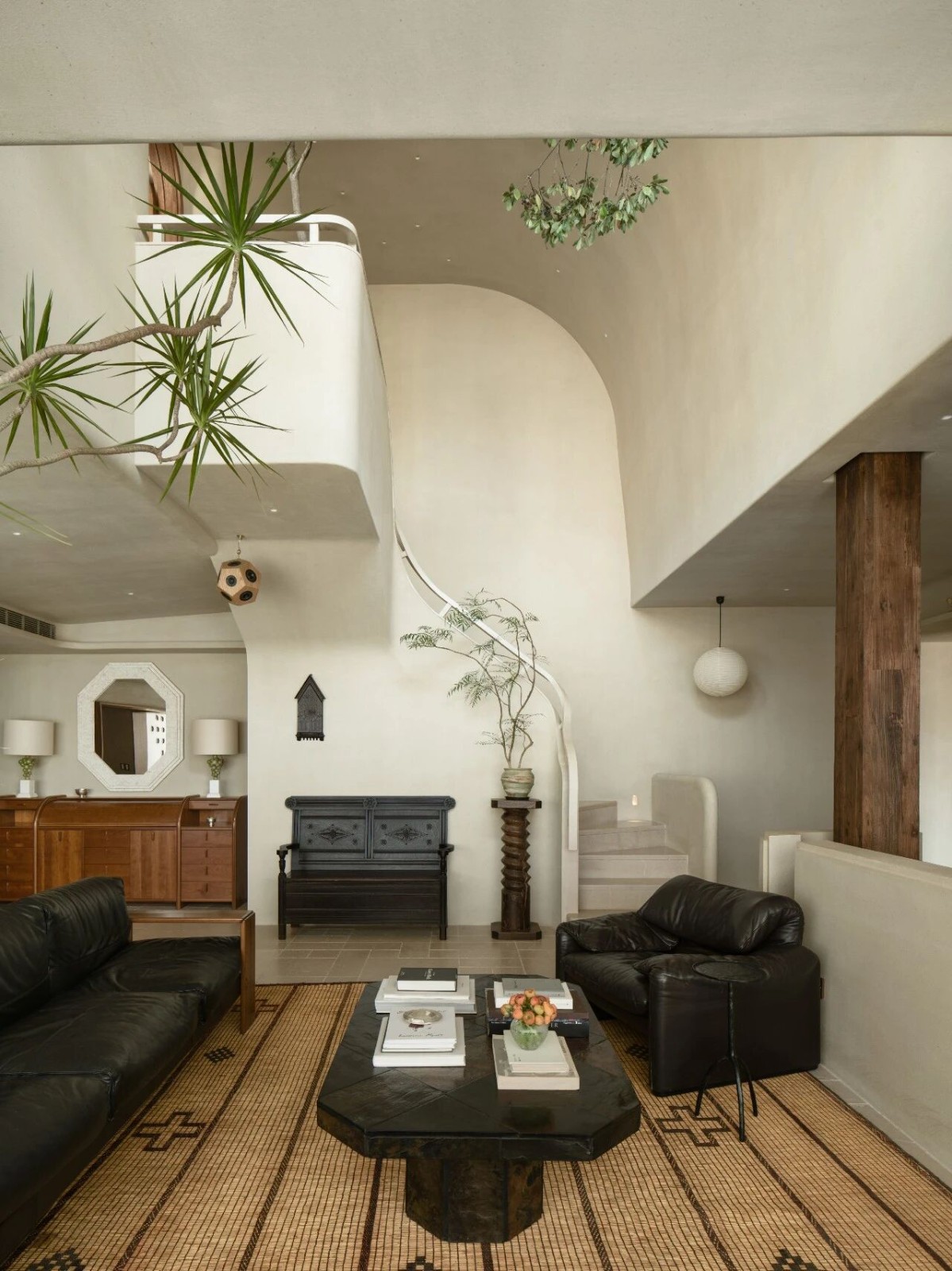
The first decision designers made was to open up the space completely, both in terms of its layout and in terms of its own framework. Now, the floor plan of each room is open concept and the “bones” of the building, in its supports, ceiling, frame, and details are visible in a way that, rather than looking unfinished, looks minimalist and modern industrial chic.
首先,设计者们在其布局方面和在其自身的框架方面,完全开放了空间。现在,每个房间的楼层平面都是开放的概念,建筑的“骨”在它的支撑、天花板、框架和细节上都是可见的,而不是看起来未完成,看起来是极简主义和现代的工业时尚。
Another update that had perhaps the biggest effect on employee moods and productivity was the decision to open up as much of each room as possible to ensure that just about every corner is flooded with natural sunlight. This contrast well with the raw elements of the redone building even as it lifts the spirits of those working in the offie and creates and inviting atmosphere typical of more modern office spaces in wider Melbourne.
另一项可能对员工情绪和工作效率产生最大影响的更新是,决定尽可能多地开放每个房间,以确保几乎每个角落都充满天然阳光。这与重新装修的建筑的原始元素形成了很好的对比,尽管它提升了那些在墨尔本工作的人的精神,创造和吸引了更多更现代的墨尔本办公空间的典型氛围。
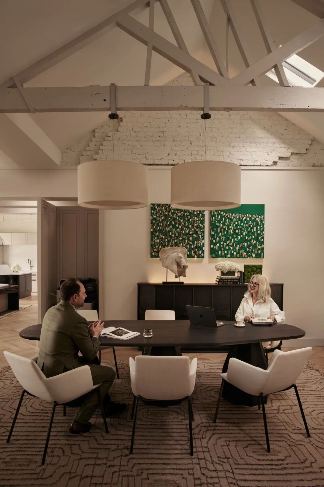
Another priority shift in the office’s redesign was the way designers opted to explore a sort of blurring of space and traditional boundaries between work spaces, break rooms, and the parts of an office that visitors would normally see. By amalgamating some of these things in one place, keeping designated areas but not closing them off, designers and company heads aimed to make the space more collaborative, friendly in its professionalism, diverse, and welcoming in the way the space works and flows. There’s also a touch of novelty here; now, visitors see some consultants at work to some degree, giving them a sort of “behind the scenes” sneak peek.
办公室重新设计的另一个优先事项是设计师选择探索一种模糊的空间和工作空间、休息室和访客通常会看到的办公室部分之间的传统界限。通过将其中的一些东西合并在一个地方,保留指定的区域,但不关闭它们,设计师和公司负责人的目标是使空间更加协作,更友好,更专业,更多样化,并欢迎空间的运作和流动方式。这里也有一点新奇之处;现在,游客们在某种程度上看到了一些顾问在工作,给他们一种“幕后”的偷窥。
Overall, the whole environment was created to feel relaxed. In the entryway, guests are immediately encountered with a welcoming space that, though separate for employee concentration, gives people an easy view into some of the collaborative workspaces. This immediate connection is great for outside collaboration as well as creativity.
总的来说,整个环境都是为了放松而创造的。在入口,客人会立即遇到一个欢迎的空间,虽然单独为员工的集中,让人们可以轻松地看到一些合作的工作空间。这种直接的联系对于外部合作和创造力都是很好的。
Increasing the option of collaborative spaces for the employees themselves was a huge priority as well. The first way in which the company decided to work towards this was by designing a shared cafe, situated near the entrance where guests might join. This space is also often used as a training zone for new employees, making it one of the most diversely used spaces in the whole office.
增加员工自己的合作空间也是一个巨大的优先事项。公司决定为此而努力的第一种方式是设计一家共享的咖啡馆,位于入口处附近,客人可以加入其中。这一空间也经常被用作新员工的培训区,使之成为整个办公室中使用最多的空间之一。
Now, as we mentioned, the Melbourne space is cohesive with the branding and style of the Sydney location, but it still has its own charm and individualized style, as influenced by its particular employees. Though company values and colour schemes are consistent between the two cities, the new Melbourne spot has a slightly more relaxed, almost residential feel. Where Sydney is rather sophisticated, Melbourne is built to make people feel a little bit more at home.
现在,正如我们所提到的,墨尔本的空间与悉尼位置的品牌和风格一致,但它仍然有自己的魅力和个性化的风格,受到其特定员工的影响。尽管公司的价值和配色方案在这两个城市之间是一致的,但新的墨尔本点稍微放松了一点,几乎是住宅的感觉。在悉尼相当复杂的地方,墨尔本是为了让人们在家里更有一点感觉。
 举报
举报
别默默的看了,快登录帮我评论一下吧!:)
注册
登录
更多评论
相关文章
-

描边风设计中,最容易犯的8种问题分析
2018年走过了四分之一,LOGO设计趋势也清晰了LOGO设计
-

描边风设计中,最容易犯的8种问题分析
2018年走过了四分之一,LOGO设计趋势也清晰了LOGO设计
-

描边风设计中,最容易犯的8种问题分析
2018年走过了四分之一,LOGO设计趋势也清晰了LOGO设计


 PintereAI


