The Arts District Loft by Marmol Radziner exudes simplistic creativity in the heart of Los Angeles
2019-03-15 17:38
Smack in the middle of The Arts District in sunny Los Angeles, California, stands a building that’s home to the Art District Loft, a recently completed project designed and carried out by Marmol Radziner.
在加利福尼亚州阳光明媚的洛杉矶艺术区的中央,矗立着一座建筑,是艺术区阁楼的所在地,这是一个最近由MarmolRadziner设计和实施的项目。
Within this project, designers altered a 2000 square foot condominium that was originally part of the Toy Factory Lofts. These were a residential initiative created in a 1924 warehouse in Downtown LA’s Art District. Within the alterations, designers removed many partitions in order to combine rooms and create more open concept spaces. One such room combination resulted in a beautiful master suite.
在这个项目中,设计师改变了一个2000平方英尺的共管公寓,原来是玩具工厂公寓的一部分。这是在1924年洛杉矶市中心艺术区的一个仓库里创建的一个住宅项目。在改造中,设计师移除许多隔断,以便将房间组合起来,创造更开放的概念空间。一个这样的房间组合导致了一个美丽的主套房。
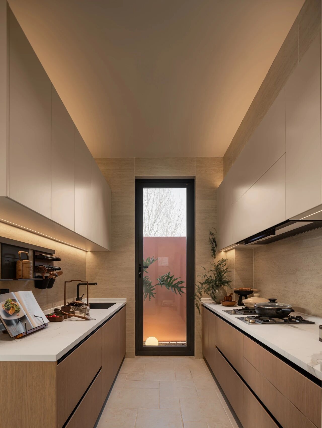
Besides the bedrooms, the living room was also reconfigured and fitted with new casework. Additionally, the kitchen, bathroom, and powder room were all renovated, just to make sure the entire loft got a bit of a contemporary update. Although designers wished to work with a much more open floor plan, they also aimed to create distinct areas for entertaining and socializing, making it easy for owners to have guests over.
除了卧室,起居室也进行了重新配置,并安装了新的个案工作。此外,厨房、浴室和化妆室都进行了翻修,以确保整个阁楼得到了一些当代的更新。虽然设计师们希望设计一个更开放的平面图,但他们的目标也是为娱乐和社交创造独特的空间,让业主更容易接待客人。
Builders chose to create a more flowing and cohesive feeling between the interior of the apartment and the street outside as well. This was done primarily through the installation of stunning floor-to-ceiling windows that are unlike anything the original lofts had featured previously.
建筑商选择在公寓内部和外面的街道之间创造一种更流畅、更有凝聚力的感觉。这主要是通过安装令人惊叹的地板到天花板的窗户来完成的,这些窗户与原来的阁楼不一样。
In order to keep things open, airy, filled with light, and flowing but also still give different areas a bit of distinction, furnishings and built-in features were used like markers. For example, a custom bookcase made with three bays that rotate 90 degrees each was placed strategically in order to mark the border between the living room and the master suite. When the bays are turned to open, natural light floods both spaces, but turning the case back closes the bedroom off a little more privately.
为了保持事物的开放,通风,充满光,而且流动,但仍然给予不同的地区一点区别,家具和内置的特点是使用像标记。例如,一个定制的书柜由三个转角各90度的书架战略性地放置,以标记起居室和主套房之间的边界。当海湾被打开时,自然的光线淹没了两个空间,但是把箱子转回去,卧室就会关闭一些私人空间。
The existing space is quite natural but industrial chic thanks to the use of concrete. This exposed material is used on the floor, walls, and ceiling, contrasting very well indeed with the inviting slightly more modern interior furnishings designers selected within the space. These are made up of an assortment of wood and metal finishes with interesting textures being prioritized. The contrast softens the space and warms the atmosphere up a little.
由于混凝土的使用,现有的空间很自然,但在工业上很别致。这种暴露的材料被用于地板、墙壁和天花板上,与空间中选择的更具吸引力的现代室内陈设设计师形成了非常好的对比。这些都是由各种木材和金属完成与有趣的纹理被优先排序。这种对比软化了空间,使大气变暖了一点。
A primarily grey colour palette helps to warm the space up as well! Black is also heavily featured to create even more contrast with the concrete and the result is comfortable to look at but also quite streamlined and sophisticated.
一个主要的灰色调色板有助于温暖的空间以及!黑色也是重量级的特点,创造了更多的对比与混凝土和结果是舒适的看,但也相当流线型和复杂。
Photographs by Jessie Webster
 举报
举报
别默默的看了,快登录帮我评论一下吧!:)
注册
登录
更多评论
相关文章
-

描边风设计中,最容易犯的8种问题分析
2018年走过了四分之一,LOGO设计趋势也清晰了LOGO设计
-

描边风设计中,最容易犯的8种问题分析
2018年走过了四分之一,LOGO设计趋势也清晰了LOGO设计
-

描边风设计中,最容易犯的8种问题分析
2018年走过了四分之一,LOGO设计趋势也清晰了LOGO设计


 PintereAI


