Apartment 67 EXE STUDIO
2011-05-29 00:00
架构师提供的文本描述。第67号公寓位于新贝尔格莱德的一个街区内。这是专为商学院的女学生设计的。公寓的所有表面都是白色的,强调黑色和绿色元素的对比。
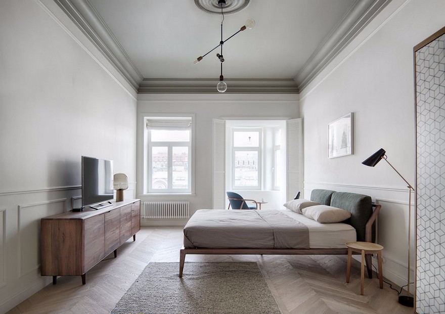
Text description provided by the architects. Apartment 67 is located in one of the New Belgrade’s blocks. It’s designed for a female student of business school. All surfaces in the apartment are rendered in white, emphasizing the contrast of black and green elements.
这个内部的中心元素是一个巨大的黑匣子,放在客厅和厨房之间,把这两个功能区隔开。一个多功能元件被用作电视机的一边站,另一个作为厨房元件的盖子,六角设计的元件穿透盒子。
The central element in this interior is a big black box, placed between the living-room and the kitchen, which separates these two functional zones. A multifunctional element is used as a TV stand on one side and the other as a cover for kitchen elements.Hexagonally designed elements penetrate the box.
这些元素被放置在墙上、天花板上和盒子上,它们连接在一个结构上。元素实际上有三种功能:货架、照明和面具。
These elements are placed on the wall, on the ceiling and on the box, which they connect in one structure. Elements actually have three functions: shelves, lighting and masks.
每一个具有照明功能的六边形元件都包含两个带有彩色滤光片的灯。一组这样的灯创造了特殊的戏剧效果和突出显示。这些效应可以改变整个公寓的氛围-从明亮而温暖的黄色光线到冷蓝色的光线。
Every hexagon element with lighting function contains two lamps with colored filters. A group of these lamps creates special dramatic effect and highlights displays. The whole apartment atmosphere can be changed by these effects – from bright and warm yellow colored light to cold blue colored light.
 举报
举报
别默默的看了,快登录帮我评论一下吧!:)
注册
登录
更多评论
相关文章
-

描边风设计中,最容易犯的8种问题分析
2018年走过了四分之一,LOGO设计趋势也清晰了LOGO设计
-

描边风设计中,最容易犯的8种问题分析
2018年走过了四分之一,LOGO设计趋势也清晰了LOGO设计
-

描边风设计中,最容易犯的8种问题分析
2018年走过了四分之一,LOGO设计趋势也清晰了LOGO设计


 PintereAI


