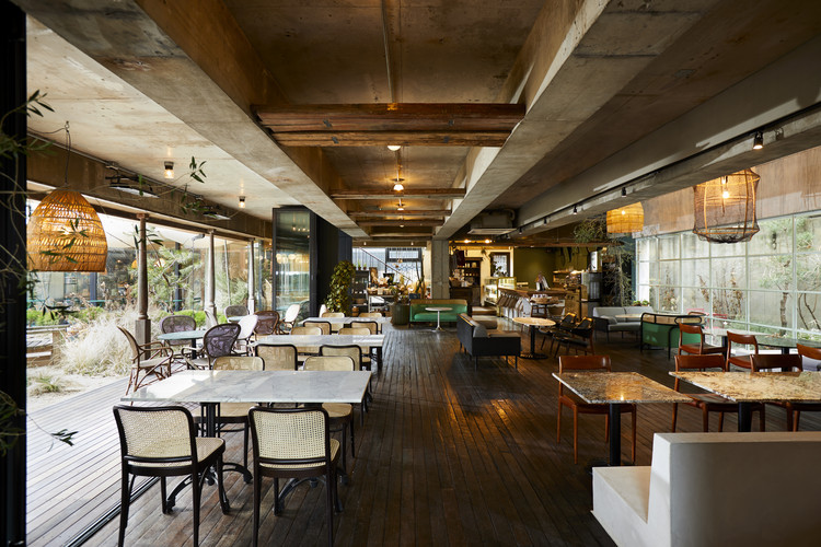
United Tannery - Boot Factory Refurbishment Wolveridge Architects
2011-07-17 00:00
架构师提供的文本描述。该项目是一座大约1900年维多利亚时代的靴子制造工厂和一家年轻建筑师事务所的翻修工程。作为一项翻新,设计反应涉及原始结构的结构如何为解决方案提供信息。作为一个开放的计划仓库,我们探索了建筑物最初使用的方式和满足我们需求的方式之间是否存在连接。一楼结构跨度清晰,提供了不间断的11x12m楼板。在早期,这是一个开放式的工作长椅布局区域。现代商业办公空间规划的要求是相似的。
Text description provided by the architects. The project is a refurbishment of a circa 1900 Victorian era boot making factory and home to a firm of young architects. As a refurbishment, the design response was concerned with how the fabric of the original structure could inform the solution. As an open plan warehouse, we explored whether a connection could exist between the way the building was used originally and the way it needs to meet our requirements. The clear span nature of the structure at first floor provided an uninterrupted 11x12m floor plate. In early times this was an open layout area for work benches. The requirements of contemporary planning for commercial office space are similar.
Courtesy of Wolveridge Architects
作为建筑师,我们在一个开放的工作室工作。我们活动的性质必须调整,以适应变化和灵活性。我们必须能够轻松和迅速地缩小或扩大。这提供了与当代思维相联系的综合对策,并规定了如何解决每一层问题。
As architects, we work in an open studio. The nature of our activities must be tuned to function, adaptation to change and flexibility. We must be able to shrink or expand easily and quickly. This provided an integrated response in connection to contemporary thinking and regulated how each floor may be resolved.
First Floor Before & After Plan
在这两层楼,开放的平面空间被插入木材覆盖的体积进行解剖。这些体积,独立的立方体形式,在空间内被覆盖在回收硬木地板。我们把盒子布置得像墙壁一样,把办公室的功能空间分隔开来,而不仅仅是一堵墙,它本身就是一个服务容器(WC/厨房/储藏室/会议)。这些形式接触到现有建筑的方式对这一想法具有重要意义,并暗示了当代的设计实践,而不是将整个空间分割成一系列较小的房间的传统方法。
Over both floors, the open plan spaces were dissected by the insertion of timber clad volumes. These volumes, freestanding cubic forms within the space were clad in recycled hardwood flooring. We arranged the boxes to act like walls, separating the functional spaces of the office, whilst becoming more than a wall, a container for services (wc/kitchen/storage/conference) within themselves. The manner in which these forms touch the existing building is significant to this idea and is suggestive of contemporary design practice as opposed to a traditional method of carving the entire space into a series of smaller rooms.
Courtesy of Wolveridge Architects
这个空间的使用范围很广,不仅仅是一间办公室,还有我们自己家具的陈列室和展示区,以及如何将材料并置的一个例子。办公室是一个测试想法的地方。客户可以触摸、感受、体验和评估的地方。这也可能是一个艺术家展示作品的地方,一个画廊,一个文化场所。我们认为,多功能、灵活性、适应性和开放空间规划的理念是当代设计实践的基础。
The use of the space is broad, not just an office, but a showroom and display area for our own furniture and an example of how materials can be juxtaposed. The office was a place to test ideas. Places where clients can touch, feel, experience and evaluate. This could also be a place for artists to show work, a gallery, a cultural venue. We consider that the ideas of multi-function, flexibility, adaptation and open space planning to be fundamental to contemporary design practice.
 举报
举报
别默默的看了,快登录帮我评论一下吧!:)
注册
登录
更多评论
相关文章
-

描边风设计中,最容易犯的8种问题分析
2018年走过了四分之一,LOGO设计趋势也清晰了LOGO设计
-

描边风设计中,最容易犯的8种问题分析
2018年走过了四分之一,LOGO设计趋势也清晰了LOGO设计
-

描边风设计中,最容易犯的8种问题分析
2018年走过了四分之一,LOGO设计趋势也清晰了LOGO设计


 PintereAI


