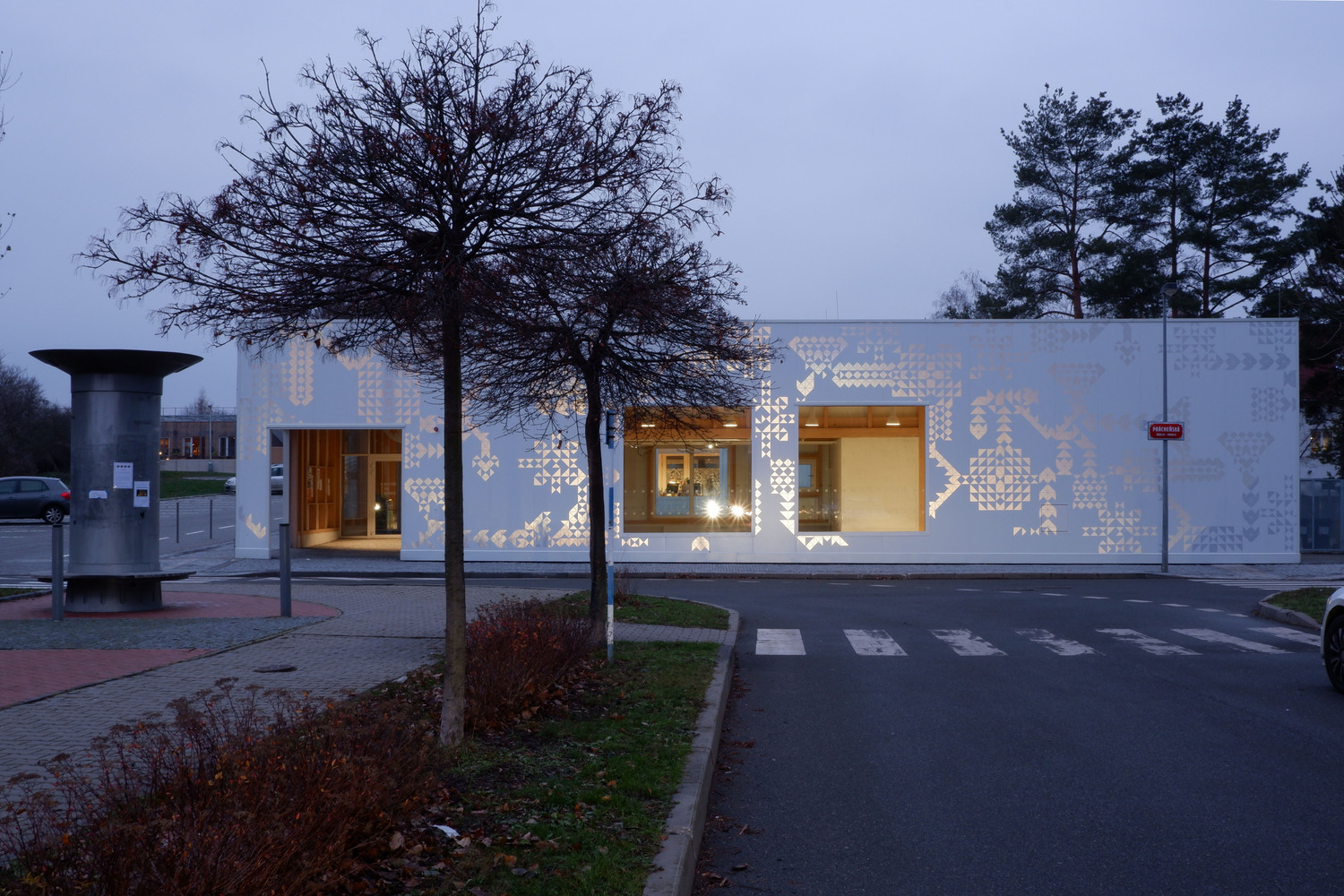
Botanica Sales Office - Showrooms Vin Varavarn Architects
2011-10-07 00:00
架构师提供的文本描述。我们位于纳科恩拉查西马省帕克冲地区著名的高叶国家公园附近,我们的挑战是为新的现代植物园设计销售办公室和陈列室。售楼处的设计需要体现建筑与优美自然环境相协调的共管公寓楼项目的原有理念,但设计独特而醒目,足以吸引潜在客户和过客的兴趣。
Text description provided by the architects. Located in close proximity to the famous Kao Yai National Park in Pakchong District NakornRatchasima Province, our challenge was to design the Sales Office and Showrooms for the new modern Botanica Condominium. The sales office design needs to reflect the original concept of the condominium project of harmonizing architecture with the beautiful natural environment but, with designs unique and striking enough to capture the interest of the prospective clients and passer-byes.
与其按要求设计一座大型空调建筑,还提出了一种不同的解决方案,通过创造一组封闭在自然环境中的小型建筑来发挥自然的作用。建筑应尽可能简单,以增强而不是压倒自然美景的景观。同时,应营造一种轻松的氛围,加强客户与营销团队之间的积极关系。这群建筑由一个销售办公室、2个陈列室大楼和厕所设施组成,所有这些建筑都是通过户外高架人行道在开阔的自然景观中连接起来的。这条看似简单的走道,是为了把穿过花园的步道,变成室内空间和样品室单元,变成一段令人愉快和难忘的旅程。这两间展厅的外墙装饰都是铺着光滑的黑色油漆的竹镶板,就像两个看上去神秘的立方体。选择竹壁上的光滑漆,与当地石材的粗糙表面和抛光的混凝土地板并置。在光滑的竹墙上,绿油油的四周闪现出迷人的倒影,这进一步为整体前景增添了更多诱人的维度。
Rather than designing one big air-conditioned building as requested, a different solution was proposed to bring nature into play by creating a group of small buildings enclosed amidst natural setting. The architecture is to be as simple as possible in order to enhance and not to overpower the natural beauty of the landscape. At the same time, it should create a relaxing atmosphere to reinforce positive relationships between the clients and the marketing team. This group of buildings composes of a sales office, 2 showroom buildings and toilet facilities, all connected by an outdoor elevated walkway through open natural landscape. This seemingly simple walkway was designed to transform the walk through the garden, into the interior spaces and the sample room units into an enjoyable and memorable journey. The two showrooms have exterior wall finishing of bamboo paneling sprayed with glossy black paint, resembling two mysterious looking cubes. The glossy paint on the bamboo walls was chosen to juxtapose with the rough surface of local stone and the polished concrete floor. Glimmering reflections from the luscious green surrounding on the glossy bamboo wall further adds more alluring dimensions to the overall outlook.
这两间陈列室虽然显示了坚实的个性,但在现场前的销售办公室,另一方面,传达了一种轻盈和通风的感觉,暴露钢结构和全高度无框玻璃镶板。透过前面正面的大玻璃板,你可以看到花园的面积和室内的样品房单元。
While these two showrooms display a solid character, the sales office in front of the site, on the other hand, conveys a light and airy feeling with exposed steel structure and full height frameless glazed paneling. Through the large glazed paneling on the front façade, one can view both the garden area and sample room units within.
在售楼处的接待处,放置了一盏天光,使自然光能够穿透室内空间。由于这个地区夏季酷热,在天窗上方,安装了第二个带有竹板条的钢屋面结构,以遮挡强烈的光线。在销售办公楼的后面,一个大型的阳台为与潜在客户进行讨论和会晤提供了更多的空间。整个地区都被大树遮住,以过滤光线和降温,为正式会议和非正式会议创造了一种完全令人愉快的气氛。
Over the reception area of the sales office, a sky light has been placed to enable natural light to penetrate into the interior space. As this area is intensely hot during the summer season, above the skylight level, a second steel roof structure with bamboo lath is installed to screen off the intense light. At the back of the sales office building, a large veranda provides additional spaces for discussions and meeting with the prospective clients. The entire area is shaded with large trees to filter the light and to cool off the heat, creating a totally pleasant atmosphere for both formal and informal meetings.
建筑材料是从当地现有材料中精心挑选的,以加强与自然环境的和谐。通过使用当地工人拥有大量专门知识的这些当地建筑材料,该项目能够大大加快施工时间。此外,我们很高兴地发现,这件作品有一定的魅力来自当地的工艺。
Construction materials were carefully selected from locally available materials in order to enhance harmony with the natural environment. By using these local construction materials which the local workmen have a great deal of expertise, the project was able to speed up the construction time considerably. Furthermore, we were delighted to find that the work has certain charms resulting from the local craftsmanship.
景观设计同样简单,强调不同大小和颜色的植物选择。例如,在中央庭院,高大的木乃伊兰开木树被提议与浓密的草地形成鲜明的对比。这棵树的光树皮进一步强化了背景中的黑色立方体建筑,给出了令人印象深刻的整体工程视图。
Design of the landscape is equally simple, emphasizing the differing sizes and colors of the plants selected. For example, in the central courtyard, the tall Moulmein Lancewood trees have been proposed to present a sharp contrast with the bushy grassy lawn. The light bark of the tree further intensifies the black cube buildings in the background, giving an impressive view of the overall project.
Text provided by Vin Varavarn Architects.
 举报
举报
别默默的看了,快登录帮我评论一下吧!:)
注册
登录
更多评论
相关文章
-

描边风设计中,最容易犯的8种问题分析
2018年走过了四分之一,LOGO设计趋势也清晰了LOGO设计
-

描边风设计中,最容易犯的8种问题分析
2018年走过了四分之一,LOGO设计趋势也清晰了LOGO设计
-

描边风设计中,最容易犯的8种问题分析
2018年走过了四分之一,LOGO设计趋势也清晰了LOGO设计


 PintereAI


