Hungarian Autoklub Headquarters Vikar - Lukacs Architect Studio
2011-12-02 00:00
架构师提供的文本描述。我们赢得了这个项目的委托,参加了匈牙利Autoklub的一个新的标志性总部的竞争。这座建筑的主要姿态是一条丝带,环绕在七层的办公空间上,同时用字母“a”来表达。由于该地点位于多瑙河大桥附近,当地政界人士很高兴有一座大楼,为到达Ujest地区的司机提供一个指导点。
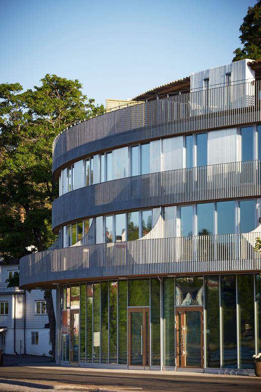
Text description provided by the architects. We won the commission for this project on a competition for a new iconic headquarter of the Hungarian Autoklub. The main gesture of the building is a ribbon that wraps around the office spaces on seven floors, while articulating a letter 'a'. As the site is located near the Danube bridge, local politicians appreciated to have a building that works as a point of orientation for drivers that arrive to district Ujpest.
主要大厅和服务功能在底层,而在最上面,弧下是一个屋顶露台代表会议。该环条约1,0米厚,它有一个不断变化的宽度和变形,因为它的连接环。建筑物的两个组成部分在材料使用、没有金属包层开口的条子和包裹建筑体积的玻璃幕墙方面也回来了。在建筑物中使用地热能系统帮助我们将屋顶从技术设备中解放出来。
The main hall and service functions are found on the ground floor, while on the very top, under the arc is a rooftop terrace for representative meetings. The looping strip is about 1,0 meter thick, it has a changing width and deforms as it articulates the loop. The two component of the building comes back also in the material usage, the strip without openings with metal cladding, and the glass curtainwall of the wrapped building volume. Using geothermal energy system in the building helped us to free the rooftop from technical devices.
 举报
举报
别默默的看了,快登录帮我评论一下吧!:)
注册
登录
更多评论
相关文章
-

描边风设计中,最容易犯的8种问题分析
2018年走过了四分之一,LOGO设计趋势也清晰了LOGO设计
-

描边风设计中,最容易犯的8种问题分析
2018年走过了四分之一,LOGO设计趋势也清晰了LOGO设计
-

描边风设计中,最容易犯的8种问题分析
2018年走过了四分之一,LOGO设计趋势也清晰了LOGO设计




 PintereAI


