Vila Vicosa School Cândido Chuva Gomes
2012-02-29 00:00
架构师提供的文本描述。干预区由广阔而干旱的学校场地组成,在现有建筑物之间生长着三棵大松树。
Text description provided by the architects. The intervention area consisted of school grounds, vast and arid, where, between the existing buildings, three large pine trees grew.
中央大楼具有社会和管理功能;另外两座设有教室和实验室,另一座仍然专门举办讲习班,最后还有一个运动馆。
The central block had social and management functions; other two held classrooms and laboratories, another was still devoted to workshops and, finally, a sports pavilion.
它的功能过时,正式缺乏吸引力,结构脆弱,表明一种老化的过早设备和明显的不能变得温暖和友好的学校社区。
Functionally outdated, formally unattractive and structurally fragile, it denoted an aging prematurely equipment and an obvious inability to become warm and friendly to the school community.
除上述方面外,解决热、声和空气处理问题以及建筑障碍、室外空间等问题也变得十分紧迫和必要。这一现实是提出新的学校理念的出发点。
Beyond the aspects listed above, it also became urgent and essential to solve the thermal, acoustic and air handling problems, as well as architectural barriers, outdoor spaces, etc. This reality is the starting point for a new school concept based proposal.
首先,选择要保存的建筑物,然后画成一个独特的最终目标。维持教室和体育场馆,答案变成了满足它们之间的空间,创造新的体积,从而成为一个持续的元素。
Firstly, the buildings to preserve were selected, and the drawing found its way into a unique final object. Maintaining both classroom buildings and the sports pavilion, the answer became to fulfill the spaces between them, creating new volumes and thus becoming a continuous element.
这座“新”学校建筑重新组织起来,开始时标志着它的入口处和一个庄严的大厅。这个空间延伸到室外,加入了一个外部广场。在内部,人们希望有一个清晰、简单和明亮的形象,并有明显的途径,以缓和几个经营实体之间的联系。
This “new” school building re-organized, and started by marking its entrance and a dignified hall. That space extended itself outdoors, joining an exterior square. On the inside, a clear, simple and bright image was wanted, with obvious paths, easing the connection between the several operational entities.
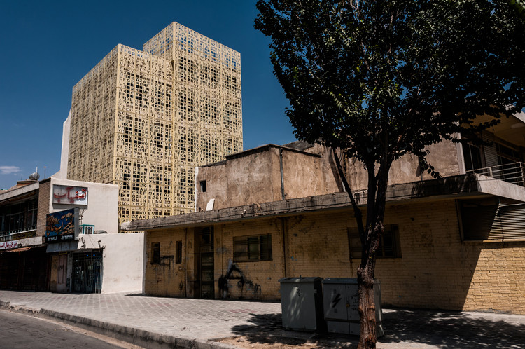
在外部,坚固的工匠砖覆盖为建筑物提供了保护,降低了维护成本,同时使整个建筑群统一起来。GRC网格允许控制光强,并为建筑物的外部图像提供均匀性,从而促进了现有积木的整合。整个周边地区被重新设计,加强户外活动,与室内空间的关系,并假设一个改进的框架为建筑物。
Externally, a solid artisan brick covering provides protection to the building, reducing maintenance costs, while giving unity to the whole complex. The GRC grid allows the control of light intensity and provides uniformity to the outside image of the building, boosting the integration of pre-existing blocks. The entire surrounding area was redesigned, enhancing outdoor activities, the relationship with the interior spaces and assuming an improved framework for the building.
 举报
举报
别默默的看了,快登录帮我评论一下吧!:)
注册
登录
更多评论
相关文章
-

描边风设计中,最容易犯的8种问题分析
2018年走过了四分之一,LOGO设计趋势也清晰了LOGO设计
-

描边风设计中,最容易犯的8种问题分析
2018年走过了四分之一,LOGO设计趋势也清晰了LOGO设计
-

描边风设计中,最容易犯的8种问题分析
2018年走过了四分之一,LOGO设计趋势也清晰了LOGO设计


 PintereAI


