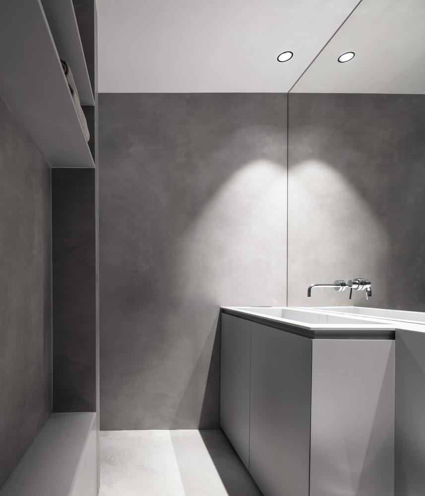
Offices for Bührmann - Partners
2012-06-29 01:00
架构师提供的文本描述。一场小型比赛的结果,Bührmann
Text description provided by the architects. The result of a mini competition, the Bührmann & Partners office complex is the manifestation of a long-standing working relationship between the respective practices – and more particularly between Sigi Teetz and Jaco Wasserfall – that began almost two decades ago and has since matured into a dynamic partnership. Equally contributing to the project in enthusiasm and skill was a contractor with experience in abundance and a reputation for impeccable off-shutter concrete work.
© Marcus Weiss - Studio One
这座新建筑位于克莱因温得和克住宅区的一处狭窄的1500平方米的库尔-德萨克地产上。这一地区被指定用于当地城镇规划方案的低密度写字楼开发,正在逐步改造,但不牺牲其独特的居住规模。
The new building is located on a narrow 1500m2 cul-de-sac property in the residential area of Klein Windhoek. Earmarked for low-density office development in the local town-planning scheme, this area is gradually being transformed but without sacrificing its distinct residential scale.
© Marcus Weiss - Studio One
除了建议拆除现有的房屋外,客户简介还规定,必须维护其整洁的花园。其他要求包括使用关闭式混凝土和引入水元素.这三个合作伙伴必须被安置在不同的办公室,可以看到花园的景色。
Besides proposing the demolition of the existing house, the clients’ brief stipulated that its immaculate garden had to be maintained. Other requirements included the use of off-shutter concrete and the introduction of a water element. The three partners had to be accommodated in separate offices with views over the garden.
© Marcus Weiss - Studio One
简单和几何清晰是压倒一切的设计愿望。一个长的混凝土梁,有着令人印象深刻的清晰的跨度,作为一个突出的循环轴,为参观者和工作人员划分出一条通向建筑物的清晰通道,并将生产和行政或服务区分隔开来。它也是一个统一的元素,将各种单层建筑部件和工作人员停车结构连接成一个单一的建筑实体。
Simplicity and geometric clarity were the overriding design aspirations. A long concrete beam, with impressive clear spans, is employed as a prominent circulation axis demarcating a clear approach to the building for both visitor and staff, and separating the production and administrative or service zones. It also serves as a unifying element that ties the various single storey building components and staff-parking structures into a single architectural entity.
© Marcus Weiss - Studio One
作为一个双容量集装箱,大型通风办公室有一个有翼和中央悬臂的混凝土屋顶,南和北都有牧师的窗户,以确保充足的日光。单独的办公室和讨论节点被连接到主卷的玻璃外墙上,就像立方的豆荚,从内部形成花园的框架视图。一个宽大的屋顶悬垂遮住了主要空间的玻璃外墙,而水平的百叶窗为办公室的吊舱提供了阴影。形成由公到私的建筑门槛,将建筑与花园实际分离,是一种线性的水元素。这也是为了起到安全威慑的作用,但后来被认为是不适当的,并增加了围墙。一个色彩鲜艳的弧形墙元素遮住了建筑物,使其免受强烈的西面阳光的照射,同时提供视觉上的缓解和暗示运动。
Conceived as a double-volume container, the large draughting office has a winged and centrally cantilevered concrete roof with clerestory windows to the south and north to ensure sufficient daylight. Individual offices and discussion nodes are attached to the glazed facades of the main volume as cubed pods framing views of the garden from within. A generous roof overhang shades the glazed façades of the main space whilst horizontal louvres provide shading to the office pods. Forming the building threshold from public to private, and physically separating building from garden, is a linear water element. It also was meant to act as a security deterrent, although it was later deemed inadequate and a perimeter fence was added. A brightly coloured curved wall element shields the building from the fierce west sun, whilst providing visual relief and suggesting movement.
© Marcus Weiss - Studio One
在材料、细节和饰面的选择和应用方面采用了一种极简和有力的方法:考虑到维护程度低,裸露的结构要素与未装饰的混凝土、钢和铝、木材和玻璃一起使用。合作伙伴最初对焦点区域有限的色彩应用犹豫不决,很大程度上是通过事先向他们展示建筑物的照片来克服的。设计参与还包括内置家具和标志。
A minimalist and robust approach was followed in the choice and application of materials, details and finishes: mindful of low maintenance, exposed structural elements are used alongside unadorned concrete, steel and aluminium, timber and glass. The partners’ initial hesitation to the limited application of bright colours in focus areas was largely overcome by presenting them with photo-rendered images of the building beforehand. Design involvement also included built-in furniture and signage.
 举报
举报
别默默的看了,快登录帮我评论一下吧!:)
注册
登录
更多评论
相关文章
-

描边风设计中,最容易犯的8种问题分析
2018年走过了四分之一,LOGO设计趋势也清晰了LOGO设计
-

描边风设计中,最容易犯的8种问题分析
2018年走过了四分之一,LOGO设计趋势也清晰了LOGO设计
-

描边风设计中,最容易犯的8种问题分析
2018年走过了四分之一,LOGO设计趋势也清晰了LOGO设计


 PintereAI


