Smolenka “Oak Tube’’ Apartment Peter Kostelov
2012-07-06 00:00
架构师提供的文本描述。这套公寓位于一座内院子的高层多层建筑的5楼。餐厅旁边的大阳台,公寓的低矮位置和房子的一部分,这些都使室内庭院蒙上了很大的阴影-所有这些都没有让太阳进入房子的这一部分。
Text description provided by the architects. The apartment is on the 5th floor of a tall multistory building with inner yard. Large balcony next to the dining room, low location of the apartment and a part of the house, which strongly shadowed the inner yard – all these didn't let the sun get into this very part of the house.
大部分公寓的比例都是长得栩栩如生的。窗户之间的空间曾经很大,尤其是14米。墙壁和阳台使它大了2,5米,现在它长了16,5米!
The greater part of apartment has vividly oblong proportions. Space between windows used to be large notably 14 meters. Walls and balcony made it 2,5 meters larger now its 16,5 meters!
结构实心墙之间的宽度仅为3,3米,而埋有通风井的地方的宽度仅为2,8米。有了这样的比例和空间,才发现公寓的中央实际上并没有减轻。
The width between structural solid-cast walls was only 3,3 meters while the places, where ventilating shafts were embedded, made it even less just 2,8 meters. Having these proportions and spaces it came out that the middle of the apartment practically was not lightened.
解决办法是这样的:这部分不应该有死墙,而是用玻璃墙代替,如果必要的话,玻璃墙可以用窗帘遮住。最后,公寓的餐饮空间、客人空间、居住空间和工作场所都受到了双方的启发。
The solution came like this: there shouldn't be dead walls in this part, instead they are to replace with glass wall which if necessary can be blinded with curtains. In the end, the part of the apartment with dining room, guest space, living space and working place got enlightened from both sides.
因此,公寓的比例和光线差导致了它的空间规划设计。至于中间部分,它被举到讲台上,以便“抓住”透过窗户的光线。墙壁、天花板和地板之间光滑而圆润的通道在视觉上连接起来,扩大了起居室墙壁之间的小间距。
Thus, apartment proportions and poor lighting caused its space-planning design. As for the middle part it was lifted on the podium, so that “to catch” the light coming through the window. Smooth and rounded passages between walls, ceiling and floor visually joined and expanded the small spacing between the walls in the living room.
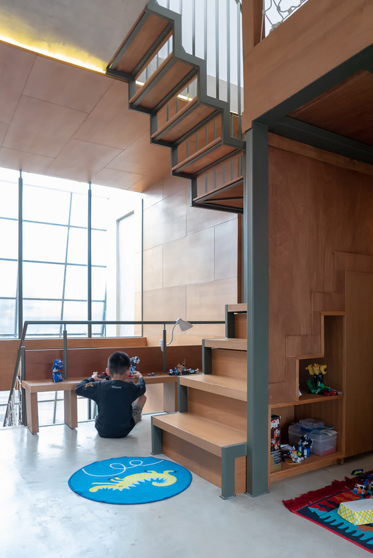
客厅的这一部分是用浅色橡树完成的,从天花板到地板,墙上都有内置的壁橱、架子和书桌。事实上,造型设计理念是由所谓的“橡木管”决定的。橡木管就在公寓的中央,它的工作和休闲场所与餐厅相邻,客房与另一侧相邻。
This part of the living room is finished with light oak tree, which gradually goes from ceiling to floor and walls with its built-in closets, shelves and desk. In fact styling design concept was determined by so called “oak tube” which runs just in the middle of the apartment with its working and leisure place to which the dining room adjoins it from one side and the guest room from another.
“管”的外部部分用复合石料进行细化。“管子”的臀部模仿其形状的切割,而松散的通风连接在墙壁上则强调了它的舒适感,给人一种从外部带来的幻觉。
External parts of “the tube” are fined with composite stone. The butts of the “tube” imitate the cuts of its form, while loose airy joining to the walls underlines its ease, giving the illusion of something brought from outside.
卧室也实施了类似的想法。房间分为几个部分,在天花板、地板和墙壁之间有光滑、封闭的通道,构成架子、壁橱和一张床。“管子的屁股也是用石头打成的,模仿切割的形状。”
Similar idea was implemented for the bedroom too. The room is divided into sections which also have smooth, closed passages between ceiling, floor and walls making up shelves closets and a bed. The butts of the “tubeª is also fined with stone, imitating the cut shape.
至于较不开明的部分,则设于次要处所:客厕、自用房及毗邻卧室的浴室。
As for the part less enlightened it is given to secondary premises: guest loo, gowning room and a bathroom adjoining bedroom.
厨房的位置是隔开的块,与窗户相反.走廊、厨房、餐厅和走廊等公共场所的地板被陶质陶粒罚款,而休闲空间、书房和卧室等所有私人区域都被橡木板罚款。
Kitchen is sited as separated block contra-lateral to a window. The floor in the common places like hallway, kitchen, dining room and corridor is fined with ceramogranite while all private zones like leisure space, study, and bedroom are fined with oak planks.
 举报
举报
别默默的看了,快登录帮我评论一下吧!:)
注册
登录
更多评论
相关文章
-

描边风设计中,最容易犯的8种问题分析
2018年走过了四分之一,LOGO设计趋势也清晰了LOGO设计
-

描边风设计中,最容易犯的8种问题分析
2018年走过了四分之一,LOGO设计趋势也清晰了LOGO设计
-

描边风设计中,最容易犯的8种问题分析
2018年走过了四分之一,LOGO设计趋势也清晰了LOGO设计


 PintereAI


