Vinery Kobler
2012-08-04 01:00
架构师提供的文本描述。首先,它是关于将品尝室与现有空间相结合。然而,建筑师们决定发表一个明确的声明,现在看来,这间屋子就像滑进了现有的空间。总体效果是朴实无华的。升降单元将空间延伸到外部,使外部空间更接近内部空间.因此,你可以坐在里面,而在外面,当你在里面。
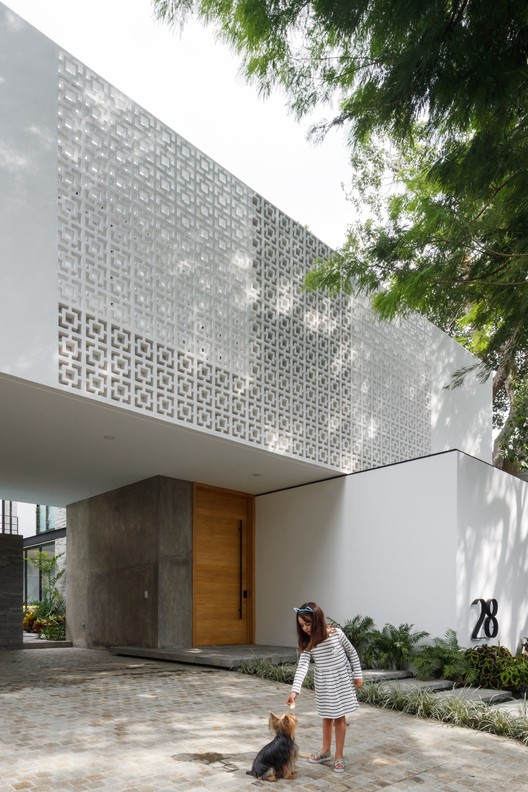
Text description provided by the architects. At first, it was about integrating the tasting room into the existing space. The architects decided to make a clear statement, however, and it now seems as if the room slides right into the existing space. The overall effect is unpretentious and simple. A lift-slide unit extends the space outside, which brings the exterior space closer to the interior space. As a result, you can sit inside while being outside or outside while being inside.
材料的选择是基于自然性和可持续性的:墙壁和天花板的表面是用马莫里诺做的,地板是用浇灌的水磨石做的。为什么是白色的?什么是白色?当你想一想,白色创造了一种高度敏感的感觉。如果我们让白色影响我们,那么周围的环境、颜色和阴影就会变得更加强烈。
The selection of materials is based on naturalness and sustainability: the surfaces of the walls and ceiling are done in marmorino, the floor in poured terrazzo. Why white? What is white? When you think about it, white creates a feeling of heightened sensitivity. If we let white affect us, then the surroundings, the colour and the shadows become more intense.
建筑师认为,葡萄酒的细微差别,颜色和味道一样,可以更敏锐地欣赏在一个白色的环境。
The architects assume that the nuances of the wine the colour and the flavours alike can be appreciated more keenly in a white environment.
 举报
举报
别默默的看了,快登录帮我评论一下吧!:)
注册
登录
更多评论
相关文章
-

描边风设计中,最容易犯的8种问题分析
2018年走过了四分之一,LOGO设计趋势也清晰了LOGO设计
-

描边风设计中,最容易犯的8种问题分析
2018年走过了四分之一,LOGO设计趋势也清晰了LOGO设计
-

描边风设计中,最容易犯的8种问题分析
2018年走过了四分之一,LOGO设计趋势也清晰了LOGO设计


.jpg)

.jpg)

.jpg)

.jpg)

.jpg)


 PintereAI


