Hospital in Villeneuve d’Ascq Jean
2012-10-25 01:00
架构师提供的文本描述。位于法国北部的Villeneuve d‘Ascq的新私立医院是对旨在提高保健质量的区域现代化方案的回应。该设施与里尔市周围已有的诊所协同作用,是一个结构要素。该医院为门诊病人和需要完全住院的病人提供多学科护理。其方案包括225张病床、医疗、外科和产科单位以及一个医疗技术中心。拥有大型42个床位的妇产科、10个手术室以及放射治疗、化疗和核医学等单位.
Text description provided by the architects. The new private hospital in Villeneuve d’Ascq (in northern France) is a response to the regional modernisation programme aiming to improve the quality of health care. The facility acts as a structuring element in synergy with the clinics already present around the city of Lille. The hospital provides multidisciplinary care for outpatients and patients requiring full hospitalisation. Its programme includes 225 beds and medical, surgical and obstetrics units as well as a medico-technical centre. It has a large 42-bed maternity unit, 10 operating theatres as well as radiotherapy, chemotherapy and nuclear medicine units.
2007年,让-菲利普旅机构被任命为由La Générale de Santé发起的竞赛的获胜者。小组成员包括egis nord,一家全行业的工程公司,以及martin。
In 2007, the Jean-Philippe Pargade agency was named winner of the competition launched by La Générale de Santé. The team included EGIS Nord, an all-trades engineering firm, and Martin & Guiheneuf, a firm specialised in quantity surveying services. The hospital has a net plan area of 22,681 m². The overall cost of the works represents €41 million (2012 value). Operational since 26 June 2012, the new hospital was inaugurated on 27 September 2012.
在Villeneuve d‘Ascq的新的私人医院覆盖了位于新的Recueil区城市化区的一个由未开垦的农田恢复的地区。它是位于住宅区和商业活动区之间的地方保健中心。同样的建筑风格统一了所有的方案元素,使新的设施成为位于大里尔地区的一个当代项目。
The new private hospital in Villeneuve d’Ascq covers an area recuperated from uncultivated farmland located in the new Recueil district urbanisation zone. It is a local health centre lying between a residential district and a commercial activity area. A same architectural style unifies all the programme elements and allows the new facility to stand out as a contemporary project located in the greater Lille area.
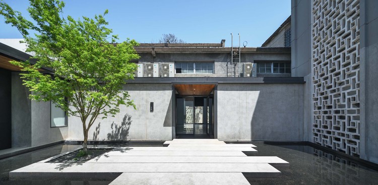
该分局的项目是根据一个矩形计划设计成一个简单的体积,提供了附近商业建筑规模与相邻郊区织物房屋规模之间的和谐过渡。从街道线形出发,该项目在入口处有一个花园。物流区域位于大楼后面,停车场位于两侧。这使得医院能够打开一个大的绿地,让人联想到修道院的布局。
The project by the Pargade agency is designed as a simple volume based on a rectangular plan providing a harmonious transition between the scale of the nearby commercial buildings and that of the houses located in the adjoining suburban fabric. Set back from the street alignment, the project incorporates a garden giving onto the entrance esplanade. The logistics area is positioned to the rear of the building and the car parks to the sides. This allows the hospital to open onto a large green space reminiscent of a convent layout.
这座大楼的信封被当作图案的构图来处理。石板色的砖墙正面重新诠释了法国北部特有的乡土建筑。这些外墙包括大窗户作为图案的设计与结合的屏幕印刷花卉主题。这一构图的重点是一个玻璃画廊在一楼延伸到大厅和开放的花园空间。
The building’s envelope is handled as a pictorial composition. The slate coloured brick facades reinterpret a vernacular architecture specific to northern France. These outer walls incorporate large windows treated as a patterned design with incorporated screen printed floral motifs. This composition is emphasised by a glazed gallery on the ground floor that extends through the hall and opens out over the garden space.
综合起来,该项目创造了一个相互作用的图形形式,吸引眼球。这一理念与医院所持有的传统形象不同,它提供了一个当代雕塑对象,同时又保留在当地居民能够识别的语境词汇中。
Taken together, the project creates an interplay of graphic forms that catches the eye. The idea is break away from the tradition image held by hospitals by providing a contemporary sculptural object while remaining within a contextual vocabulary recognisable by local residents.
建筑在提升医院形象方面起着重要作用。作为一种象征性的环境,医院同时需要受到欢迎和安慰,同时也要有效率和安全。特别强调接待和舒适,以确保以个性化和适应的方式照顾每一个病人。入口大厅与酒店大堂相似,提供了超过两层的巨大空间,并创造了一个欢迎和慷慨的空间。
Architecture has a major role to play in enhancing the image held by hospitals. As a symbolic setting, the hospital simultaneously needs to be welcoming and reassuring as well as efficient and safe. Particular emphasis is placed on reception and comfort to ensure that each patient is looked after in a personalised and adapted manner. The entrance hall is similar to a hotel lobby, providing a monumental volume rising up over two levels and creating a welcoming and generous space.
该建筑的中心强调透明度,同时提供对室外景观和各种室内空间的看法。玻璃画廊提供病人护理单位之间的横向联系,并有助于医院的有效运作。几何和紧凑的体积被洞口形式的小花园露台的形式,打开建筑物周围的环境。这些偶尔出现的空隙会将自然光带入地板层的中心,并适应潜在的方案限制。
The heart of the building places emphasis on transparency and simultaneously provides views over the outdoor landscape and the various indoor spaces. Glazed galleries provide transversal links between patient care units and contribute to the efficient running of the hospital. The geometric and compact volume is pierced by openings in the form of small garden patios that open the building onto the surrounding environment. These occasional voids bring natural light into the heart of the floor levels and adapt to potential programmatic constraints.
室内空间中使用的颜色代表了医院空间组织中的一个基本组成部分。柔和的浅色色调为周围环境的宁静做出了贡献。交替的纯色利用粉红,蓝色和绿色覆盖表面,创造对比效果。通过建筑物的运动显示出平面构图,联想和绘画延伸到空间。色彩有助于人性化的各种功能,并创造一个温暖和友好的气氛。
The colours used in the interior spaces represent a fundamental component in the hospital’s spatial organisation. Soft, pale colour tones are privileged to contribute to the serenity of the surroundings. Alternating solid tints making use of pinks, blues and greens cover the surfaces, creating contrast effects. Movements through the building reveal graphic compositions, associations and paintings reaching out into the space. The colours contribute to humanising the various functions and create a warm and friendly atmosphere.
该设施的整体组织作为医院功能的典范。它的基础是有利于各部门之间共享手段、接近程度和可见度的最低层制度。矩形几何图形采用紧凑梳子的形式,其设计目的是方便地创建垂直延伸,而不需要任何额外的建筑工程。这尤其适用于位于种植园下方的手术室以及底层会诊和医疗图像区。
The overall organisation of the facility presents itself as a model of hospital functionality. It is based on a system of floor levels favouring shared means, proximity and visibility between departments. The rectangular geometry takes the form of a compact comb and is designed to easily permit the creation of vertical extensions without any need for additional building works. This particularly applies to the operating theatres lying below the plantrooms and the ground floor consultation and medical imagery areas.
这种简单的几何结构提供了相当大的组织灵活性。它使环流区域合理化,并通过支持横向并置来减少流动。组织系统确保医院建筑能够适应未来的任何方案修改。
This simple geometry provides considerable organisational flexibility. It rationalises circulation areas and reduces movements by favouring horizontal juxtapositions. The organisational system ensures that the hospital building is able to adapt to any future programmatic modifications.
 举报
举报
别默默的看了,快登录帮我评论一下吧!:)
注册
登录
更多评论
相关文章
-

描边风设计中,最容易犯的8种问题分析
2018年走过了四分之一,LOGO设计趋势也清晰了LOGO设计
-

描边风设计中,最容易犯的8种问题分析
2018年走过了四分之一,LOGO设计趋势也清晰了LOGO设计
-

描边风设计中,最容易犯的8种问题分析
2018年走过了四分之一,LOGO设计趋势也清晰了LOGO设计


.jpg)


 PintereAI


