Bistro Japonais Kinoya Jean De Lessard
2012-11-04 01:00
架构师提供的文本描述。自从最近在圣德尼街的日本小酒馆Kinoya开业以来,Irassha Mase的敬礼一直没有停在这里,这是日本人对Tapas酒吧的回答。现代而又充满传统,这小宝石的日本菜值得它的珠宝箱,只有一个不同寻常的创造性设计。由才华横溢的设计师让·德·莱纳德(JeandeLessard)创作,他在这个项目中随心所欲,巨大的简洁的体积和形状使这一空间呈现出一种完全的随意别致。
Text description provided by the architects. Since the recent opening of Japanese bistro Kinoya on Saint-Denis Street, the Irasshaïmase salutes have not stopped in this izakaya, the Japanese answer to the tapas bar. Modern yet imbued with tradition, this little gem of Japanese cuisine deserved for its jewel case nothing but an unusually inventive design. Created by the talented designer Jean de Lessard, who had carte blanche for this project, the volumes and shapes of great simplicity are making this space shine with a total casual chic.
虽然内部的石头和砖覆盖必须保持,变质是激进的,在这个曾经黑暗的地方。吉恩·德·莱纳德解释说:“以前的意大利餐厅有着巨大的比萨饼烤箱,现在人们可以在他们的开放式厨房里欣赏表演日本厨师的表演了。”
Although the interior stone and brick covering had to be kept, the metamorphosis is radical in this once darken place. "Any trace of the previous Italian restaurant with its huge pizza ovens has disappeared. One can now enjoy the show of performing Japanese chefs in their open kitchen ", explains Jean de Les
改变现有的流通轴,以及以不同的氛围创造新的观点,给了这个空间一种惊人的活力和流动性。
Changes to the existing circulation axis, as well as the creation of new viewpoints with different ambiances have given the space an amazing sense of dynamism and fluidity.
设计师给了传统的“塔塔米”房间一个幽默的扭曲,这是该项目的核心。它打破了“餐厅风格”的影响,这是由于高高的天花板和长方形的地方,迫使我们质疑我们对空间的看法。这条由黄色桦树制成的长条形雕塑环绕着自己,就像一只浮石一样,形成了一个“盒子”,设计师的位置稍微偏离了标记的位置。当一个人在小酒馆的酒吧里移动时,原因就变得很明显了。“让想到最小的细节,他是一个伟大的设计师和完美主义者谁是热情的设计!”然而,在这个干净的空间里,没有一个细节是多余的。
The designer has given a humoristic twist to the traditional "tatami" room which is at the heart of the project. It breaks the "cafeteria style" effect which is due to the high ceilings and the rectangular shape of the place and forces us to question our perception of space. The long sculptural strip made of yellow birch wraps itself around, as would a furoshiki, to form a "box" that the designer has positioned slightly off the mark. The reason for this becomes apparent when one moves along inside the bistro bar. "Jean thinks of the smallest detail, he is a great designer and a perfectionist who is passionate about design!", rejoices Ivy Dong, one of the owners. In this clean space, however, not a single detail is superfl
在地板、墙壁和天花板上流淌着巨大的花朵,让我们进入了一个充满幻想和诗意的世界。这种过度的演示经常出现在漫画世界中。在这里,巨大的梅花、牡丹和风格化的菊花已经成为古代武士家族的纹章标志。这些相同的图案也出现在墙上展示的一张小小的和服上,这是十件艺术品中的第一件,它们的形状和颜色对彼此都是一种大胆的挑战。这一典型的签名已经成为Kinoya身份的一部分,它的美感花纹也显示在菜单卡上。
The gigantic flowers that run on the floor, walls and ceiling lead us into a world of fantasy and poetry. Such excessive demonstration is often seen in a manga universe. Here, the huge plum blossoms, peonies and stylized chrysanthemums have become contemporary representatives of thekamon (the heraldic insignia of ancient samurai clans). These identical patterns are also found on a tiny paper kimono displayed on the wall, the first of a series of ten works of art, which shapes and colors are a daring challenge to one another. This quintessential signature has become a part of the identity of Kinoya, so much that the aesthetic floral graphic is also displayed on the menu card.
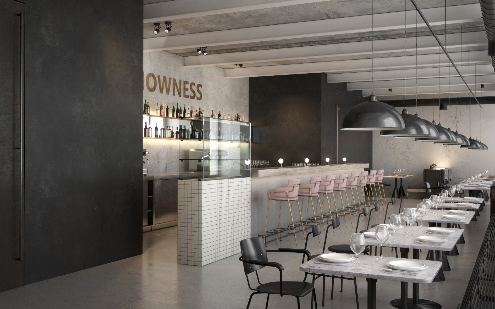
木材的温暖和金黄色,柔和的粉红色与男性光泽的黑色相映成趣;更经典的灰色色调中的材料柔和,都与巧妙融合在一起,因为对于让·德·莱萨德(Jean De Lessard)来说,“我想创造一个性感但不是假的地方,一个男人和女人都会感觉良好的地方。”尽管如此,幽默永远不会让人联想到设计师创造的穿着戏谑的裙子吧凳子。软照明和间接照明被用来创造不同的情绪,以及通过各种建筑元素,如设计师从墙壁上分离出来的木条隔断,使“满”地向“空”倾斜。
The warmth and golden quality of wood, the delicate and sharp shades of pink against a masculine glossy black; the softness of materials in a more classic shade of grey all blend in with finesse, because for Jean de Lessard: "I wanted to create a place which would be sexy but not fake, a place where both men and women would feel good." Still, humour is never far away evokes the playfully clad-in-skirt bar stools created by the designer. Soft and indirect lighting is used to create different moods, as well as the play of chiaroscuro and of pitching "full" against "empty" through various architectural elements, such as the wood partition at the bar that the designer has detached from the wall.
如果Kinoya被设计成符合其时尚客户的形象,那么它也忠实地反映了年轻、富有创造力和活力的所有者的个性。“我们在这里工作很开心,”董艾薇说,至于厨师陈德文,他总结道:“在我的餐厅里,我总是觉得自己穿的是尤卡塔,我和我的朋友们都聚集在纹身上,吃东西,喝饮料,享受美好时光!”Dōmo arigatōGozaimasu!
If Kinoya was designed to be in the image of its trendy clients, it also reflects the personality of its young creative and dynamic owners faithfully. "We have so much fun working here", says Ivy Dong, and as for the chef Devin Chen, he concludes: "In my restaurant, I always feel as if I am wearing the yukata and that we are gathered on the tatami, my friends and I, for food and drinks and to have a good time! "Dōmo ari
 举报
举报
别默默的看了,快登录帮我评论一下吧!:)
注册
登录
更多评论
相关文章
-

描边风设计中,最容易犯的8种问题分析
2018年走过了四分之一,LOGO设计趋势也清晰了LOGO设计
-

描边风设计中,最容易犯的8种问题分析
2018年走过了四分之一,LOGO设计趋势也清晰了LOGO设计
-

描边风设计中,最容易犯的8种问题分析
2018年走过了四分之一,LOGO设计趋势也清晰了LOGO设计


 PintereAI


