Qingtao Marketing Center Tsushima Design Studio
2012-12-05 00:00
架构师提供的文本描述。位于美丽的青桃山,中国,TDStudio的青桃营销中心是万科在该地区最大的发展中心。在现有建筑结构约束下,新建筑轻轻地从现有建筑中分离而出,而不是从新的开始。该建筑利用简单的设计语言和简单的透明材料,优雅地将周围的山坡用半透明的金色光泽构成框架。
Text description provided by the architects. Located within the beautiful hills of Qingtao, China, TDStudio's Qingtao Marketing Center acts as the centerpiece for the Vanke's largest development in the region. Working with the existing buildings structural constraints, the new structure gently wraps and extends out from the existing building rather then beginning from anew. Utilizing a simplistic design language as well as simple transparent materials, the building elegantly frames the surrounding hillside behind a semi-transparent golden sheen.
深色的本地砖和透明的日本金色屏幕之间的鲜明对比,使得悬臂式的二楼可以轻柔地漂浮在周围的景观上,同时创造出一个一整天都在变化的立面。白天,二楼画廊读起来像一块漂浮的固体团,是新开发项目的一个闪亮的图标。到了晚上,画廊就会向周围展示自己。因为它的居民的活动和里面的艺术品而变得活跃起来。
The stark contrast between the dark local brick and the light transparent Japanese golden screen allow for the cantilevering second floor to gently float over the surrounding landscape, while creating a facade which changes throughout the day. By day the the second floor gallery reads as a floating solid mass, and a shining icon for the new development. By night the the gallery reveals itself to its surroundings, becoming enlivened by the movements of its inhabitants and the artwork within.
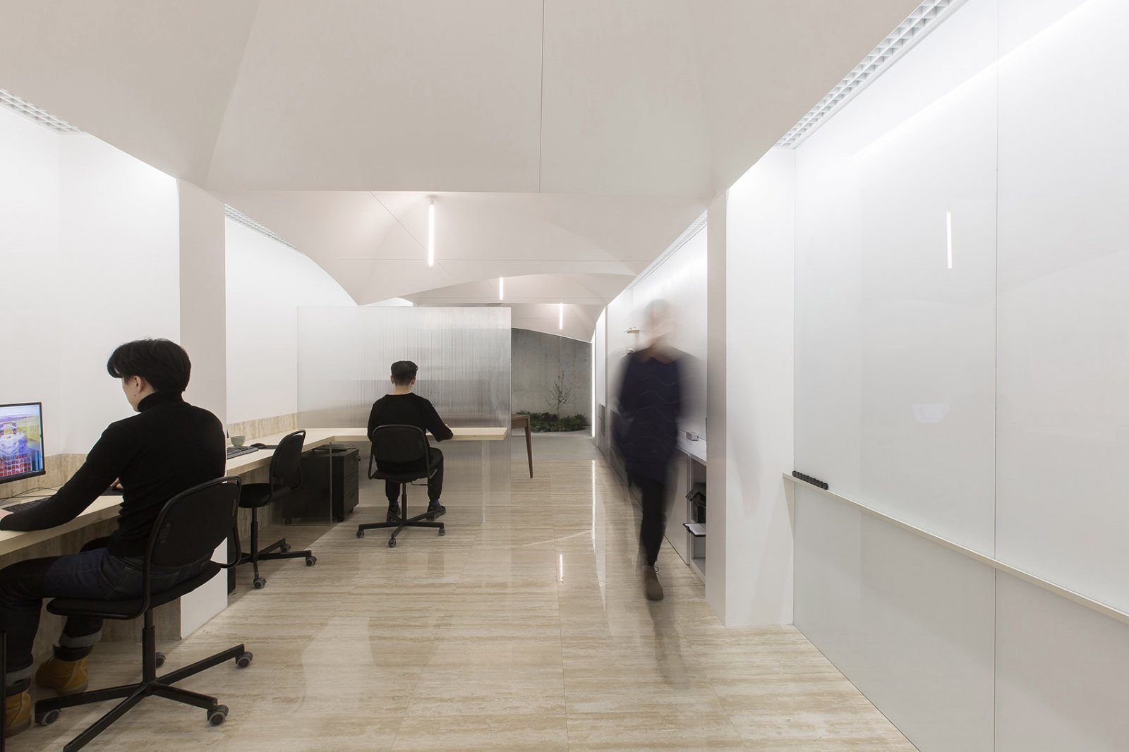
从程序上讲,营销中心很简单,一楼有开放/透明的营销中心和办公室,而二楼则是一个很大的开放画廊/展览空间。
Programmatically the marketing center is quite simple. The first floor houses the open/transparent marketing center and offices, while the second floor acts as a large open gallery/exhibition space.
 举报
举报
别默默的看了,快登录帮我评论一下吧!:)
注册
登录
更多评论
相关文章
-

描边风设计中,最容易犯的8种问题分析
2018年走过了四分之一,LOGO设计趋势也清晰了LOGO设计
-

描边风设计中,最容易犯的8种问题分析
2018年走过了四分之一,LOGO设计趋势也清晰了LOGO设计
-

描边风设计中,最容易犯的8种问题分析
2018年走过了四分之一,LOGO设计趋势也清晰了LOGO设计


.jpg)


.jpg)

.jpg)


 PintereAI


