Human.Kind Advertising PPS Architects
2013-03-05 01:00
KIND广告公司是一家位于南非高登市约翰内斯堡的广告公司。他们接近我们,PPS内部,为他们提供一个概念上的重新设计他们的内部空间。
Human.Kind Advertising is an advertising agency based in Johannesburg, Gauteng, South Africa. They approached us, PPS Interiors, to provide them with a conceptual redesign of their interior spaces.


简短的是创造一个有趣的空间,保持一定程度的公司专业精神,同时引入一种独特的南非风味。
The brief was to create fun spaces which maintained a degree of corporate professionalism, whilst introducing a uniquely South African flavour.
© Lizl Sheridan
利兹尔·谢里丹


我们认为现有空间的主要问题是缺乏连贯的、设计的后续性、黑暗的空间和过度分割的办公环境,禁止舒适地从一个空间流向另一个空间。
The main problems we identified with the existing space was a lack of coherent, design follow-through, dark spaces and an overly segmented office environment prohibiting comfortable flow from one space to another.
© Lizl Sheridan
利兹尔·谢里丹


这座建筑是约翰内斯堡的一座旧房子,一段时间前它被改建成办公室,这也是我们解决这些问题的主要原因。
The building is an old Johannesburg house which was converted into offices some time ago, the main reason for the problems we addressed.
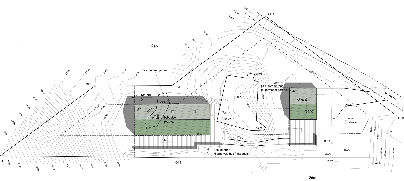
Floor Plan


考虑到这一点,我们的主要目标是让建筑更加明亮,并在以前彼此无关的房间之间建立动态对话。使用Astro草皮覆盖的舱壁,该舱壁流经接待处与主会议室之间的空间,并在接待处形成一个等候长凳,以及一个隐蔽的进入客人浴室的入口,以实现房间之间的连接。
With this in mind our main objective was to open up the building to more light and create a dynamic dialogue between rooms previously unrelated to one another. Use is made of an Astroturf covered bulkhead, which flows through the spaces connecting the reception to the main boardroom and forming a waiting bench in reception as well as a concealed entrance into the guest bathroom, in order to achieve a connection between rooms.
© Lizl Sheridan
利兹尔·谢里丹


必须从背景的角度向建筑物的殖民根源致敬,但更重要的是将这些殖民根源与当代南非文化结合起来,从而庆祝彩虹民族的活力和多样性。这是通过将传统的欧洲部件,如丹玛克图案墙纸与传统的非洲纹理,如传统楼梯的板条栅栏栏杆相结合来实现的。
It was important to pay homage to the colonial roots of the building from a contextual point of view, however what was more important was to integrate these colonial roots with contemporary South African culture, thus celebrating the vibrant, diversity of The Rainbow Nation. This was achieved through combining traditional European components such as damask patterned wallpaper, with traditional African textures such as the lath fence railing for the staircase traditionally used to form a “boma”.
© Lizl Sheridan
利兹尔·谢里丹


南非在接待区的罢工显示了该国的9个省.在此同时,还有南非所讲的11种正式语文中的每一种表示欢迎的问候。问候语的颜色对应于使用该语言的省份的颜色。
The South Africa cut-out in the reception area shows the 9 provinces of the country. Alongside this are welcome greetings of each of the 11 official languages spoken in South Africa. The colour of the greeting corresponds to the colour of the Province in which the language is spoken.
© Lizl Sheridan
利兹尔·谢里丹


图书馆/小型会议室的设计是为了创造一个多才多艺的空间,供人们放松或举行会议。作为一个寒冷的房间,桌子和长凳被折叠成一个集成的内置长凳,人们可以用来休息。把桌子和长凳折叠起来,露出图书馆的书架,然后空间变成一个小会议室。
The library/small meeting room was designed so as to create a versatile space in which one could relax or conduct a meeting. As a chill room, the table and benches are folded up into an integrated built-in bench which one can use to lounge upon. Fold down the table and benches to reveal the library shelves and the space becomes a small meeting room.
© Lizl Sheridan
利兹尔·谢里丹


© Lizl Sheridan
利兹尔·谢里丹


楼上,第二个会议室利用色彩和质感来创造新旧之间的动态关系。董事会的椅子和花缎图案的壁纸等元素,再加上来自再生木材覆层、星形草皮和抛光混凝土的鲜艳色彩和纹理,被并置在一起,创造了一个既有趣又协调的空间。
Upstairs, the second boardroom makes playful use of colour and texture to create a dynamic relationship between old and new. Elements such as the boardroom chairs and damask patterned wallpaper combined with vibrant colours and textures from the reclaimed timber cladding, astroturf and polished concrete are juxtaposed creating a funky and fun, yet coherent space.


Architects PPS Architects
Location 259 Jan Smuts Ave, Dunkeld, Johannesburg, South Africa
Category Offices Interiors
Project Year 2013
Photographs Lizl Sheridan

 PintereAI


.jpg)
