Facts Emporia Wingårdh Arkitektkontor
2013-06-13 00:00
架构师提供的文本描述。Emporia首先是一个城市规划项目,在这个项目中,办公室、住房和零售在马尔默南侧的Hyllie大道和Stationsgatan的混合用途开发项目中汇集在一起。我们赢得比赛的主要想法是隐藏在住宅和商业大厦的花圈后面,向内看的零售。整个购物中心最终将融入城市的结构。
Text description provided by the architects. Emporia is first and foremost an urban planning project in which offices, housing, and retail come together in a mixed-use development along Boulevarden and Stationsgatan in Hyllie, on the south side of Malmö. The main idea of our winning competition entry was to hide inward-looking retail behind a wreath of residential and commercial buildings. The whole shopping complex would thereby eventually become integrated into the fabric of the city.
(C)Tord-Rikard S derstr m
这是一个巨大的发展,其中只有琥珀入口的角落建筑尚未完工。这一入口将是唯一的一部分,商场购物中心,仍然可以看到,当开发完全建成。街道两旁都是混合用途的建筑,这一想法要求有一种强有力的形式,可以吸引车站广场的游客前来购物。从之前的竞赛提案中获得的一系列金库,再加上万神殿的记忆,以一种铜绿的语调重新出现。双弯玻璃包围着穿过建筑物的对角线狭缝。在这里,雷森海峡的天气,其快速移动的云层追逐阳光的一瞥,成为现实和有形的。
It is a huge development, of which only the corner building with the Amber Entrance has yet been completed. This entrance will be the only part of the Emporia shopping center that remains visible when the development is completely built out. The idea of lining the streets with mixed-use buildings demanded a strong form that could attract visitors from Station Square to come in and shop. A sequence of vaults from a previous competition proposal, along with a memory from the Pantheon, reemerged in a bronze-ochre tone. Double-bent glass encloses the diagonal slit that cuts through the building. Here the weather of the Öresund Strait, its fast-moving clouds chasing glimpses of sun, becomes present and tangible.
(C)Tord-Rikard S derstr m
从Hyllie车站广场的对角线入口通向这个街区的深处。在内部,零售是围绕着一个三层楼高的图8来组织的.商店围绕着五颜六色的中庭聚集在一起,每个中庭都有着不同的主题。在建筑群的北侧,一个坡道通向一个彩虹色停车场(2500辆车),直接进入图8。东面是一个露天停车场(500人),就在超市外面。
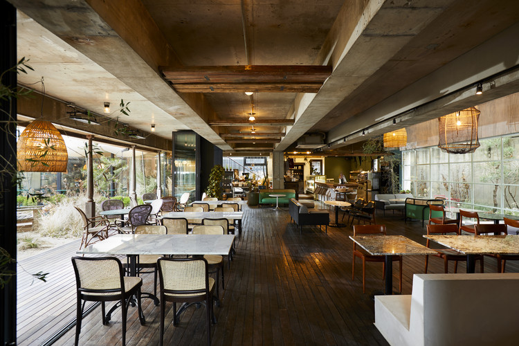
The diagonal entrance from Hyllie Station Square leads deep into the block. Inside, retail is organized around a three-story figure eight. Shops are grouped together around boldly colored atriums, each with a different theme. On the north side of the complex, a ramp leads into a rainbow-colored parking garage (for 2500 cars) with direct access to the figure eight. To the east is a surface parking lot (for 500) right outside the supermarket.
(C)Tord-Rikard S derstr m
屋顶公园设计得有点自然。它的植被(刚玉、草原草和树木)和它面向太阳的,避风的露台可以从建筑内外到达。提供防风保护的山丘实际上隐藏着机械室。在未来,屋顶将开发与户外餐饮和温泉设施类似游乐园,购物中心需要提供新的景点定期。
The rooftop park is designed as a bit of cultivated nature. Its vegetation (sedum, prairie grass, and trees) and its sun-facing, wind-sheltered patios are accessible from both inside and outside the building. The hills that provide protection from the wind are actually hiding mechanical rooms. In the future the roof will be developed with outdoor dining and a spa facility—like amusement parks, shopping centers need to offer new attractions at regular intervals.
(C)Tord-Rikard S derstr m
Emporia可以向西向上扩张,但在其他任何一个方向都不能扩张。面对林荫大道的独立住宅建筑尚未建成,南侧的Stationsgatan将矗立在主席台上。
Emporia can expand upward and to the west, but not in any of the other directions. The freestanding residential buildings facing Boulevarden have yet to be built, as do those that will stand atop the podium along Stationsgatan on the south side.
(C)Tord-Rikard S derstr m
Emporia的内部挑战建立了购物中心的惯例。它大胆的颜色和弯曲的视线打破了标准,该项目的规模和雄心也是如此-这使得为从天花板、地板、店面到标牌、挂着植物的绳索、家具和铸玻璃门把手的所有东西都能进行定制设计。
Emporia’s interior challenges established shopping center conventions. Its bold colors and bent sightlines break with the norm, as do the project’s size and ambition—which have made it possible to do custom designs for everything from ceilings, floors, and storefronts to signage, ropes of hanging plants, furniture, and cast glass door handles.
(C)Tord-Rikard S derstr m
我们的座右铭是“没有中间规模”,因为这是展示产品的领域。大规模的模式和复杂的细节特点的内部。水磨石地板是该方法的典型代表,它具有超大型的三角形连接模式,从白色逐渐向石墨的七步移动,以及闪烁的彩色镜面玻璃夹杂。这个设计非常注重细节,包括皮革包裹的扶手和内置座椅上缝纫的颜色。
Our motto has been “no intermediate scale”—because that is the realm of the products on display. Large-scale patterns and intricate details characterize the interior. The terrazzo floor is typical of this approach, with its oversized triangular joint pattern, its gradual shift from white to graphite in seven steps, and its flashing inclusions of colored mirror glass. The design has been wrought with extraordinary attention to detail, down to the leather-wrapped handrails and the color of the stitching on the built-in seating.
(C)Tord-Rikard S derstr m
Emporia还包括一些在商业环境中很少见到的艺术。Petteri Nisunen和Tommi Gr nlund的一个照明装置(99个门柱)将琥珀入口、Joep van Lieshout的青铜雕塑和Silja Rantanen装饰的海洋入口的玻璃艺术作品(4×81米)和一幅极其超大的格式(20x114米)的线画放在停车场的门面上。在内部是一系列的照片,由西涅玛丽亚安徒生。
Emporia also includes a quantity of art seldom seen in a commercial environment. A lighting installation (ninety-nine bollards) by Petteri Nisunen and Tommi Grönlund lifts the Amber Entrance, bronze sculptures by Joep van Lieshout and a glass art piece (4 x 81 m) by Silja Rantanen adorn the Sea Entrance, and a line painting on film at an extremely outsized format (20 x 114 m) by Per Mårtensson clads the façade of the parking garage. On the interior is a series of photos by Signe Maria Andersen.
 举报
举报
别默默的看了,快登录帮我评论一下吧!:)
注册
登录
更多评论
相关文章
-

描边风设计中,最容易犯的8种问题分析
2018年走过了四分之一,LOGO设计趋势也清晰了LOGO设计
-

描边风设计中,最容易犯的8种问题分析
2018年走过了四分之一,LOGO设计趋势也清晰了LOGO设计
-

描边风设计中,最容易犯的8种问题分析
2018年走过了四分之一,LOGO设计趋势也清晰了LOGO设计


.jpg)

.jpg)

.jpg)

.jpg)


.jpg)

.jpg)

.jpg)


 PintereAI


