2Day Languages Masquespacio
2013-08-11 01:00
架构师提供的文本描述。马斯克帕西奥在西班牙巴伦西亚的一个中心地区展示了它的最新项目。在这个机会,设计工作室创造了空间和身份的2天语言,一所新的西班牙学校在巴伦西亚。
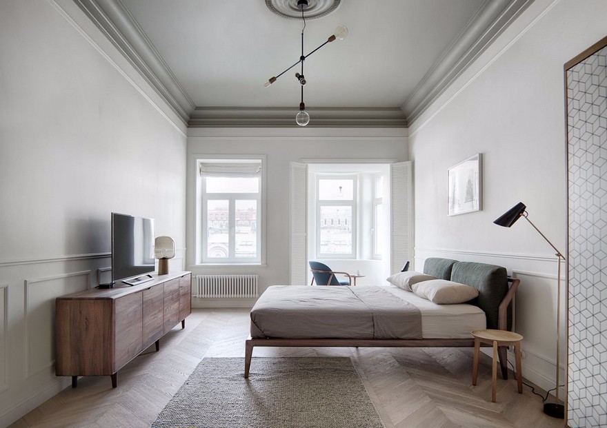
Text description provided by the architects. Masquespacio presents its latest project in a central area of Valencia, Spain. In this opportunity, the design studio has created the space and identity of 2Day Languages, a new Spanish school in Valencia.
这是一个项目,一方面,从其公司身份开始,以一面旗帜为代表,将文本泡沫与学习语言的三个基本特征融合在一起:水平、目标和会话。另一方面,它融合了巴伦西亚城的部分价值观,融合了现代建筑和古代建筑。这个新的西班牙学派通过其新古典建筑和设计师的介入,象征着这种融合。
This is a project that starts, on one hand, from its corporate identity represented by a flag which merges with a text bubble with the three fundamental characteristics of learning a language: levels, goal, and conversation. On the other hand, it integrates part of the values of the city of Valencia, that blends modern and ancient architecture. This merger is symbolized in this new Spanish school through its neoclassical architecture and the intervention made by the designers.
该空间设计面积183平方米,有三间教室、一间职员室和一间休息室。每间教室和房间都是品牌形象的碎片,里面还包括西班牙语和瓦伦西亚建筑的部分内容。首先,我们可以看到教室里有三种颜色的品牌,同时也代表了欧洲通用语言参考框架所建立的A、B和C级别,这里用蓝色、黄色和粉红色描绘。每个教室都有不同的颜色,似乎呈现出语言学习的进步。
The space is designed on an area of 183 square meters, with three classrooms, a staff room, and a lounge. Each of the classrooms and rooms are a defragmentation of the identity of the brand, and also include parts of the Spanish language and Valencia architecture inside. At first, one can see that the classrooms feature the three colors of the brand, which at the same time are a representation of the levels A, B, and C established by the Common European Framework of Reference for Languages, here portrayed in blue, yellow and pink. Each classroom has a different color that fades as if presenting progress in language learning.
雕塑灯是图形的碎片。马斯克帕西奥的创意总监安娜·米莲娜·埃尔南德斯·帕拉西奥斯(Ana Milena Hernández Palacios)说:“由于教室里的主角是学生和他们的老师,所以我们希望把我们的参与限制在最低限度,同时又不忘记每一个空间所需要的新鲜感和良好感觉,此外还要配合现代装饰的重要性和新古典主义建筑的美。我们选择了像松树这样温暖的材料来产生愉悦的感觉,同时也选择了功能特征来促进学校的表演。因此,我们在每个教室里提出了两张桌子,可以随时分开堆放,以便进行不同的活动。这些椅子考虑到学生的舒适度,也可以堆叠起来。“
Sculptural lamps are a defragmentation of the graphics. Ana Milena Hernández Palacios, creative director of Masquespacio, says: “Since the protagonists in the classrooms are the students and their teachers, we wanted to limit our involvement to a minimum without forgetting the freshness and the good feeling that each space required, in addition to matching the importance of modern decor and the beauty of the neoclassical architecture of the building. We chose warm materials like pine to generate pleasurable sensations, along with functional features to facilitate the performance of the school. We thus proposed two tables in each classroom, that can be separated and stacked at any time in order to carry out different activities. The chairs take into consideration comfort for students, and can also be stacked.”
离开教室后,在学生聚集的公共区域,人们可以看到水平和他们的颜色是如何结合在一起的,无论是在接待处还是走廊里,都可以通过木材壁板下部的颜色渐变的小火花来观察。休息室采用相同的调色板,但与品牌标识设计的装饰元素融合在一起。
Upon leaving the classrooms, in common areas where students gather, one can see how the levels and their colors come together, in the reception and also in the hallway, by means of small sparks of color gradients in the lower parts of the wood siding. The lounge follows the same color palette, but merges into the decorative elements designed upon the brand identity.
毫无疑问,这是项目的一部分,其中的装饰是最突出的,遵循指导方针,在其他部分的空间。这里强调的是沟通元素的表现,西班牙语的特色词汇,以及瓦伦西亚建筑的一些图标,使用木材和钉子的编织技术。
Undoubtedly, this is the part of the project where the decoration is most prominent, following the guidelines established in other parts of the space. Highlighted here is the representation of communication elements, characteristic words of the Spanish language, and some icons of Valencia architecture using a knitting technique with wood and nails.
Masokpacio想要坚持其商业理念,将其转变为创造性、群体性和民主设计,总是在创造空间以供生活和享受的概念下,创造让用户惊讶并使他们感到舒适的空间。
Masquespacio wanted to stay true to its business philosophy translated into creativity, corporativity, and democratic design, always under the concept of creating space to live in and to enjoy, space that surprises its users and makes them comfortable.
 举报
举报
别默默的看了,快登录帮我评论一下吧!:)
注册
登录
更多评论
相关文章
-

描边风设计中,最容易犯的8种问题分析
2018年走过了四分之一,LOGO设计趋势也清晰了LOGO设计
-

描边风设计中,最容易犯的8种问题分析
2018年走过了四分之一,LOGO设计趋势也清晰了LOGO设计
-

描边风设计中,最容易犯的8种问题分析
2018年走过了四分之一,LOGO设计趋势也清晰了LOGO设计




 PintereAI


