Screen House K2LD Architects
2013-08-28 01:00
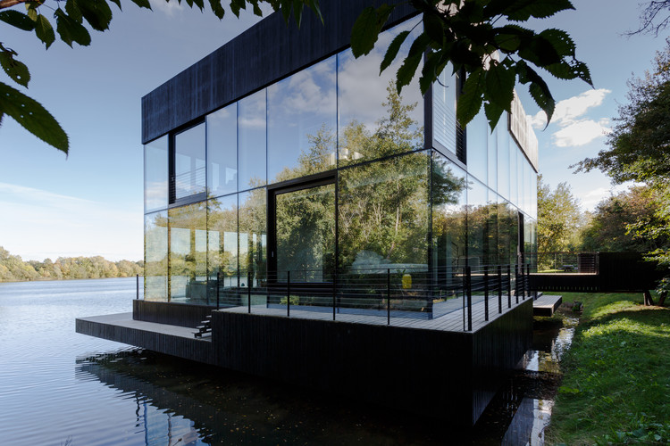
架构师提供的文本描述。该设计由一条直面街道的直线砌块组成,在中央公共花园上方的柱上有一个曲线展馆。据建筑师说,这是第一次实践设计了一些非直线的东西,但是曲线的形状并不是因为建筑的怪诞而产生的,因为建筑师从一个L形的块开始,但是为了回应它的两个直接邻居:连家的殖民平房和立方房子,它决定软化它的几何学。建筑师决定把他们的屏幕屋从两个邻居手中拉回来。这是一种“后退的姿态”,它尊重殖民平房,与其保持一定距离,建筑师似乎在实践一种典型的建筑语境主义,特别是在历史环境中,在这种情况下,设计符合其背景,不能单独或孤立地理解,因为只有在与其上下文相联系的情况下才能获得意义。
Text description provided by the architects. The design consists of a linear block facing the street, with a curvilinear pavilion elevated on pilotis above the central communal garden. According to architect, this is the first time that the practice had designed something non-rectilinear, but the curvilinear shape did not arise out of architectural whimsy, as architect started with an L-shaped block but decided to soften the geometry in response to its two direct neighbours: the Lien family’s colonial bungalow and the Cubic House. Architect decided to pull their Screen House back from both its neighbours. It is a “receding gesture”, one which respects the colonial bungalow by keeping a distance from it Here architect appears to be practicing the type of architectural contextualism typically seen in an urban context, especially a historical one, whereby the design defers to its context and it cannot be understood on its own or in isolation, as it only acquires meaning when understood in relation to its context.
建筑师们注意到,这种后退的姿态与“消失”的设计策略具有同样的精神,他指的是建筑师打算融入现场的自然景观,因为他们的地块上有最多的成熟树:在街道入口处,屋顶由一排高大细长的钢柱支撑着,在花园边,在靠近水池的木甲板上突出的屋顶由三对细长的钢柱支撑。建筑师还在曲线展馆的玻璃信封前和线状建筑的第二层使用精致的木屏风,赋予玻璃表面以天然材料的温暖和一种尺度感,同时将透明的平面变成半透明的平面,保护它们不受探视的眼睛和直接的阳光照射。此外,建筑物的质量被分解成体积较小的不同材料的重叠面,如纹理混凝土、花岗岩和木材覆层。这种通过使用丰富的材料调色板与自然融合的策略在建筑师的其他项目中很明显。建筑师对材料和场地的敏感性受到其他设计师的影响,这些影响可以看作是建筑师社会文化背景的反映。他对日本传统美学的感同身受,可以从他职业生涯早期在日本工作的那一年,以及他对日本传统美学的钦佩来理解。
Architects notes that the receding gesture is in the same spirit as the design strategy of ‘disappearance,’ by which he is referring to architect’s intention to blend in with the natural landscape on the site, as their plot had the most number of mature trees: at the street entrance, the roof is supported by a row of tall slender steel columns and, on the garden side, the roof projecting over the timber deck adjoining the pool is supported by three slender pairs of steel columns. Architect also used delicate timber screens in front of the glass envelopes of the curvilinear pavilion pavilion and the second level of the linear block to give the glass surfaces the warmth of natural material and a sense of scale while also turning transparent planes into translucent ones, shielding them from probing eyes and direct sunlight. In addition, the massing d the building was broken down into smaller volumes and overlapping planes of different materials, such as textured concrete, granite and timber cladding. This strategy of blending in with nature through the use of a rich palette of materials is evident in other projects by architect. Architect’s sensibility towards material and site has been influenced by other designers, and these influences can be seen as an indication of architect’s socio cultural background. His empathy with Japanese tradition-inspired aesthetics could be understood in relation to the year he spent working in Japan early in his career, and his admiration for.
歌颂“材料的自然美”及其表现潜力一直是建筑师作品的核心主题之一,即使其意图并不明确地与自然融合。如果你看看建筑师的投资组合,你就会发现,人们对探索一个相当路易·卡纳(Louis Kahnian)的问题有着一致的兴趣,即某一特定材料想要成为什么,因此,如何充分表达对业主的要求,即在适应未来空间的不同用途、连接空间和分隔化的想法方面具有灵活性,这是必须重新思考的。
Celebrating the “natural beauty of the materials” and their expressive potential has always been one of the central themes of architect’s works, even when the intention was not explicitly to blend in with nature. If one looks at architect’s portfolio, one detects a consistent interest in exploring a rather Louis Kahnian question of what a particular material wants to be and, accordingly, how to fully express the Due to the owner’s request of having flexibility in adapting different uses to spaces in the future, connecting spaces and the idea of compartmentalization had to be rethought.
为了灵活使用房屋的主要区域,主要空间,如生活/餐饮和家庭空间合并为一个流动空间。房间之间的隔板可以滑动并隐藏起来,以适应变化的功能。走廊为3.6米宽的通道,在使用时形成儿童游乐区的延伸。甚至地下室也被配置成一个宽栏的免费空间,客户可以在那里举行聚会,客人可以从娱乐区畅通无阻地观看到保龄球馆。材料的特点。
To allow for flexibility in the use of the main areas of the house, main spaces such as the living/dining and family spaces were consolidated into one fluid space. The partition between rooms can slide and be hidden away to adapt to changing functions. Corridors become 3.6m wide passageways which forms an extension of the children’s play area when in use. Even the basement was configured to be a wide column free space where the client could hold parties and guests could have unobstructed views from the entertainment area to the bowling alley. characteristic of the material.
总的来说,也许可以说,“消失”的行为是在“银幕屋”中以一种与现代主义对它的传统理解截然不同的方式实现的。在现代建筑中,消失往往与非物质化联系在一起:否认或压制物质性的过程。
On the whole, it could perhaps be argued that act of ‘disappearance’ was achieved in the Screen House in a manner quite different from modernism’s conventional understanding of it. In modern architecture, disappearance tends to be associated with dematerialization: a process of denial or a suppression of materiality.
 举报
举报
别默默的看了,快登录帮我评论一下吧!:)
注册
登录
更多评论
相关文章
-

描边风设计中,最容易犯的8种问题分析
2018年走过了四分之一,LOGO设计趋势也清晰了LOGO设计
-

描边风设计中,最容易犯的8种问题分析
2018年走过了四分之一,LOGO设计趋势也清晰了LOGO设计
-

描边风设计中,最容易犯的8种问题分析
2018年走过了四分之一,LOGO设计趋势也清晰了LOGO设计


 PintereAI


