Mercado Central De Cadiz, Rehabilitación y Ampliación Carlos de Riaño Lozano
2014-01-23 01:00
架构师提供的文本描述。这是西班牙第一座管理和安置易腐产品销售的建筑,直到那时,这座建筑仍在街头摊贩手中。这是塞维利亚的Encarnación市场和波多黎各皇家市场的同时代,早于1840年后在马德里、巴塞罗那和桑坦德建立的市场。这座建筑是开放广场和后来将被覆盖的市场广场之间的过渡。由于这种巨大的内在结构疏远了原建筑并隐藏了它的价值,所以很难区分这两个时期。上了屋顶后,所有的疑虑都消除了,因为看到四扇华丽的门,每个门面上都有一扇门,从街面上看不见,就在一座向内倾覆的大楼里。
Text description provided by the architects. It is one the first buildings built in Spain to regulate and house the sale of perishable products, until then in the hands of street vendors. It is a contemporary of the Encarnación market in Seville and the Puerto Real market, and previous to the markets that were built in Madrid, Barcelona and Santander after 1840. The building is a transition between the open square and what later would be covered market squares. With that massive inner structure that alienated the original architecture and hid its values, it was difficult to distinguish the two periods. After going up to the roof, all doubts were cleared upon seeing four splendid doors, one in each facade, imperceptible from the street level, in a building overturned to the interior.
有两个明显不同的建筑:一个新古典建筑,于1838年完成,由胡安·多拉负责。和另一个兵营一样,由胡安·塔拉维拉签署,日期为1929年。第二个人淹没了第一个人,妨碍了纪念碑的视野。在这一点上,决定是明确的:保持周边和拆除中心。我们必须强调,没有通风,没有自然光,永久性地强制使用人工光,由此产生的热负荷的人和货物。
There were two clearly differentiated architectures: a neoclassic one, finished in 1838, under the responsibility of Juan Daura. And another one barracks-like, signed by Juan Talavera and dated in 1929. The second one drowns the first and prevents the vision of the monument. At this point the decision was clear: to keep the perimeter and to demolish the centre. We must emphasize the lack of ventilation of the nave and the absence of natural light that permanently forces the use of artificial light, with the consequent calorific load for people and goods.
有一系列被迫的场所。这座老建筑必须呼吸,必须从整体上看。新的,开放的,可渗透的和透明的,将依靠类似的能力被拆除。一个明亮和通风的内部将允许一个长远的角度和对柱廊和周围拱门的感觉。原建筑经过了严格的修复过程,隐藏的结构和石头元素已被恢复。
There were a series of forced premises. The old building would have to breathe and to be seen in its totality. The new one, opened, permeable and transparent, would count on a similar capacity as the demolished one. A luminous and ventilated interior would allow a long perspective and the perception of the colonnade and surrounding arches of access. The original building has passed through a rigorous process of restoration and the hidden structures and stone elements have been recovered.
它的内部蠕动令人想起古代的Paestum和Agrigento神庙,几年前在伦敦被约翰·纳什收回,后来被斯堪的纳维亚人使用到阿斯普罗德。
Its inner peristyle recalls the archaic orders of the Paestum and Agrigento temples, recovered a few years earlier by John Nash in London, and later used by Scandinavians up to Asplund.
它坚持开放市场的理念,这是由作者Benjumeda和Daura设想的。由于温暖的Cádiz天气,街道进入市场,市场走上街头。
It maintains the idea of an open market, as conceived by its authors Benjumeda and Daura. The street enters the market and the market goes out to the street, thanks to the warm Cádiz weather.
这项任务产生于十位建筑师之间有限的竞争,经过了之前的择优阶段。它是由公共工程部、住房、建筑和城市规划司建筑司召集的。
The assignment emerged from a limited competition amongst ten architects, after a previous merit selection stage. It was called by the Ministry of Public Works, Department of Housing, Architecture and City Planning, Division of Architecture.
市场覆盖了利伯塔德广场(Libertad Square)、AlcaláGaliano街和Libertad街(显著长方形)的边缘。边长106,75米,56,00米,106,73米和55,78米,总面积为6,602.93平方米。
The market covers a surface bordered by Libertad square, Alcalá Galiano street and Libertad street, significantly rectangular. Its sides measure 106,75 m, 56,00 m, 106,73 m, and 55,78 m, and the total surface is 6,602.93 m2.
新建筑将与旧建筑混合,有足够的空间在两座建筑之间进行流畅的对话。以类似于有盖走廊的方式,一个充足的混凝土门廊将保护外面的门。这株植物的轮廓很简单。
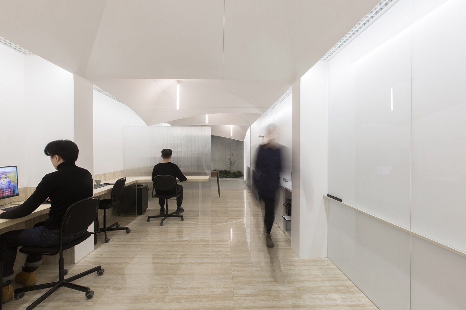
The new building will be blended in the old one, with the sufficient margins for a fluid dialogue between the two architectures. In a similar way as the covered gallery, an ample concrete porch will protect the outer doors. The outline of the plant is very simple.
新的内外布局的看台有两个街区在较小的一面,其中通信核心与地窖被安置。必须指出的是,几个空间的欺骗性使购物更加方便,避免了长时间步行到顾客那里。在底层的顶层,有两条开放的办公室、自助餐厅、会议室和档案馆。
The new inner and outer layout of the stands has two blocks on the smaller sides, where the communication cores with the cellar are housed. It must be mentioned that the duplicity of several spaces makes shopping more convenient, avoiding long walks to the customers. On top of the ground floor level there are two open mezzanines for offices, cafeteria, meeting room and archives.
一系列薄薄的白色混凝土屏风隔开看台,支撑3,30米。屋顶投影。除了屋顶投影,屏幕有60×30厘米的相同类型的混凝土支柱,支持130×30米的梁支撑屋顶板。
A series of thin white concrete screens separate the stands and support the 3,30 m. roof projection. Beyond the roof projection, the screens have 60 by 30 cm pillars of the same type of concrete, which support 130 by 30 m girders that support the roof slab.
遮阳篷顶部的结构上覆盖着一层额外透明的玻璃板,并以45°的固定角度进行着色。每个单元约180×30厘米,安装在AISI-316质量的管状金属不锈钢底座上。我们选择了一种透明的玻璃解决方案,它提供了历史建筑的景观,同时它给新的建筑带来了轻盈,并为室内的永久通风提供了便利。
The structure on top of the awning is covered with slats of extra clear glass with shading serigraphy, at a fixed angle of 45º. Each unit measures approximately 180 by 30 cm and it is mounted on a tubular metallic stainless steel substructure of AISI-316 quality. We chose a glass solution for its transparency, which offers a view of the historical building, while it gives lightness to the new one and facilitates a permanent ventilation of the interior.
白色混凝土和玻璃,根据客户的需要对看台进行了仔细的设计,与覆盖整个老建筑(包括柱子)的清澈的石料完美共存,直到今天,这些石料和绘画都被层层隐藏起来。
White concrete and glass, with a studied design of the stands according to necessities of the client, coexist perfectly with the clear stone that covers the totality of the old building, including columns, until today hidden by layers of plaster and painting.
 举报
举报
别默默的看了,快登录帮我评论一下吧!:)
注册
登录
更多评论
相关文章
-

描边风设计中,最容易犯的8种问题分析
2018年走过了四分之一,LOGO设计趋势也清晰了LOGO设计
-

描边风设计中,最容易犯的8种问题分析
2018年走过了四分之一,LOGO设计趋势也清晰了LOGO设计
-

描边风设计中,最容易犯的8种问题分析
2018年走过了四分之一,LOGO设计趋势也清晰了LOGO设计


.jpg)


 PintereAI


