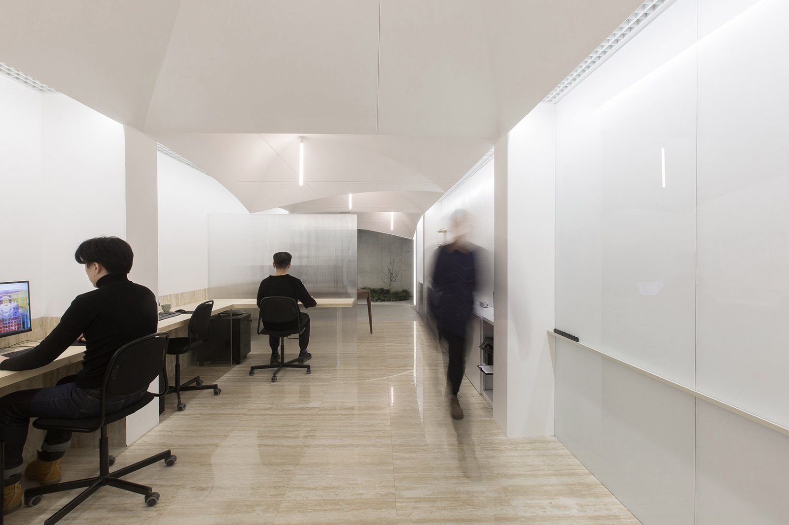
Jia Little Exhibition Center SKEW Collaborative
2014-01-31 01:00
架构师提供的文本描述。佳小展览中心将创意产业的展示和生产空间整合成一个单一的混合用途的建筑综合体,由一个展厅和三个工作室组成。主要的空间策略是在生产和消费空间之间建立一种无缝的关系,使游客和消费者重新联系到制作和生产过程的知识和欣赏。
Text description provided by the architects. Jia Little Exhibition Center integrates the display and production spaces of creative industries into a single mixed-use building complex, consisting of an exhibition hall and three work-live atelier buildings. The primary spatial strategy is to create a seamless relationship between spaces of production and consumption, so that visitors and consumers are reconnected with the knowledge and appreciation of the processes of making and production.
Courtesy of SKEW Collaborative
CRITIQUE OF PRODUCTION & CONSUMPTION
我们生活在这样一个时代,我们不再了解我们所消费的商品的来源和生产,常常在不知不觉中使自己接触到可能危害我们健康的材料,或者是根据不公平或剥削性生产做法生产的货物。在追求这个项目的时候,我们的主要目标是建立优雅和实用的展览空间,我们觉得有责任把游客带到场景后面更坚硬的生产厂。事实上,人们可能会说,这正是今天受过教育的消费者所追求的-了解制造商负责任的做法、设计师的道德操守、获取原材料的社会和环境责任、制造过程的工具等等。
We live in an age where we are no longer acquainted with the origins and production of the goods we consume, often unwittingly exposing ourselves to materials that may be hazardous to our health, or goods that are produced under unfair or exploitative production practices. In pursuing this project, while the primary goal is to establish elegant and practical exhibition spaces, we feel there is a responsibility to bring visitors to the more gritty production houses behind-the-scene. In fact, one may argue this is exactly what an educated consumer seeks today – to learn about the responsible practices of the manufacturers, the ethics of the designers, the social and environmental responsibility towards the acquisition of the raw materials, the tools of the manufacturing process, and so on.
Courtesy of SKEW Collaborative
展厅实质上是一个水平的核心,通过一个正式表达的木包层和钢框架系统在外观上可以看到。这个连续的核心让游客在高架上穿过4座建筑物,包围着展厅内的其他单独的展示空间。当游客穿过大桥进入不同的制作工作室和加工厂时,他们被重新定位在不同层次的交流大厅和楼梯上。换句话说,制作程序是由展览厅在中心进行的,允许参观者到达其他空间,而不需要离开展览线路。通过线性说服的零售策略,核心得以延伸,流通也得到了延长,让游客体验到了各种各样的空间体验-从人工照明的展览内部到外部凹凸不平的桥梁,从圆滑的展览到设计工作室,再到杂乱无章的加工厂。通过这个项目,对展览的体验进行了重新思考,希望通过生产和消费之间的连接,能够增强和验证游客的体验。
The exhibition hall is in essence a horizontal core that is made visible on the exterior through a formally expressive wood cladding and steel framing system. This continuous core circulates visitors through the 4 buildings on an elevated level, enveloping otherwise separate display spaces within the exhibition hall. As visitors weave through the complex across the bridges into different production studios and fabrication plants, they are re-oriented at different levels of communicating lobbies and stairs. In other words, the production programs are being held together in the center by the exhibition hall, allowing visitors to reach other spaces without getting off the circuit of exhibition. The core is stretched and circulation is prolonged through a retail strategy of linear persuasion, weaving visitors through a multitude of spatial experiences – from artificially lit exhibition interiors to exterior ramped bridges, from sleek exhibitions to design studios and untidy fabrication plants. The experience of the exhibition is re-thought through this project, with the hope that a visitor’s experience can be enhanced and authenticated by the connectivity between production and consumption
Courtesy of SKEW Collaborative
INDUSTRIAL & SOCIO-ECONOMIC CONTEXT IN CHINA
这个项目的地点最初被划为工业用地。工业景观往往不过是以最低成本建造的大棚屋。该项目的设计议程是对这一生产和消费系统采取更负责任的办法,而不是创造与周围环境的任何视觉联系。展览项目与中国的制造业和工业项目齐头并进,因此,必须从其对生产和消费周期本身的贡献来看待环境一体化的概念。这里的目标是使人们更开放和更公开地进入制造过程,并在这样做的过程中赋予生产工人社区权力,使他们意识到他们的工作是有对应关系的-一个受过教育的消费者群体,他们寻求了解正在生产的设计和产品中的内容。这种整合形式旨在将社会、经济和环境关系与建筑及其网站的关系联系起来。
The site of this project was originally zoned as an industrial site. The industrial landscape tends to be nothing more than large sheds built at a minimum cost. The design agenda for this project was to generate a more responsible approach towards this very system of production and consumption, rather than to create any visual link to its surroundings. Exhibition programs go hand in hand with manufacturing and industrial programs in China, hence the notion of an integration to the surroundings has to be seen from its contribution towards the production and consumption cycle itself. The ambition here is to generate a more open and public access to the processes of manufacturing, and in so doing, empower a community of production workers who are aware that there is a counterpart to their work – a community of educated consumers who seek to know what goes into the designs and goods that are being produced. This form of integration was designed to link up socio-economic and environmental relationships with that of architecture and its site.
Courtesy of SKEW Collaborative
SUSTAINABILITY THROUGH CONTINUOUS FAÇADE
该项目对绿色建筑做法的主要贡献可见于展厅木材幕墙的遮阳百叶窗细节,以及阁楼的最低开窗设计。利用有限的木材百叶窗深度和角度排列,发展了多达12种类型,以适应不同的太阳角度和方向。展厅的形式和方向取决于需要为工作室建筑之间的社会互动和流通以及场地的微观城市化创造更小的区域。多面展厅的设计标准具有挑战性,同时也赋予了建筑特殊的设计特色。展厅木幕墙系统的方向性设计不仅是为了提高建筑作为水平核心系统的可读性,而且也为控制景观和遮阳提供了独特的可能性。在三个工作室的建筑物中使用的垂直窗户系统的设计是为了提供充足的采光,同时保持一个一般紧的热封套,最小的开窗。
The main contribution of this project towards green building practices can be seen in the shading louver details of the timber curtain wall of the exhibition hall, as well as the minimum fenestration design of the atelier buildings. Using limited permutations of the timber louver depth and angles, as many as 12 types were developed to suit different sun angles and orientation. The form and orientation of the exhibition hall was determined by a need to create smaller zones for social interaction and circulation between the atelier buildings, as well as the micro-urbanism of the site. While the criteria for the multi-sided exhibition hall was challenging, it also gave special design character to the building. The directionality of the timber curtain wall system of the exhibition hall was not only designed as a continuous surface to promote the legibility of the building as a horizontal core system, it also gave unique possibilities for the control of views and sun-shading. The vertical window system used in the 3 atelier buildings was designed to provide sufficient daylighting, while keeping with a generally tight thermal envelope, with minimum fenestration.
 举报
举报
别默默的看了,快登录帮我评论一下吧!:)
注册
登录
更多评论
相关文章
-

描边风设计中,最容易犯的8种问题分析
2018年走过了四分之一,LOGO设计趋势也清晰了LOGO设计
-

描边风设计中,最容易犯的8种问题分析
2018年走过了四分之一,LOGO设计趋势也清晰了LOGO设计
-

描边风设计中,最容易犯的8种问题分析
2018年走过了四分之一,LOGO设计趋势也清晰了LOGO设计


.jpg)

.jpg)

.jpg)


 PintereAI


