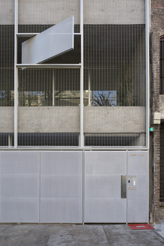
City College Norwich BDP
2014-02-01 01:00
架构师提供的文本描述。鼓舞人心的新创意艺术建筑代表了学院总体规划的第一阶段。它的目的是表达一个独特的大学身份,同时支持内部连接,在建筑规模,以及整个校园。
Text description provided by the architects. The inspiring new creative arts building represents the first stage in the college’s masterplan. It is designed to express a distinct college identity while supporting internal connectivity at the building scale as well as the whole campus.
它支持学院的愿景,提供卓越和创新的创意艺术,有三层有用途的地板,用于表演艺术彩排空间、数字艺术以及包括时尚在内的传统艺术和设计。它强大而纯净的架构意味着它能够很好地吸收这些短暂而混乱的活动。
It supports the college’s vision to deliver outstanding and innovative creative arts provision, with three purpose-built floors for performing arts rehearsal spaces, digital arts, and traditional art and design including fashion. Its strong and pure architectural frame means that it can absorb these transient and messy activities well.
一个黑色的木材覆盖的展馆设置在一棵树的边缘,南面花园,形成绿色的背景。北面的墙壁是相当开放的,以吸收眩光,自由的北极光进入画廊空间。建筑的这一面也是与众不同的,因为它向外推,形成一个令人兴奋的正面。
A black timber clad pavilion is set on the edge of a tree lined south facing garden which forms a green backdrop. The north facing wall is quite open in order to soak up glare free north light into the gallery spaces. This side of the building is also distinctive as it pushes outwards to form an exciting frontage.
该设计的关键驱动因素之一是利用流通空间促进学生之间的非正式会议。避免了双面堆叠的走廊,在中央自然照明的空间周围形成了小的“互动口袋”。建筑的清晰定位,加上学生活动的可见度,让使用者有信心和归属感。
One of the key drivers of the design was the use of circulation space to promote informal meetings between students. Double-banked corridors were avoided, and small ‘pockets of interaction’ created around a central naturally-lit space. The clear orientation of the building together with the visibility of student activities gives the users confidence and a sense of belonging.
该建筑物的底层大部分是玻璃,以提高透明度,允许对每一个不同的活动和通过舞蹈演播室到花园以外的意见。这条底层的牧师彩带为舞者提供了灯光和隐私。
The ground floor of the building is largely glazed in order to promote transparency, allowing views towards each of the diverse activities and through the dance studio to the garden beyond. This ribbon of clerestory glazing at ground floor level gives dancers both light and privacy.
在二楼,学生们喜欢通风的阁楼式室内装饰,这给人一种开放的感觉,营造出专业画廊布置的氛围。室内的景色一般都是由穿孔的窗户构成的,南北墙都有长长的形式,但在西面的立面上,遮阳的幕墙使人们对花园里的成熟树木有了更广阔的看法,并为接近游客提供了开放和透明的建议。杆上的垂直鳍从低角度西风太阳的内部遮住了变化的活动。
At second floor level students enjoy airy loft-like interiors which give a sense of openness and create the atmosphere of a professional gallery arrangement. Views from the interior are generally framed by punched windows, set in the long forms on both north and south walls, except on the western elevation where a shaded curtain wall gives wider views towards mature trees in the garden and suggests openness and transparency to approaching visitors. Vertical fins on rods shade the varying activities internally from low angle westerly sun.
在该计划的整个过程中,以及在正门的入口,我们都会表现出审慎的态度,确保所有的使用者都能愉快地到达一幢建筑物,进入一座倾斜的场地标志、找路和定位,以及良好的色彩对比,协助所有学生畅通无阻地浏览和使用学院及其设施。
Thoughtfulness with regard to access is evident throughout the scheme and at the main entrance where a gentle gradient has been enabled to ensure that all users arrive happily into what is a building cutting into a sloping site Signage, way finding and orientation along with good colour contrasts, assists all students to navigate and use the college and its facilities without impairment.
该学院更倾向于采用工业材料调色板,这有助于节约成本,例如暴露混凝土泡沫和油漆混凝土地板。该项目的预算紧张,为每平方米1660英镑。
An industrial material palette was preferred by the college, which helped in the cost saving process, for example exposed concrete soffits and painted concrete floors. The project was delivered to a tight budget of £1,660/sqm.
 举报
举报
别默默的看了,快登录帮我评论一下吧!:)
注册
登录
更多评论
相关文章
-

描边风设计中,最容易犯的8种问题分析
2018年走过了四分之一,LOGO设计趋势也清晰了LOGO设计
-

描边风设计中,最容易犯的8种问题分析
2018年走过了四分之一,LOGO设计趋势也清晰了LOGO设计
-

描边风设计中,最容易犯的8种问题分析
2018年走过了四分之一,LOGO设计趋势也清晰了LOGO设计
.jpg)

.jpg)

.jpg)

.jpg)

.jpg)

.jpg)

.jpg)

.jpg)

.jpg)

.jpg)

.jpg)

.jpg)

.jpg)


 PintereAI


