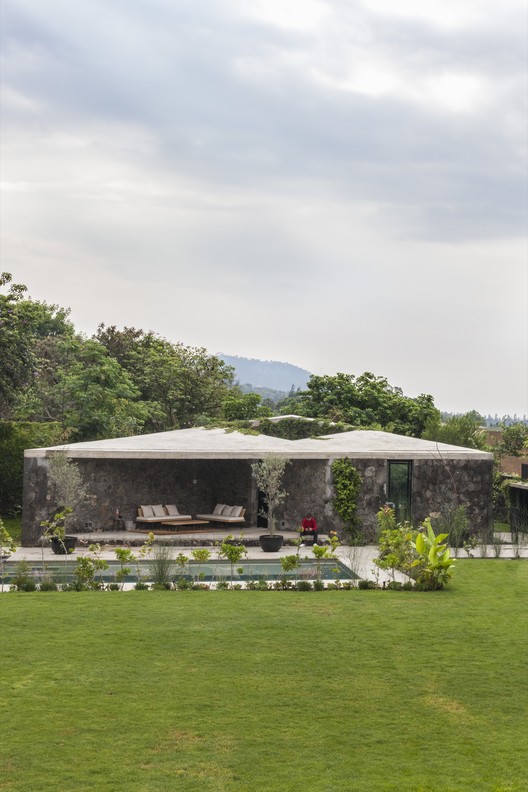
Pearl Bay residence Gavin Maddock Design Studio
2014-08-05 01:00
架构师提供的文本描述。这座原始的现代住宅位于开普敦以北90公里处的西海岸,毗邻海洋的自然保护区。像这样的网站没有什么比这更壮观的了。充分利用海洋景观,并响应沿海沙丘环境,加文·马多克将其描述为“一个光荣的遗址”。
Text description provided by the architects. This pristine contemporary home is located on the west coast 90kms north of Cape Town bordered by a nature reserve adjoining the ocean. Sites like this don’t come much more spectacular. Taking full advantage of the ocean views and responding to the coastal dune context, Gavin Maddock describes it as ‘a glorious site’.
这位客户想要一间度假屋,她最终要退休了。这份简报呼吁建造一座“现代”的海景住宅,严格遵守有限的预算,其中包括标准的住宿要求。
The client wanted a holiday house she would eventually retire to. The brief called for a ‘modern’ house with ocean views and a strict observance of a limited budget, which was to include the standard accommodation requirements.
由于前面的沙丘比场地的其他地方高一点,挑战是如何调和房屋、沙丘和景观。结果是一幢600平方米的长方形双层结构,并有创意构思的户外居住空间。它包括:三间卧室、四间浴室、内外宽敞的起居和就餐区、画廊、休闲客厅、书房、甲板、露台和阳台:几乎每个房间都有海景。
With the front dune sitting up a little higher than the rest of the site, the challenge was to reconcile house, dune and views. The result is a rectangular double storey structure of 600 square metres with imaginatively conceived outdoor living spaces. It comprises: three bedrooms, four bathrooms, generous living and dining areas both inside and out, a gallery, casual living room, a study, decks, terraces and balconies: Ocean views exist from virtually every room.
鉴于情况有限,重点放在两个主要问题上:在预算范围内的现代签字。建筑和室内设计享受着各种各样的审美兴趣,受到了西海岸景观的启发,这种景观具有相当的质感,以简单的白色房屋和小屋为代表,让人联想到地中海。
Given a limited brief the focuse was on two main issues: a modern signature within the budget. The architecture and interiors enjoy various aesthetic interests and were inspired by the west coast landscape which is quite textural and typified by simple white houses and cottages, reminiscent of the Mediterranean.
采用空腔砖结构,所有墙壁都涂上了抹灰,漆成了白色。该建筑物必须接地-它不能浮动-因此,它需要是垂直的,而不是水平的。前面和后面的展馆都是两层楼,窗户被切入到栏杆上,以强调垂直性。这两个展馆由画廊连接,这是一个单层单元,水平侧壁再次强调主建筑的垂直性。在这些空间之间有一种无缝的流动,内部和外部之间有一种不间断的连接感。楼板是异形混凝土,与墙壁的油漆灰泥形成鲜明对比,但也进一步表达了垂直线。
Cavity brick construction was used throughout with all walls plastered and painted white. The building had to be grounded – it could not float – therefore it needed to be vertical, not horizontal. ‘Both the front and rear pavilions are two storeys and the windows are sliced through to the parapet to emphasise the verticality. The two pavilions are joined by the gallery, which is a single storey element where the horizontal lateral wall again emphasises the verticality of the main building. There is a seamless flow between these spaces and a sense of uninterrupted connection between inside and outside. The floor slabs are off-form concrete, contrasting with the painted plaster of the walls, yet further expressing the vertical line.
家具的尺寸,它的颜色和质地,是满足舒适水平的重要因素。单位座位和餐桌是定制的,以补充空间。选择外部家具件是因为它们的规模和简单性;将空间连接在一起的大胆部件。电视和所有的音响设备都藏在客厅的壁橱里,在大的钢架滑动板后面,里面放着大量的艺术品。一个定制的壁炉被插进不锈钢窗台。
The scale of furniture, its colour and texture, were important to satisfy comfort levels. The unit seating and the dining table were custom designed to complement the space. The external furniture pieces were chosen for their scale and simplicity; bold pieces that hold the spaces together. The TV and all audio equipment was concealed in the living room wall cabinet, behind the large steel framed sliding panel that accommodates a substantial artwork. A custom designed fireplace was recessed into a stainless steel ledge.
为了最大限度地扩大主套间的大小,设计了一个定制淋浴,内墙使用玻璃。所有卧室的地板都是在宽木板橡木地板上完成的,主套房的视野也在不断变化。
To maximise the size of the main en-suite, a custom-shower was created and glass for the internal walls was used. All bedroom floors are finished in wide board oak flooring; the view from the master suite is ever changing.
选择花岗岩砖是因为它们的质地和颗粒,它们与远处的岩石产生共鸣,提供了在露台上的外部感觉。它们的大小与空间成比例,并与内部的某些软纹理形成对比。在这里,家具的选择包括各种现代经典。
The granite tiles were selected for their texture and grain, which resonates with rocks in the distance, providing that external feel of being on the terrace. Their size is proportionate to the space and contrasts with certain soft textures within the interior. Here, the selection of furniture includes various modern classics.
为了尽量减少结构,使视图最大化,没有“框架视图”。画布必须尽可能大,在这样的网站上,但提供隐私的未来邻居和庇护不受元素。利用战略上放置的柱子,开口向海洋延伸至最大14米。为了达到空间的轻盈,比例和高度是必不可少的。3,3米的天花板高度确保了这一结果,并配备了全高度滑动门。起居室需要无缝流动,创造一个外部甲板的感觉在里面和生活/餐饮空间,包括覆盖平台的灵活性。整个高度滑动门缩进结构,形成一个奇异的空间在这里。
Striving to reduce the structure to its minimum so as to maximise views, there are no ‘framed views’. The canvas had to be as large as possible on a site such as this, yet provide privacy to / from future neighbours and shelter from the elements. Using strategically placed columns, the opening was stretched to the maximum of 14 metres addressing the ocean. To achieve the lightness of the space, proportion and height was essential. Ceiling heights of 3,3 metres ensured this result, with full height sliding doors. The living areas needed to flow seamlessly, creating a feel of the outside deck to be inside and the living / dining space to include the covered terrace for flexibility. The full height sliding doors retract into the structure to form a singular space here.
其结果是一个独特的呼吁对称的声明,一个拥有大型娱乐区域的现代住宅,以及所有的现代建筑设计(Mod)的缺点。
The result is an individual statement of appealing symmetry, a modern home with large entertainment areas and all the mod cons.
 举报
举报
别默默的看了,快登录帮我评论一下吧!:)
注册
登录
更多评论
相关文章
-

描边风设计中,最容易犯的8种问题分析
2018年走过了四分之一,LOGO设计趋势也清晰了LOGO设计
-

描边风设计中,最容易犯的8种问题分析
2018年走过了四分之一,LOGO设计趋势也清晰了LOGO设计
-

描边风设计中,最容易犯的8种问题分析
2018年走过了四分之一,LOGO设计趋势也清晰了LOGO设计


 PintereAI


