T PARK CUBE Architecten
2014-09-02 01:00
架构师提供的文本描述。2013年8月,阿姆斯特丹市政府批准将阿姆斯特丹Jdenbreestraat的一间办公室下的一间旧储藏室重新开发成一个多功能广场。这一计划是其办公室新的灵活住房概念的一部分,可以通过建立这种广场来加强这一概念。立方体,经过一个封闭的竞争,要求发展这个530平方米的广场。根据阿姆斯特丹市的说法,它必须成为一个具有非凡外观的有吸引力的地区。
Text description provided by the architects. In August 2013 the City of Amsterdam gave the go-ahead for the redevelopment of an old store room under one of their offices on Jodenbreestraat in Amsterdam into a multifunctional plaza. This plan is part of the new flexible housing concept for their offices, which can be densified through realization of such plazas. CUBE is, after a closed competition, asked to develop this 530 m2 plaza. According to the City of Amsterdam it had to become an attractive area with an extraordinary appearance.
半公共广场可用于工作,合作,会议,或吃和喝有机咖啡,果汁和三明治从酒吧。也有可能举行专题介绍和会议。程序中功能更强的部分被有效地打包成简单的卷,这样它们就形成了广场的开放空间。这座巨大的办公楼的入口处重新开发了一个新的接待处,并增加了这个新的广场。虽然建筑物的防火分隔需要在此之前改变,但入口与广场之间的开放连接对于使新的附加物真正成为整座建筑的一部分是非常重要的。
The semi-public plaza can be used for working, collaborating, meeting, or eating and drinking the organic coffee, juices and sandwiches from the bar. There is also the possibility for holding presentations and meetings. The more functional parts of the program are efficiently packaged in simple volumes in such a way that they form an open space for the plaza. The entrance area of the huge office building was redeveloped with a new reception desk and added to this new plaza. Although the fire separation in the building needed to be changed fore this, the open connection between the entrance and the plaza was really important to make the new addition really part of the whole building.
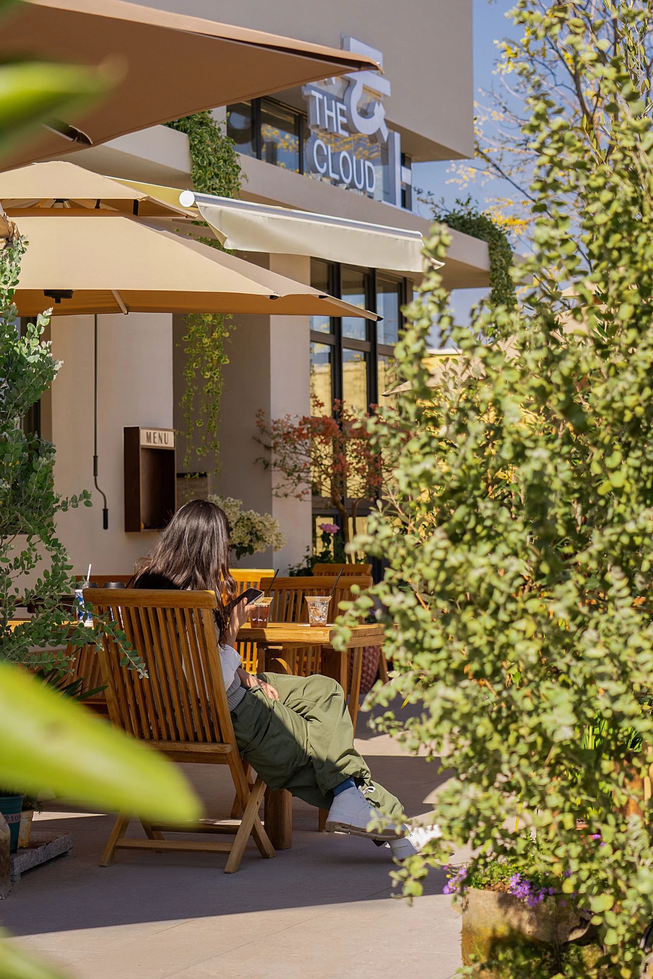
这样,我们就为这座建筑增添了一个空间,一个绿色公园的宁静和嬉戏。巨大的不同的植物笼子就像一个树冠一样悬挂在真正的桦树树干之间。沿着大玻璃门,播种机悬挂,形成一个天然的过滤器。墙壁上印有树叶的影子,地板上有一种自然的“外表:灰褐色的色调”。一致使用的颜色-白色、棕色和绿色-在其他相当随意的放置元素之间带来一定的平静。这种看似随机放置的树木、植物笼和家具实际上是相对于投影仪和步行路径的精确定位。包含额外空间的卷,作为木棚在树木之间,有不相等厚度的木板条。
By this we have added a space to the building with the peace and playfulness of a green park. Large different plant cages hang like a canopy between the real birch trunks. Along the large glass doors planters are hung that form a natural filter. On the walls a print of the shadows of the leaves was used, and the floor has a natural "outside look: with its gray / brown tones. The consistent use of the colors white, brown and green brings a certain calmness between the otherwise fairly random placed elements. This seemingly random placement of trees, plant cages and furniture is in reality a precise positioning relative to the projector and the walking paths. The volumes containing extra spaces that are located as wooden sheds between the trees, have wooden slats of unequal thicknesses.
吊篮中的真正植物,从一开始就是规划的重要组成部分,确保良好的空气质量和绿色体验,是设计过程中最大的挑战。最初我们研究的是一个自动浇水系统,但最终我们选择将它们挂在10台通常仅在影院的电动葫芦上。每4周,他们将被降下来照顾水生植物。
The real plants in the hanging cages, which from the beginning were an essential part of the plan and ensure good air quality and a green experience, were the biggest challenge in the design process. Initially we looked at an automatic watering system, but in the end we opted to hang them on 10 electric hoists that are normally just in theaters. Every 4 weeks they will be lowered to take care of the hydroponic plants.
可持续性是关键原则之一,重用是其中的一部分。我们可以重新利用部分设施,也可以在市政仓库寻找二手家具。柜台上方的吊灯和一些桌椅都是从这里来的。
Sustainability was one of the key principles and reuse is a part of it. We could reuse parts of the installations, and also for the furniture we went looking for used elements in the storage depots of the municipality. The pendant lights above the counter and some of the tables and chairs all come from here.
 举报
举报
别默默的看了,快登录帮我评论一下吧!:)
注册
登录
更多评论
相关文章
-

描边风设计中,最容易犯的8种问题分析
2018年走过了四分之一,LOGO设计趋势也清晰了LOGO设计
-

描边风设计中,最容易犯的8种问题分析
2018年走过了四分之一,LOGO设计趋势也清晰了LOGO设计
-

描边风设计中,最容易犯的8种问题分析
2018年走过了四分之一,LOGO设计趋势也清晰了LOGO设计


 PintereAI


